Most companies start their email journey the same way: a developer hardcodes a password reset template, then they copy/paste parts of that original template for an order confirmation, then a welcome series. Each template looks great in isolation, but this practice becomes unmaintainable at scale.
Fast forward two years. Now, you have fifty email templates scattered across your codebase, three different shades of your brand blue, and your lifecycle marketing team spends half their time fulfilling template requests from product teams. Every brand refresh requires updating templates one by one. Even engineers are afraid to touch the email code because "it works, don't break it."
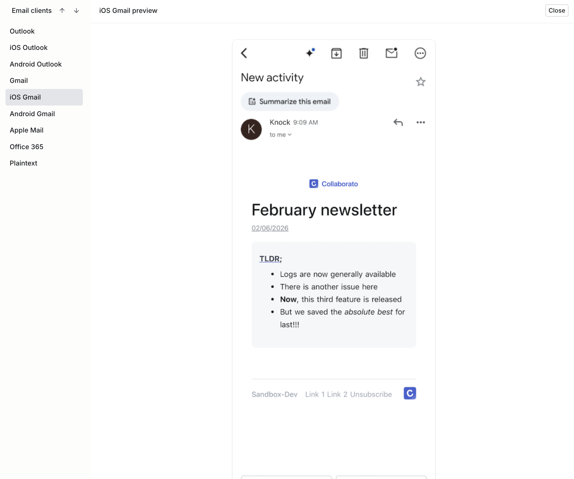
Before we created an email design system in Knock our email UI was very inconsistent and fragmented across multiple places.
At Knock, we've talked to teams at companies like Medium and Zapier who've navigated this exact transition. They've moved from fragmented, unmaintainable templates to more holistic email design systems to help them move faster.
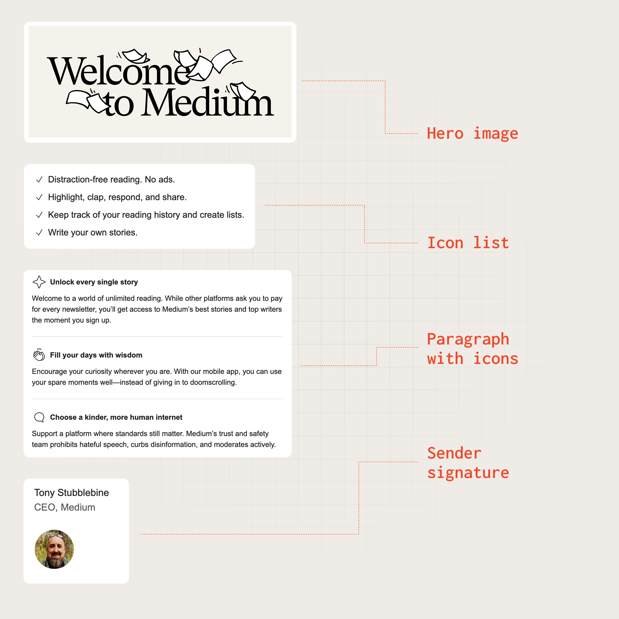
Medium's unified email design system, implemented via Knock partials and layouts
An email design system is the technical architecture and governance model that lets you scale email production across teams while maintaining brand consistency and code quality.
It's the difference between treating emails as one-off artifacts and treating them as a maintained product with reusable components, clear ownership, and systematic updates.
Here's what we've learned about building email design systems that scale.
What is an email design system?
An email design system operates at two layers: the technical implementation layer and the organizational governance layer.
The technical layer
At its core, an email design system is component-based architecture applied to email templates. Instead of maintaining fifty unique HTML files, you maintain a library of composable components that can be assembled into templates.
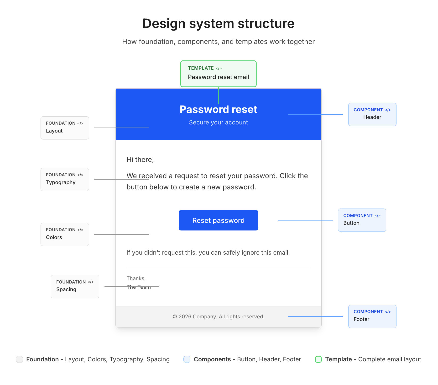
An email design system organizes your email code into foundation, component, and template layers
Component architecture organizes your email code into three levels:
- Foundation layer. Base styles, typography scales, color tokens, and spacing systems that establish your brand's visual language. This layer defines the atoms of your design system—the hex codes, font sizes, and margin values that everything else builds upon.
- Component layer. Reusable UI elements like buttons, headers, footers, and content blocks. Each component accepts parameters to handle variants (primary button vs. secondary button, light footer vs. dark footer) without duplicating code.
- Template layer. Complete email layouts assembled from components. A password reset template might be: header component + hero section + button component + footer component.
Style management determines how CSS is authored, organized, and delivered. Email CSS is notoriously complex. You're targeting dozens of email clients with varying support for modern CSS.
A robust style system handles:
- Design tokens that centralize brand values (colors, fonts, spacing).
- CSS optimization to stay under Gmail's 102KB size limit.
- Intelligent inlining (inline styles for compatibility, media queries for responsiveness).
- Unused style cleanup to minimize payload size.
Template composition defines how components combine into emails. Modern approaches fall into two categories:
- Code-first tools like React Email and MJML let developers compose templates from component files in a codebase.
- Platform-based tools like Knock and Parcel provide managed composition through partials and visual editors, so non-engineers can assemble templates from pre-built components without writing code.
Many teams combine both—building components in code and surfacing them through a self-serve platform for broader team access.
The governance layer
The technical architecture only works with clear organizational boundaries around ownership, access, and change management.
The ownership model defines who maintains what parts of the system. In mature email programs, this typically splits between the following teams:
- Brand/design team. Owns the foundation layer (colors, typography, spacing systems).
- Email platform team. Owns the component library and base templates.
- Product/marketing teams. Own specific template content and triggering logic.
Access patterns determine who can create and modify templates. Companies typically evolve through three stages:
- Gated. A central team (lifecycle marketing, email ops) manages all templates. Product teams request changes through tickets. This prevents chaos but creates bottlenecks.
- Self-serve. Product teams create and edit their own templates using the component library. This scales better but requires strong governance to prevent brand drift.
- Hybrid. Components and layouts are gated (maintained by the platform team), but content within those structures is self-serve (product teams can edit copy, swap images, adjust spacing).
Version control tracks changes and enables rollbacks. Email templates should be treated like application code—versioned, reviewed, and deployable. Whether templates live in git repositories or in a platform's version control system, changes should be trackable and revertable.
Why you need an email design system
An email design system is an investment that requires upfront effort to architect and ongoing effort to maintain. The payoff is speed, consistency, and autonomy at scale.
But the right time to make that investment varies. Some teams hit the breaking point at 20 templates, others at five. However, the symptoms, which include bottlenecked teams, inconsistent branding, and slow turnaround times, show up differently depending on your team structure, email volume, and how many stakeholders touch your templates.
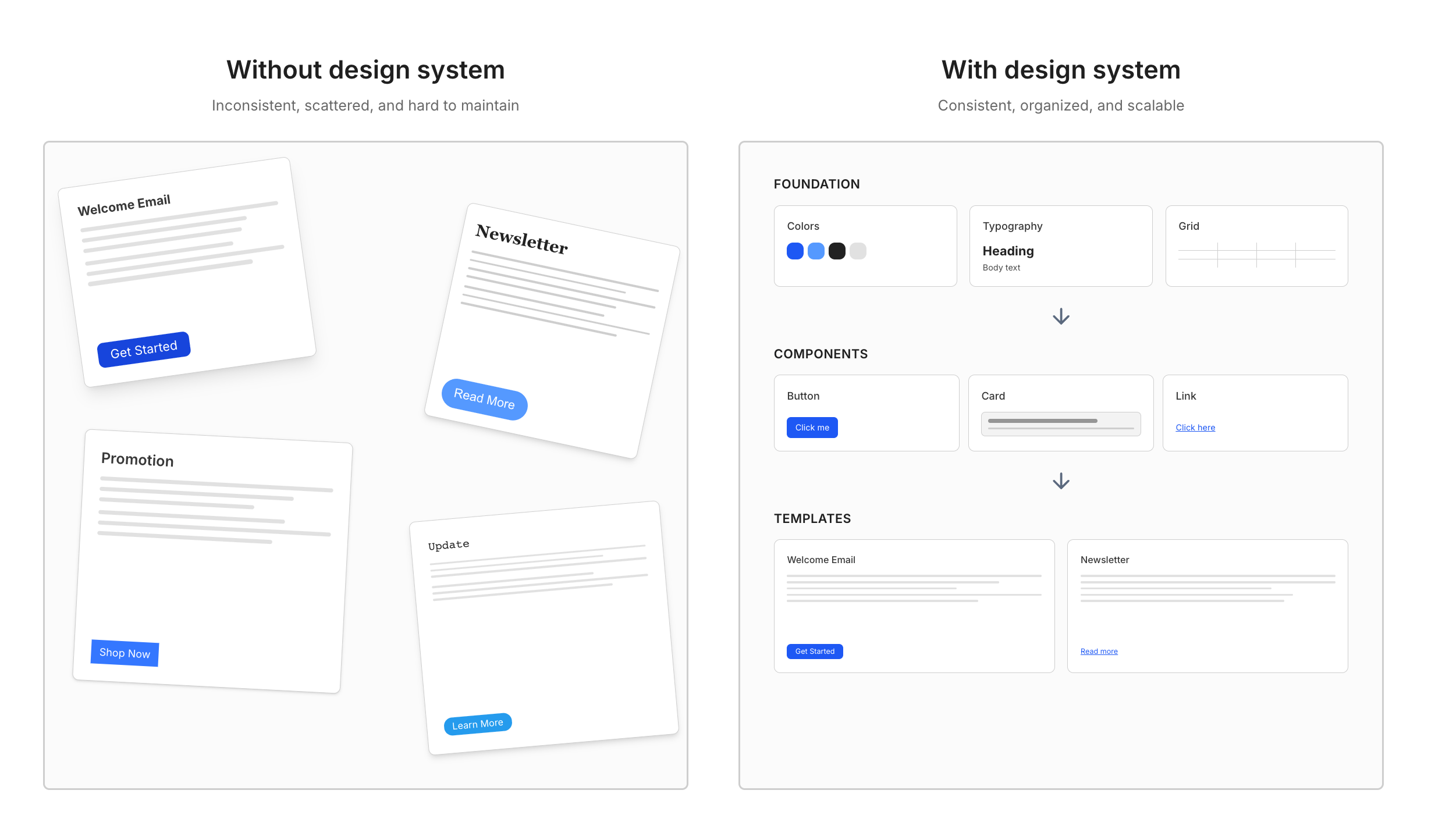
Without an email design system, templates drift apart over time. With one, consistency is built in.
When you don't need one
Email design systems are infrastructure. Like all infrastructure, they have overhead. Skip the system if you have:
- Low template volume. Fewer than 10-15 email templates that change infrequently. The maintenance burden of individual templates is manageable.
- Single team ownership. One team manages all emails with clear processes. There's no coordination overhead because there's nothing to coordinate.
- Simple requirements. Basic transactional emails with minimal styling. The "just use plain text" approach actually works.
Signals it's time to build one
You need a design system when maintaining individual templates becomes harder than maintaining the system itself. Watch for these signals:
- Multiple teams requesting email templates. When product, growth, support, and marketing teams are all shipping emails, coordination complexity explodes. Each team has different timelines, different tools, and different ideas about what your brand looks like.
- The email team becomes a bottleneck. Some of the teams we've talked to were spending 50% of their bandwidth fulfilling template requests from product teams. Product teams were blocked because they couldn't edit emails directly because any changes would be overwritten when marketing updated templates in their design system. Template requests had week-long turnaround times, slowing product velocity.
- Brand inconsistencies multiply. Even with React components, inconsistency creeps in. Medium maintained a React-based email rendering service that provided "decent consistency across components," but one-off customizations led to sprawl. Combined with a separate legacy rendering system, their emails were "very inconsistent and fragmented across multiple places." Each new template added to the entropy without shared governance.
- Engineers hardcode email styles. Developers start embedding HTML and CSS directly in application code because the official process is too slow. Now you have two sources of truth—the marketing team's templates and the codebase's templates—and they diverge over time.
- Brand changes require archeology. When your company rebrands or updates typography, someone has to hunt through dozens of templates updating hex codes one by one. The project takes weeks. Some templates get missed.
The cost of not having one
The absence of a design system compounds costs over time:
- Technical debt accumulates. Each template built without shared components becomes harder to update. What starts as "just copy this template and modify it" turns into 50 templates with duplicated code and subtle differences. Updating a button style means editing 50 files.
- Teams get bottlenecked. Centralized email teams become overwhelmed with requests. Product velocity slows because launching features depends on email templates that take weeks to create. Or teams route around the bottleneck by creating shadow templates that bypass brand standards.
- Brand value erodes. Inconsistent emails train customers to distrust your brand. If every email looks different, customers question whether emails are legitimate. If one template uses your old logo and another uses the new one, you signal sloppiness.
- Shipping slows. Without reusable components, every email starts from scratch. Developers waste time on email rendering quirks instead of features. Marketing teams waste time on template production instead of strategy.
Core components of an email design system
Building an email design system means implementing four key components: component architecture, style management, content systems, and governance.
Component architecture
Component architecture organizes email code into composable pieces. Modern approaches use MJML (a markup language that compiles to responsive HTML) or React Email (React components that render to HTML).
Foundation layer: design tokens
Design tokens centralize brand decisions into named variables that propagate through your component library.
// tokens.js
export const tokens = {
  colors: {
    primary: "#0066FF",
    secondary: "#00CC88",
    neutral: {
      50: "#F9FAFB",
      900: "#1A1A1A",
    },
  },
  typography: {
    fontFamily: "Inter, Arial, sans-serif",
    sizes: {
      xs: "12px",
      sm: "14px",
      base: "16px",
      lg: "18px",
      xl: "20px",
      "2xl": "24px",
      "3xl": "32px",
    },
    lineHeights: {
      tight: 1.25,
      normal: 1.5,
      relaxed: 1.75,
    },
  },
  spacing: {
    xs: "8px",
    sm: "16px",
    md: "24px",
    lg: "40px",
    xl: "60px",
  },
};
These tokens become the single source of truth. When your primary color changes from #0066FF to #0052CC, update the token and all components inherit the change.
Platforms can manage this layer without code. Knock's branding variables let you configure brand values—logo, primary color, and any custom properties—in the dashboard, and they propagate through every template, layout, and partial via the vars.branding.* namespace. Knock also supports per-tenant branding, so you can white-label emails for different customers or business units without duplicating templates.
Component layer: reusable elements
Components encapsulate UI patterns with configurable parameters. Here's a button component in React Email:
// Button.jsx
import { Button as ReactEmailButton } from "@react-email/button";
import { tokens } from "./tokens";

export function Button({ variant = "primary", href, children }) {
  const styles = {
    primary: {
      backgroundColor: tokens.colors.primary,
      color: "#FFFFFF",
    },
    secondary: {
      backgroundColor: "transparent",
      color: tokens.colors.primary,
      border: `2px solid ${tokens.colors.primary}`,
    },
  };

  return (
    <ReactEmailButton
      href={href}
      style={{
        ...styles[variant],
        fontSize: tokens.typography.sizes.base,
        padding: `${tokens.spacing.sm} ${tokens.spacing.md}`,
        borderRadius: "6px",
        fontWeight: 600,
        textDecoration: "none",
        display: "inline-block",
      }}
    >
      {children}
    </ReactEmailButton>
  );
}
This button handles multiple visual treatments through a single variant parameter. Product teams don't need to know CSS—they just specify variant="primary" or variant="secondary".
Platform approach: reusable components without code
Code-first frameworks like React Email work well when developers author every template. But when the goal is self-serve—enabling product and marketing teams to build emails without engineering support—you need a way to expose components through a visual interface.
Knock's HTML partials provide this. Engineers create partials with isolated HTML and CSS, then define a schema that controls which fields are editable. Here's the same button concept as a Knock HTML partial:
<style>
  .btn {
    font-size: 16px;
    padding: 12px 24px;
    border-radius: 6px;
    font-weight: 600;
    text-decoration: none;
    display: inline-block;
  }
  .btn-primary {
    background-color: {{ vars.branding.primary_color }};
    color: {{ vars.branding.primary_color_contrast | default: "#FFFFFF" }};
  }
  .btn-secondary {
    background-color: transparent;
    color: {{ vars.branding.primary_color }};
    border: 2px solid {{ vars.branding.primary_color }};
  }
</style>

<a href="{{ action }}" class="btn btn-{{ variant }}"> {{ text }} </a>
The partial's schema defines the fields that appear in Knock's visual editor when someone uses this component:
[
  {
    "type": "text",
    "key": "text",
    "label": "Button text",
    "settings": { "required": true, "default": "Learn more" }
  },
  {
    "type": "text",
    "key": "action",
    "label": "Button URL",
    "settings": { "required": true, "default": "https://example.com" }
  },
  {
    "type": "select",
    "key": "variant",
    "label": "Style",
    "settings": {
      "options": [
        { "label": "Primary", "value": "primary" },
        { "label": "Secondary", "value": "secondary" }
      ],
      "default": "primary"
    }
  }
]
Once an engineer creates this partial and enables it as a block, it appears in the drag-and-drop sidebar of Knock's visual email editor.
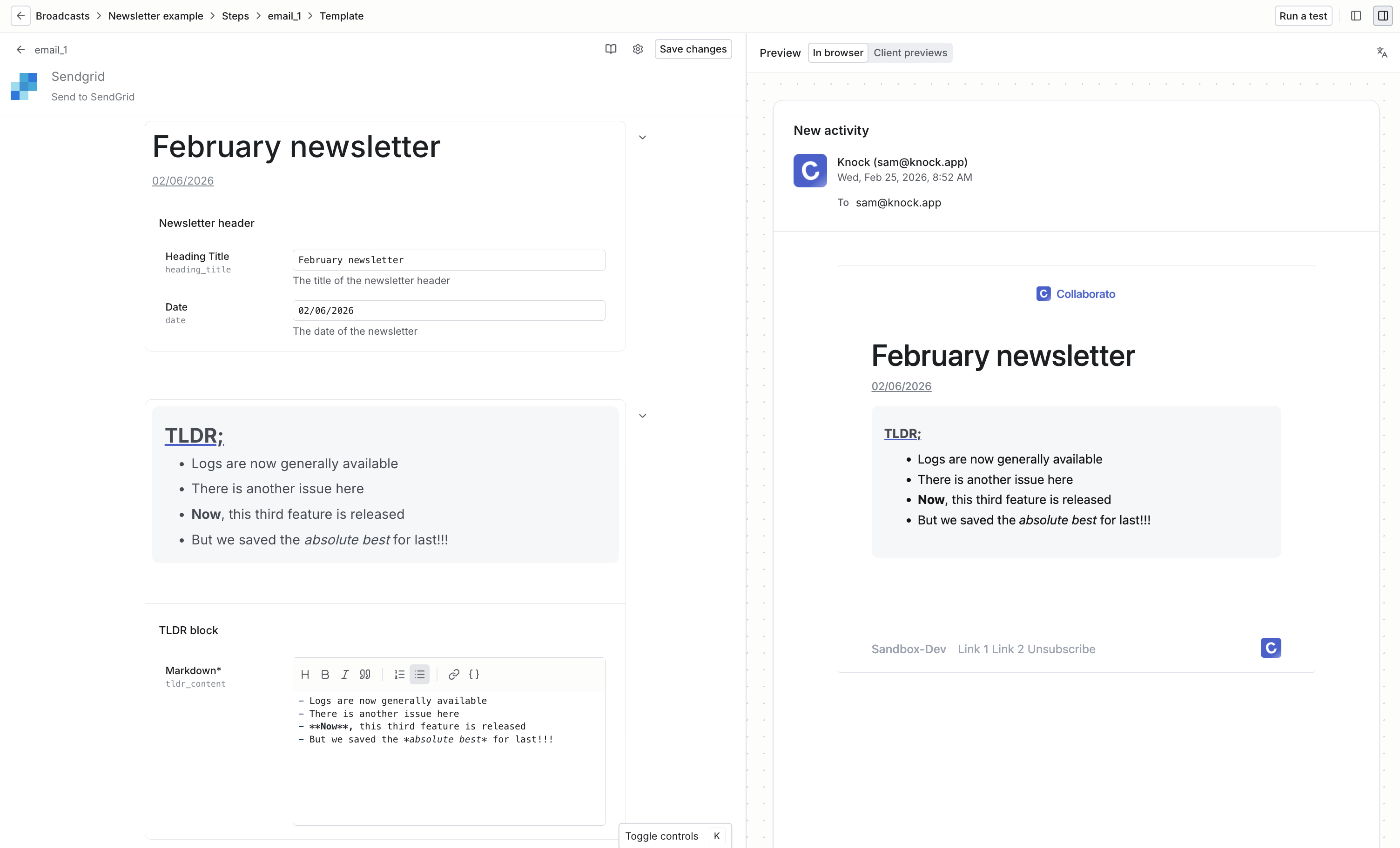
Building a newsletter broadcast with Knock's partial blocks
A marketer composing a product launch email can drop in a button, set the label to "Try it now," pick the primary style, and paste in a URL—without opening a code editor or filing a ticket. The CSS stays isolated to the partial, so it won't leak into other components or bloat the email layout.
This is the model that teams like Medium adopted when they built their email design system in Knock. Engineers own the component library as partials, and product teams compose templates using those partials as blocks.
Template layer: composed layouts
Templates compose components into complete emails:
// PasswordReset.jsx
import { Html, Head, Body, Container } from "@react-email/components";
import { Header } from "./components/Header";
import { Button } from "./components/Button";
import { Footer } from "./components/Footer";
import { tokens } from "./tokens";

export default function PasswordReset({ resetUrl, userName }) {
  return (
    <Html>
      <Head />
      <Body style={{ backgroundColor: tokens.colors.neutral[50] }}>
        <Container style={{ padding: tokens.spacing.md }}>
          <Header />

          <div style={{ padding: `${tokens.spacing.lg} 0` }}>
            <h1
              style={{
                fontSize: tokens.typography.sizes["3xl"],
                marginBottom: tokens.spacing.md,
              }}
            >
              Reset your password
            </h1>

            <p
              style={{
                fontSize: tokens.typography.sizes.base,
                lineHeight: tokens.typography.lineHeights.normal,
                marginBottom: tokens.spacing.md,
              }}
            >
              Hi {userName}, we received a request to reset your password. Click
              the button below to create a new password.
            </p>

            <Button href={resetUrl} variant="primary">
              Reset Password
            </Button>

            <p
              style={{
                fontSize: tokens.typography.sizes.sm,
                color: tokens.colors.neutral[600],
                marginTop: tokens.spacing.md,
              }}
            >
              This link expires in 24 hours. If you didn't request this, please
              ignore this email.
            </p>
          </div>

          <Footer />
        </Container>
      </Body>
    </Html>
  );
}
This template focuses on content and structure. All styling comes from tokens and components. Updating the button style across all templates means editing one component file.
Style management
Email CSS is uniquely challenging. You're targeting 50+ email clients with inconsistent CSS support. Gmail strips <style> tags unless they're in <head>. Outlook uses Word's rendering engine, which doesn't support CSS Grid or Flexbox. Apple Mail supports modern CSS but applies aggressive dark mode overrides.
A robust style system handles these constraints:
CSS optimization pipeline
High-volume senders hit Gmail's 102KB size limit regularly when including comprehensive stylesheets. The solution is a build-time optimization pipeline:
- Collect styles. Gather CSS from components as they're rendered.
- Inline critical styles. Move CSS into inline
styleattributes for maximum compatibility. - Preserve media queries. Keep responsive styles in
<style>tags (they can't be inlined). - Strip unused CSS. Remove styles that aren't referenced in the HTML.
- Minify output. Compress whitespace and shorten class names.
A stylesheet might start at 1,800 lines of CSS covering every possible component and variant:
/* core-styles.css - 1,800 lines */
.button-primary {
  background: #0066ff;
  color: #fff;
}
.button-secondary {
  background: transparent;
  border: 2px solid #0066ff;
}
.card {
  background: #fff;
  border-radius: 8px;
}
.card-header {
  padding: 24px;
  border-bottom: 1px solid #e5e5e5;
}
.card-body {
  padding: 24px;
}
/* ... 1,750 more lines ... */
After the optimization pipeline processes a simple password reset template, the output contains only the styles actually used:
<!-- Optimized output - 200 lines -->
<button style="background:#0066FF;color:#fff;padding:12px 24px">
  Reset Password
</button>
The stylesheet shrank from 1,800 lines to 200 lines of inlined styles. Gmail won't clip the email, load times are faster, and the template still looks identical.
Design token implementation
Design tokens work best in a format consumable across your email tooling. JSON works well:
{
  "color": {
    "brand": {
      "primary": { "value": "#0066FF" },
      "secondary": { "value": "#00CC88" }
    },
    "neutral": {
      "50": { "value": "#F9FAFB" },
      "100": { "value": "#F3F4F6" },
      "900": { "value": "#1A1A1A" }
    }
  },
  "spacing": {
    "xs": { "value": "8px" },
    "sm": { "value": "16px" },
    "md": { "value": "24px" },
    "lg": { "value": "40px" }
  },
  "typography": {
    "fontFamily": {
      "base": { "value": "Inter, Arial, sans-serif" }
    },
    "fontSize": {
      "sm": { "value": "14px" },
      "base": { "value": "16px" },
      "lg": { "value": "18px" }
    }
  }
}
Transform these tokens into formats for different email frameworks:
// For MJML attributes
const mjmlAttributes = `
<mj-attributes>
  <mj-class name="text-primary" color="${tokens.color.brand.primary.value}" />
  <mj-class name="spacing-md" padding="${tokens.spacing.md.value}" />
</mj-attributes>
`;

// For JavaScript/React Email
const jsTokens = {
  colors: {
    primary: tokens.color.brand.primary.value,
  },
  spacing: {
    md: tokens.spacing.md.value,
  },
};
Content and localization
Email design systems must handle dynamic content and multiple languages without breaking layouts.
Template variables and type safety
Template variables inject personalized content into emails. The challenge is preventing runtime errors when expected data is missing. Type-safe templating helps:
// TypeScript interface for password reset data
interface PasswordResetData {
  userName: string;
  resetUrl: string;
  expiresInHours: number;
}

// Template with type checking
export default function PasswordReset(props: PasswordResetData) {
  const { userName, resetUrl, expiresInHours } = props;

  return (
    <Email>
      <p>Hi {userName},</p>
      <Button href={resetUrl}>Reset Password</Button>
      <p>This link expires in {expiresInHours} hours.</p>
    </Email>
  );
}
Type checking catches errors at build time rather than when sending emails. If a developer tries to render this template without resetUrl, TypeScript errors before the template reaches production.
Platform-based approaches solve this differently. Knock's partial schemas define the fields a component expects, including their types, labels, defaults, and whether they're required. When a content editor drags a partial into a template, the visual editor renders a form with those fields and validates input before saving. A button partial can require a URL and label, a hero partial can require an image and headline, and so on.
The schema acts as a contract between the engineer who built the component and the person using it, catching missing or invalid data at authoring time rather than at send time.
Translation system
Global products need emails in multiple languages. A translation key system separates content from structure:
// translations/en.json
{
  "password_reset": {
    "subject": "Reset your password",
    "greeting": "Hi {{userName}},",
    "body": "We received a request to reset your password.",
    "cta": "Reset Password",
    "expiry": "This link expires in {{hours}} hours."
  }
}

// translations/es.json
{
  "password_reset": {
    "subject": "Restablece tu contraseña",
    "greeting": "Hola {{userName}},",
    "body": "Recibimos una solicitud para restablecer tu contraseña.",
    "cta": "Restablecer Contraseña",
    "expiry": "Este enlace expira en {{hours}} horas."
  }
}
Templates reference translation keys instead of hardcoded text:
export default function PasswordReset({ locale, userName, resetUrl }) {
  const t = useTranslation(locale);

  return (
    <Email>
      <h1>{t("password_reset.subject")}</h1>
      <p>{t("password_reset.greeting", { userName })}</p>
      <p>{t("password_reset.body")}</p>
      <Button href={resetUrl}>{t("password_reset.cta")}</Button>
    </Email>
  );
}
The same template structure renders in any language. Add a new language by adding a translation file—no template changes required.
Governance model
Technical implementation needs organizational boundaries. Without governance, component libraries devolve into dumping grounds where every team adds their own version of a button component.
Ownership structure
Clear ownership prevents conflicts and establishes accountability:
- Foundation layer (design tokens). Brand/design team owns color palettes, typography scales, spacing systems. Changes require design review. Updates cascade through components automatically.
- Component library. Platform/email engineering team owns components and base layouts. They enforce code quality, accessibility, and cross-client compatibility. Product teams can request new components but can't add them directly.
- Template content. Product teams own specific templates. They can edit copy, swap images, adjust spacing within boundaries set by components. They can't modify component internals or global styles.
This separation lets teams move independently. Product teams iterate on messaging without waiting for engineering. Engineering updates components without breaking templates.
Access patterns
Who can edit what determines velocity and quality trade-offs:
- Gated (slow, safe). A central team controls all template creation and editing. Product teams submit requests through tickets. This prevents chaos but creates bottlenecks. Works for small email programs (fewer than 20 templates) or highly regulated industries where every email needs legal review.
- Self-serve (fast, risky). Product teams create and edit templates directly using the component library. This scales but requires strong guardrails. Teams can accidentally break brand standards or create inaccessible emails. Works when teams are educated on email best practices and components enforce constraints.
- Hybrid (balanced). Component structure is gated, content within components is self-serve. Product teams can edit headlines, body copy, button text, and swap images. They can't modify spacing, colors, or layouts outside component parameters. This is the most common pattern for mature email programs—it provides autonomy without sacrificing consistency.
Platforms like Knock implement the hybrid pattern natively through partials. Engineers build HTML partials with schemas that define exactly which fields are editable—button text, image URLs, copy—while the underlying HTML, CSS, and layout remain locked. Content teams use those partials as drag-and-drop blocks in the visual editor, constrained to the parameters the schema exposes. The schema acts as the governance boundary between component owners and content editors.
Version control and review
Email templates should be versioned like application code. Whether templates live in git or a platform's version control, establish a review process:
# .github/workflows/email-review.yml
name: Email Template Review
on:
  pull_request:
    paths:
      - "emails/**"

jobs:
  review:
    runs-on: ubuntu-latest
    steps:
      - name: Check file size
        run: |
          # Fail if HTML exceeds 100KB

      - name: Validate HTML
        run: |
          # Check for broken links, missing alt text

      - name: Screenshot preview
        run: |
          # Generate previews in Gmail, Outlook, Apple Mail

      - name: Request design review
        run: |
          # Auto-tag design team if brand tokens changed
This catches errors before emails reach customers. Brand-breaking changes get flagged for design review. Broken links are caught. Templates that exceed size limits are rejected.
Platforms can provide this without custom CI. Knock's commit model versions every change to templates, partials, and layouts. You can diff changes before committing, promote commits from development to production, and roll back to prior versions if something breaks. This gives you a version history and promotion workflow for email content that mirrors the git-based process above, without needing to build the pipeline yourself.
For the screenshot preview step specifically, Knock offers built-in email client previews powered by Litmus.
Test your design system across devices and clients directly from the dashboard
You can preview how your email renders across popular clients like Gmail, Outlook, and Apple Mail directly in the template editor, without sending test emails or leaving the dashboard. This replaces the need to build a custom screenshot pipeline in CI and gives content editors the same cross-client visibility that engineers get from testing tools.
Choosing your email tooling
Now that you understand what an email design system requires., you'll have to decide how much of the infrastructure you want to own.
The tools available span a spectrum, from open-source libraries you integrate into your own stack to managed platforms that handle composition, version control, and delivery for you.
Code-first tools
Code-first tools give you full control over your email rendering pipeline. You author components in code, build your own infrastructure around them, and own the output end to end.
- React Email. Open-source component library for building emails with React. Works well when developers are the primary template authors and you want tight integration with your existing frontend tooling.
- MJML. An open-source markup language that compiles to responsive HTML. MJML abstracts away email client quirks and is a good middle ground between raw HTML and a full component framework—accessible to developers with varied experience levels.
Code-first tools offer maximum flexibility: you can customize every aspect of rendering, integrate with any build pipeline, and avoid vendor lock-in.
The trade-off is that you own the maintenance burden. As email clients evolve, you maintain compatibility. You also need to build your own version control, visual editing, and collaboration workflows if non-engineers need to create or edit templates.
Managed platforms
Managed platforms provide infrastructure for template authoring, version control, and delivery. They handle the operational complexity so your team can focus on content and design.
- Knock. Notification infrastructure with HTML partials that function as a component library. Engineers create partials with schemas that define editable fields, and product teams compose templates through a visual editor—enabling a self-serve email design system. Knock also manages push, in-app, SMS, and chat channels alongside email.
- Parcel. An email-specific development platform with a code editor, MJML support, and collaboration features. Useful for teams that want a dedicated email development environment with built-in testing and rendering previews.
- Stripo and Chamaileon. Visual editors with modular block systems and design token support, aimed at marketing-led email teams that prioritize drag-and-drop authoring over code.
Managed platforms offer faster time to value, built-in collaboration workflows, and ongoing maintenance as email clients change. The trade-off is less flexibility within platform constraints and, for some tools, cost that scales with volume.
How to decide
The choice depends on who authors your emails and how much infrastructure you want to maintain.
- Choose code-first tools when developers are the primary authors, you have unique rendering requirements, or you need deep integration with existing systems. Teams with strong engineering bandwidth and fewer than a dozen stakeholders touching email often do well here.
- Choose a managed platform when multiple teams need to create and edit templates, you want self-serve capabilities for non-engineers, or you'd rather invest engineering time in product features than email infrastructure. Platforms compress the timeline from months to weeks.
- Combine both. Many teams use code-first tools for component development and a platform for composition and delivery. You might author components in MJML or React Email locally, then manage them as partials in a platform like Knock where product teams can assemble templates without engineering support.
Getting started: a practical roadmap
Building an email design system is iterative. Start small and prove value before you expand.
Phase 1: Audit and foundation (weeks 1-2)
Audit existing templates. Document every email template. Note inconsistencies in colors, button styles, spacing. Identify duplicates with minor variations—prime candidates for componentization.
Document pain points. Interview stakeholders. Ask marketing where they spend time. Ask product teams where they're blocked. Ask developers what they hate about email. These answers reveal where your design system provides immediate value.
Define base styles. Extract common styles into design tokens. Start with minimum viable set: primary brand color and 2-3 accents, typography scale (3-4 sizes), spacing scale (4-5 values), and 1-2 font families.
Choose technical approach. Decide on MJML, React Email, HTML, or a managed platform based on team skills and requirements. MJML works well for teams with varied technical abilities. React Email excels when developers are primary authors. If you want built-in visual editing and version control without building the infrastructure yourself, a platform like Knock lets you skip straight to creating components as HTML partials.
Phase 2: Core components (weeks 3-4)
Build 5-7 essential components. Start with elements appearing in most emails: button (primary/secondary variants), header (with logo), footer (with links and legal text), content block (for body text), spacer (for vertical rhythm), divider (horizontal rule), and callout box (for highlighting). In a platform like Knock, each of these becomes an HTML partial with a schema that defines its editable fields, making the components available as drag-and-drop blocks in the visual editor from day one.
Create 2-3 template layouts. Define standard structures for basic (header + content + button + footer), digest (header + multiple content blocks + footer), and transactional (header + content + data table + button + footer) emails.
Set up version control. Put templates in git or enable platform versioning. Establish a basic review process. At minimum, requiring one approval before changes go live.
Phase 3: Migration and governance (weeks 5-8)
Migrate high-traffic templates first. Start with most frequent emails or those that matter most to business. Password resets, order confirmations, shipping notifications. Validate they render correctly across clients.
Document component guidelines. Create simple documentation showing usage, variants, and accessibility requirements for each component.
Train teams. Run workshops with product teams and marketers. Show how to compose templates from components. Give sandbox environments to experiment.
Establish review process. Define what requires review: new components need engineering review, changes to existing components need engineering + design review, content changes are self-serve, brand token changes need design review.
Phase 4: Scale and optimize (ongoing)
Add components as needed. Evaluate requests: is this reusable or one-off? Can existing components be extended? Maintain consistent quality bar.
Optimize performance. Monitor payload sizes. Implement CSS cleanup if approaching Gmail's 102KB limit. Test load times. Smaller emails improve deliverability.
Gather feedback. Regularly survey teams. What's working? What's frustrating? Are components flexible enough? Is review too slow?
Iterate governance. As teams gain experience, reduce gatekeeping. Start gated, move to hybrid, eventually enable self-serve for trusted teams.
Measure impact. Track template creation time, brand consistency, team velocity, and support tickets related to emails. These metrics justify continued investment.
Conclusion
An email design system is infrastructure that pays dividends across your organization. It turns email from a coordination nightmare into a self-serve capability. It transforms brand consistency from manual enforcement into automatic inheritance. It converts template production from a bottleneck into a fast, repeatable process.
The key is starting simple: establish base styles, build core components, and define clear ownership. Choose your technical approach, whether that's MJML, React Email, HTML, or a platform like Knock—based on team capabilities and scale requirements. Implement governance that balances velocity with consistency.
The companies that invest in email design systems see teams ship faster, brands stay consistent, and developers spend less time fighting email rendering bugs. The companies that skip this investment watch chaos compound until someone finally gets the budget to rebuild everything from scratch.
You don't need to build everything at once. Start with the foundation and add components as patterns emerge. You can refine governance as your team learns the system. Treat your email design system like you treat your application code—version it, review it, and improve it continuously.
If you're evaluating platforms for your email design system, Knock's HTML partials let you build a component library that product and marketing teams can use without writing code—alongside push notifications, in-app messaging, and SMS through a unified workflow system. Sign up for a free account to get started.