What this component solves
- Drives feature adoption by showcasing new capabilities directly within the user's workflow, increasing discovery rates compared to email-only announcements.
- Creates consistent, visually appealing announcement experiences that maintain product quality standards while reducing design/development time per launch.
- Enables product teams to communicate value propositions effectively with rich media support, improving user understanding of complex features.
- Provides measurable engagement through built-in CTAs, allowing teams to track announcement effectiveness and iterate on messaging.
When to use this component
Use this component when:
- You're launching new features that users might not discover organically through normal product usage.
- The feature has visual elements that benefit from screenshots, GIFs, or illustrations to convey value.
- You need to segment announcements to specific user cohorts based on plan, usage, or other attributes.
- The announcement requires multiple actions (e.g., "Try it now" and "Learn more") to accommodate different user intents.
- You want to maintain momentum post-launch by highlighting features users haven't tried yet.
How it works
Inputs
- title: The feature name or announcement headline (string).
- body: Brief explanation of the feature value and functionality (string/HTML).
- dismissible: Boolean indicating if the user can dismiss the announcement.
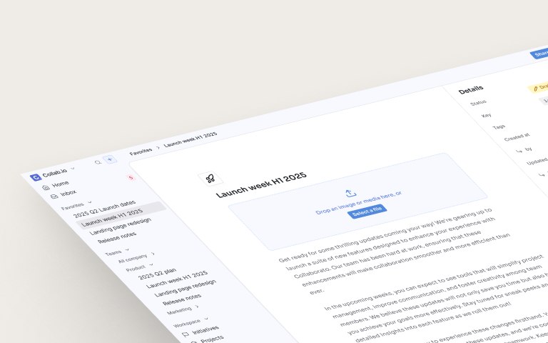
- image.url: Hero image, screenshot, or GIF demonstrating the feature.
- image.alt: Alt text for the image.
- image.action: Optional URL to navigate when image is clicked.
- primary_button.text: Main action button text (e.g., "Try it now").
- primary_button.action: URL or action for the primary button.
- secondary_button.text: Optional secondary action button text (e.g., "Learn more").
- secondary_button.action: URL or action for the secondary button.
Behavior
- On eligible page load, check if the guide should be displayed based on targeting conditions.
- Render feature announcement card with image, title, body, and action buttons.
- Display image at the top with configurable URL and alt text.
- Show primary and secondary action buttons at the bottom of the card.
- Display dismiss button (X) in the top-right corner if dismissible is true.
- On primary button click → navigate to the specified action URL and mark as interacted.
- On secondary button click → navigate to the specified action URL and mark as interacted.
- On dismiss → hide card and mark as archived to prevent re-display.
Best practices
- Lead with user value, not feature names. Instead of "Introducing Advanced Analytics," try "See exactly how users engage with your product."
- Show, don't just tell. Use GIFs for interactive features, screenshots for UI changes, and illustrations for abstract concepts. Ensure images load quickly and have alt text.
- Right place, right time. Show announcements contextually—budgeting features when users are in financial sections, collaboration features in team areas.
- Progressive disclosure. Start with the essential value prop. Let interested users dig deeper through secondary CTAs rather than overwhelming everyone upfront.
Common mistakes to avoid
- Announcing too many features at once. Feature announcement fatigue is real. Space out announcements and prioritize based on user value, not internal excitement.
- Using generic stock imagery. Users can tell when images don't represent actual product functionality. Use real screenshots or purpose-built illustrations.
- Blocking critical workflows. Never position announcement cards where they obstruct primary user tasks. Interruptive modals should be reserved for critical features only.
- Not tracking post-announcement adoption. Without measuring whether users who saw announcements actually tried features, you can't optimize future launches.
FAQ
Should we announce every new feature?
No. Reserve in-app announcements for features that significantly impact user workflows or deliver substantial value. Minor improvements can go in release notes.
How long should feature announcements remain active?
Typically 2-4 weeks for new launches, or until the user interacts with the announcement or tries the feature. Avoid showing stale announcements from months ago.
What's the ideal image size and format?
Keep images under 200KB for fast loading. Use 16:9 ratio for flexibility across devices. GIFs should be under 3MB and optimized for web. Always include fallback images.
Can we A/B test different announcement messages?
Yes. Test variations of headlines, CTAs, and images to optimize engagement. Just ensure consistent experience within user sessions to avoid confusion.