When you’re new to the Slack block kit UI and designing your first Slack notification, it’s easy to get writer’s block. We’ve been there and our customers have, too.
That doesn’t mean you should let it get in the way of building great Slack notification experiences for your own customers. If you’re a product manager building a B2B product, Slack notifications and the interactive surface area they represent are one of the best engagement tools you can use to help deliver value to your users and to drive your engagement metrics (such as DAU/MAU).
Slack represents a unique opportunity for today’s product teams. It meets users where they already work. It gives them an opportunity to learn about what’s happening in your product. And it lets them act on resources in your product without having to leave their current working context.
We’ve designed and helped design many interactive messages at Knock. This post is a guide on what we’ve learned about building great messages with the Slack block kit framework. We start with an overview of the key concepts within the block kit, then cover six learnings you can use in your Slack message layouts.
The Slack block kit UI basics for designing messages
The Slack block kit UI framework is super flexible and can be used for everything from Slack messages to modals to entire app surfaces built within Slack. Because of this, it can be hard to sort through the block kit docs and understand what you need for designing great Slack messages.
In this section, we cover the the block kit UI basics and highlight which concepts you’ll need to cover the majority of Slack messaging use cases.
The Slack block kit UI framework is comprised of three building blocks (no pun intended) you’ll use to compose your Slack message templates: blocks, block elements, and composition objects. We go into detail on each below.
Blocks
Blocks are reusable components you use to build Slack messages. These are the highest order concept in the block kit UI.
There are a number of block types you can use to compose your Slack message layouts. The main ones we find ourselves using are sections, actions, headers, and dividers. You can learn about all of the block types Slack offers in their block reference.
A given Slack message template will contain n number of blocks, each of which is comprised of its own block elements and/or composition objects. Here’s a typical Slack message you might receive from a Slack app. We’ve outlined which components are blocks, block elements, and composition objects to help understand what’s what.
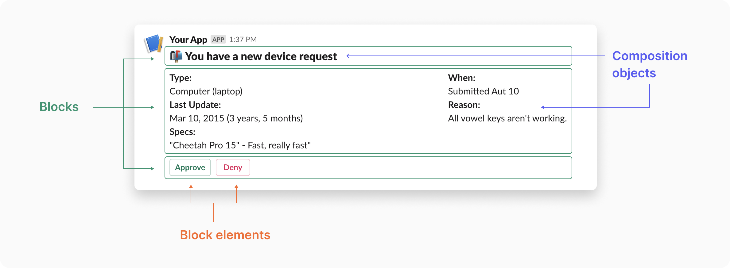
Block elements
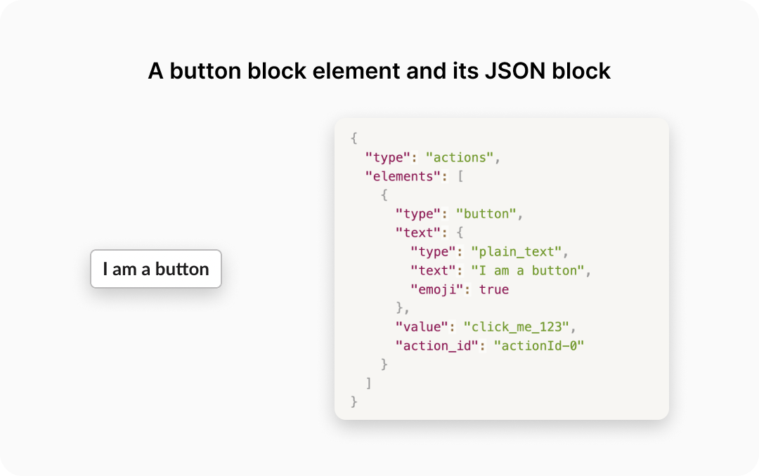
Block elements represent the interactive components you’ll use in your Slack messages. They can only be used in section, context, input, and actions blocks. The most common block element we see customers use by far is button. You can read about all the other block elements in the Slack block element reference.
Composition objects
Slack defines composition objects as “common JSON object patterns that you'll encounter frequently when building blocks or composing messages.” This definition is a bit vague and may leave you feeling a bit confused. For the purposes of **this** guide—i.e. how to use the block kit UI to design great messages—all you need to know is that you use the text composition object to put text into your message. Nice and simple.
How to get the most out of blocks in your Slack notifications
At Knock we’ve worked with lots of customers as they’ve designed their Slack notifications to power through our service. If you’re looking at a blank canvas in the Slack block kit builder and aren’t sure where to start, here are a few tips we share with new customers that may help.
Start with a header
Header blocks in Slack are a great way to give your users immediate context about what you’re sending them. In our experience, a great Slack message uses its header block the same way a great email uses its subject line. It’s to the point but still gives the user the necessary context to know what they’re seeing.
Use dividers to separate concerns and help with readability
Divider blocks are a great way to help with the layout of your Slack message. They give you a way to break up the different sections of your Slack message to help your users easier parse the information you’re sending them.
If you’re just sending single block messages with text today, dividers are probably overkill. If you’re building interactive messages with many blocks, they’re a key layout tool.
Iterate blocks to list items
A non-obvious tool at your disposal is block iteration. If you’re notifying a user about a digest or batch of items, you can loop through those items and produce a block to render each one. When our customers do this we recommend using dividers to help distinguish between each item in a list, as you can see in the example below.
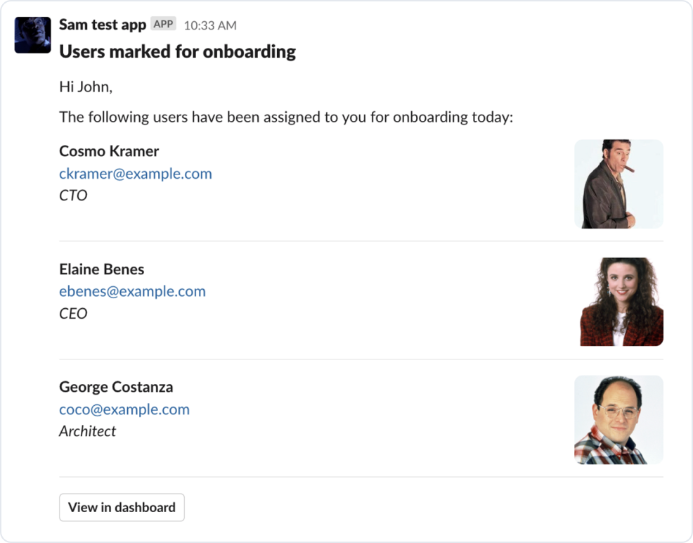
The example above also uses another helpful layout tip: section blocks with
accessories. An accessory lets you add any Slack block element
(such as the images you see above) to the right side of any Slack
section block. Keep this in mind for cases where you’re
presenting a lot of data within a single Slack section or want to
give users visual context with an image.
Get creative with Slack button labeling
When it comes to Slack button styling, the block kit framework gives us a limited palette to work with: black (default), green (primary), and red (danger ).
In our experience, best practice is to save green and red for clear confirm/accept or cancel/reject use cases. Approval notifications are a great example of this.
For cases where you’re building notifications that include multiple default buttons for linking to various parts of your product, consider using emoji in your labels to help visually distinguish buttons and make it clear to users what they do.
Use emoji to add color and visual cues to your messages
On the note of emoji, they are your one tool to introduce color as a visual cue in your Slack messages, so it helps to be creative in how you use them.
A few ideas to help you get started:
- Include a single emoji in your headers to distinguish between different notification types
- For lists of information, use emojis instead of simple bullet characters
- Add an emoji in button block elements to help distinguish between default style buttons
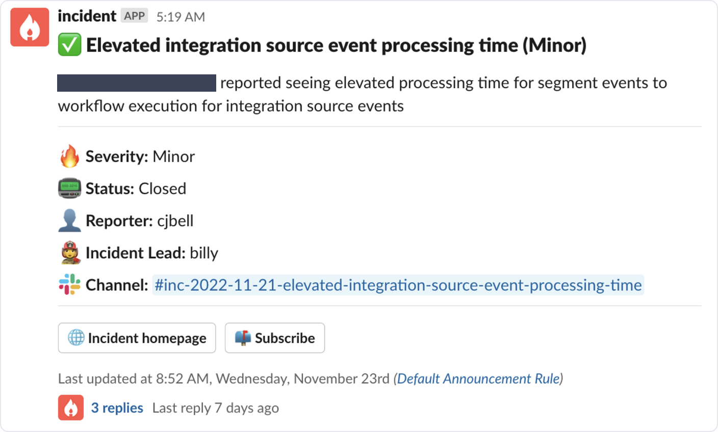
A shining example of block kit design 🌠
Here’s a great example of these concepts in action from one of our favorite Slack apps at Knock: incident.io.
It uses most of the concepts we discussed above:
- A clear header to set context
- Dividers to separate incident details from context and buttons
- Emojis for listed items to help with visual differentiation
- Clear button affordances (again, thanks to emoji)
Depending on your product, a Slack integration can be a valuable addition to your feature set. At Knock, we're focused on helping developers leverage Slack as a notification channel, so here are a few additional posts we've written on using Slack:
- How to think about Slack as a notification channel for your app
- How to autheticate users in Slack using OAuth
- How to think about Slack as a notification channel for your app
- Taking a deep dive into Slack's Block Kit
Wrapping it up
These learnings have helped us a lot in our own journey designing Slack notifications with customers, and we hope they help they you as you explore Slack as a notification surface for your product.
If you're thinking about Slack notifications for your product and want to talk through your approach with our team, give us a shout at [email protected].