Modern React applications need notification systems to keep users informed and engaged. Whether you're building a simple feedback system with toast messages or implementing a complex real-time notification center, choosing the right library can significantly impact your development speed and user experience.
In this article, we'll explore the nine best open-source notification libraries for React applications in 2026, categorized by their primary use cases and strengths.
React libraries for toast and alert notifications
Toasts have become a ubiquitous UI component over the years and serve multiple purposes in an application.
Despite some claims that toasts aren’t very accessible, you still see them widely used in applications of all kinds. These libraries help provide non-intrusive visual feedback in your application, and they’re perfect for success messages, errors, and quick alerts.
Sonner (with shadcn/ui integration)
Best for: Modern React applications prioritizing design and developer experience.
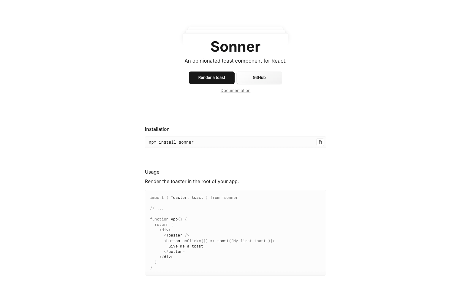
Sonner has emerged as the go-to choice for developers building modern React applications. Built specifically for React 18+ with TypeScript-first design, it offers an opinionated API that offers customization options like visibleToasts to control how many toasts are displayed at one time and hotkey to bind toast focus to a keyboard shortcut. The shadcn/ui ecosystem has adopted Sonner as its official toast component, making it easy to integrate with existing design systems.
Key features:
- Lightweight footprint with zero dependencies.
- Built-in support for promises and async operations.
- Customizable icons and undo actions.
- Seamless dark mode integration.
- Excellent TypeScript support out of the box.
- Native shadcn/ui integration with consistent styling.
Installation:
# Standard installation
npm install sonner

# Or install via shadcn/ui CLI for integrated styling
npx shadcn-ui@latest add sonner
Quick example:
import { toast, Toaster } from "sonner";

function App() {
  return (
    <div>
      <Toaster />
      <button onClick={() => toast.success("Operation completed!")}>
        Show Toast
      </button>
    </div>
  );
}
shadcn/ui integration example:
import { toast } from "sonner";
import { Button } from "@/components/ui/button";

export function ToastDemo() {
  return (
    <Button
      variant="outline"
      onClick={() =>
        toast("Event has been created", {
          description: "Sunday, December 03, 2023 at 9:00 AM",
          action: {
            label: "Undo",
            onClick: () => console.log("Undo"),
          },
        })
      }
    >
      Add to calendar
    </Button>
  );
}
When to choose Sonner: You're building a modern React application and want a notification system that feels current and well-designed. The TypeScript-first approach makes it ideal for teams prioritizing type safety. It’s the essential choice for shadcn/ui-based projects.
React Hot Toast
Best for: Developers seeking simplicity and performance.
React Hot Toast has gained popularity for its minimalist approach and promise-based API, and it’s also one of the most battle-tested libraries on this list. At just 5KB, it delivers powerful functionality without bloating your bundle size. If you want complete control over your toast notification, you can use the useToaster hook to create your own headless version. The default toast function also accepts ariaProps so that you can build with accessibility in mind based on the role your toast plays in your application.
Key features:
- Extremely lightweight (5KB).
- Promise-based API for handling async operations.
- Smooth animations and transitions.
- Hook-based integration.
- Built-in accessibility features.
Installation:
npm install react-hot-toastQuick example:
import toast, { Toaster } from "react-hot-toast";

const notify = () => toast.success("Here is your toast!");

function App() {
  return (
    <div>
      <button onClick={notify}>Make me a toast</button>
      <Toaster />
    </div>
  );
}
When to choose React Hot Toast: Bundle size is a priority, and you need a straightforward solution that works well with React hooks and modern development patterns.
React Toastify
Best for: Feature-rich applications requiring extensive customization.
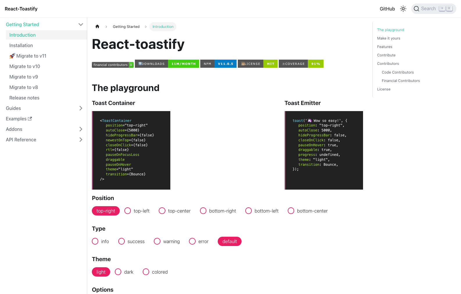
As one of the most established libraries in this space, React Toastify offers comprehensive customization options and robust features that have been battle-tested in production environments.
Key features:
- Extensive theming and customization options.
- Multiple positioning strategies.
- Progress bars and auto-close timers.
- Rich animation system.
- Strong community support and documentation.
Installation:
npm install react-toastifyQuick example:
import { toast, ToastContainer } from "react-toastify";
import "react-toastify/dist/ReactToastify.css";

function App() {
  const notify = () => toast.success("Wow so easy!");

  return (
    <div>
      <button onClick={notify}>Notify!</button>
      <ToastContainer />
    </div>
  );
}
When to choose React Toastify: You need extensive customization options or are working on a large application where the established ecosystem and community support matter more than bundle size.
Notistack
Best for: Material-UI applications and complex notification management.
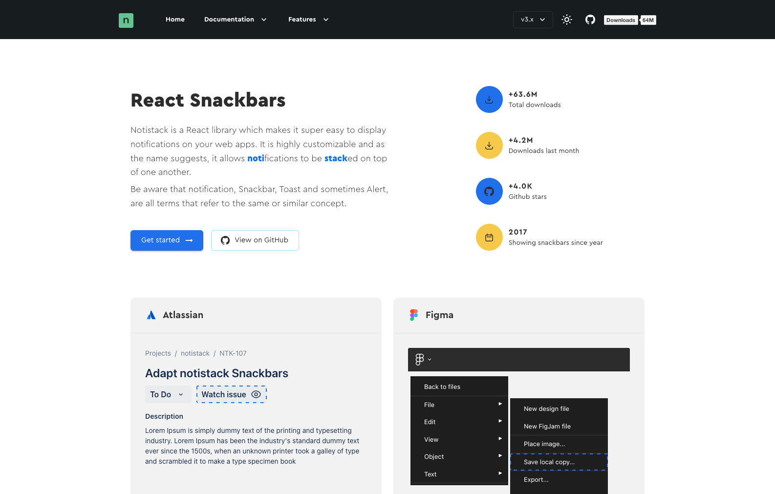
Notistack specializes in stackable snackbar notifications, making it perfect for applications that need to display multiple notifications simultaneously, especially those built with Material-UI.
Key features:
- Stackable notification management.
- Material Design integration.
- Multiple notification variants (success, error, warning, info).
- Queue management for multiple notifications.
- Programmatic dismissal and actions.
Installation:
npm install notistackQuick example:
import { SnackbarProvider, enqueueSnackbar } from "notistack";

function App() {
  return (
    <SnackbarProvider maxSnack={3}>
      <button onClick={() => enqueueSnackbar("Success notification!")}>
        Show snackbar
      </button>
    </SnackbarProvider>
  );
}
When to choose Notistack: You're building with Material-UI or need sophisticated queue management for multiple simultaneous notifications.
Reapop
Best for: Redux-based applications requiring centralized notification state.
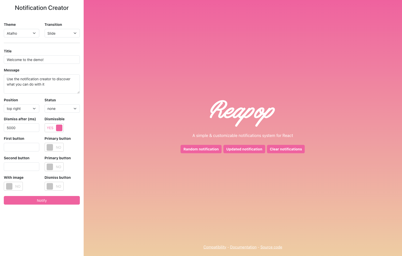
Reapop is a relatively smaller library compared to the other options for toasts, but it has a unique take on this space. Instead of just giving you a library to show single toasts, ReaPOP provides state management primitives as well so that it's a bit closer to building an entire front-end notification system. Reapop provides Redux-compatible notification management, making it perfect for applications that already use Redux and want to maintain consistent state management patterns.
Key features:
- Redux integration with actions and reducers.
- Centralized notification state management.
- Theme support with customizable styling.
- Notification positioning and timing controls.
- TypeScript support.
Installation:
npm install reapopQuick example:
import { NotificationsProvider, notify } from "reapop";
import { useDispatch } from "react-redux";

function App() {
  const dispatch = useDispatch();

  const showNotification = () => {
    dispatch(
      notify({
        title: "Success",
        message: "Operation completed successfully!",
        status: "success",
      }),
    );
  };

  return (
    <NotificationsProvider>
      <button onClick={showNotification}>Show Notification</button>
    </NotificationsProvider>
  );
}
When to choose Reapop: Your application uses Redux for state management, and you want notification state to be managed consistently with the rest of your application state.
React libraries for modal-style alerts
Modals, also sometimes called dialogs, provide an alternative to toasts for notifications or messages that need to be shown in-app. While toasts are unobtrusive notifications typically located in the corner of a screen, a modal is generally much more front-and-center, taking up the central area of a screen and blocking content behind it.
They’re useful because they allow more customization than the default browser alert feature, but since they are more disruptive than toasts, you should use them cautiously.
SweetAlert2
Best for: Rich modal experiences and user confirmations.
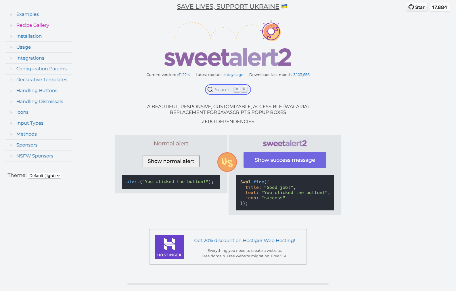
SweetAlert2 goes beyond simple toasts to provide beautiful, customizable modal dialogs that can handle complex user interactions and confirmations.
Key features:
- Beautiful, customizable modal designs.
- Rich content support (HTML, images, videos).
- Promise-based API.
- Built-in validation for inputs.
- Extensive animation options.
Installation:
npm install sweetalert2Quick example:
import Swal from "sweetalert2";

function App() {
  const showAlert = () => {
    Swal.fire({
      title: "Good job!",
      text: "You clicked the button!",
      icon: "success",
    });
  };

  return <button onClick={showAlert}>Show Alert</button>;
}
When to choose SweetAlert2: You need rich modal experiences for confirmations, forms, or complex user interactions that go beyond simple toast notifications.
shadcn/ui Dialog and AlertDialog
Best for: Design system consistency and modern modal patterns.
The shadcn/ui Dialog and AlertDialog components provide accessible, customizable modal solutions that integrate seamlessly with modern design systems. Built on Radix UI primitives, they offer enterprise-grade accessibility and customization.
Key features:
- Built on Radix UI primitives for accessibility.
- Fully customizable with CSS-in-JS or Tailwind CSS.
- TypeScript-first with excellent type safety.
- Consistent with design system patterns.
- Multiple modal types (Dialog, AlertDialog, Sheet).
- Built-in focus management and keyboard navigation.
Installation:
# Install via shadcn/ui CLI
npx shadcn-ui@latest add dialog
npx shadcn-ui@latest add alert-dialog
Dialog example:
import {
  Dialog,
  DialogContent,
  DialogDescription,
  DialogHeader,
  DialogTitle,
  DialogTrigger,
} from "@/components/ui/dialog";
import { Button } from "@/components/ui/button";

export function DialogDemo() {
  return (
    <Dialog>
      <DialogTrigger asChild>
        <Button variant="outline">Edit Profile</Button>
      </DialogTrigger>
      <DialogContent className="sm:max-w-[425px]">
        <DialogHeader>
          <DialogTitle>Edit profile</DialogTitle>
          <DialogDescription>
            Make changes to your profile here. Click save when you're done.
          </DialogDescription>
        </DialogHeader>
        <div className="grid gap-4 py-4">{/* Form content */}</div>
      </DialogContent>
    </Dialog>
  );
}
AlertDialog example:
import {
  AlertDialog,
  AlertDialogAction,
  AlertDialogCancel,
  AlertDialogContent,
  AlertDialogDescription,
  AlertDialogFooter,
  AlertDialogHeader,
  AlertDialogTitle,
  AlertDialogTrigger,
} from "@/components/ui/alert-dialog";
import { Button } from "@/components/ui/button";

export function AlertDialogDemo() {
  return (
    <AlertDialog>
      <AlertDialogTrigger asChild>
        <Button variant="outline">Show Dialog</Button>
      </AlertDialogTrigger>
      <AlertDialogContent>
        <AlertDialogHeader>
          <AlertDialogTitle>Are you absolutely sure?</AlertDialogTitle>
          <AlertDialogDescription>
            This action cannot be undone. This will permanently delete your
            account and remove your data from our servers.
          </AlertDialogDescription>
        </AlertDialogHeader>
        <AlertDialogFooter>
          <AlertDialogCancel>Cancel</AlertDialogCancel>
          <AlertDialogAction>Continue</AlertDialogAction>
        </AlertDialogFooter>
      </AlertDialogContent>
    </AlertDialog>
  );
}
When to choose shadcn/ui Dialog components: You're building with shadcn/ui or need enterprise-grade accessibility with full customization control. These components provide the foundation for consistent modal experiences across your application.
React libraries for real-time and push notifications
All of the notification libraries we've looked at thus far are client-side only abstractions. In some cases, you'll need additional server-side libraries or packages to complement these client-side components.
Two common types of notifications for web apps that require servers are real-time and web push notifications.
Socket.IO client
Best for: Real-time notification systems and live updates.
Socket.IO Client enables bi-directional real-time communication, making it ideal for building live notification systems, chat applications, and collaborative features.
Key features:
- Real-time bi-directional communication.
- Automatic fallback to long polling.
- Room and namespace support.
- Built-in error handling and reconnection.
- Cross-browser compatibility.
Installation:
npm install socket.io-clientQuick example:
import { useEffect, useState } from "react";
import { io } from "socket.io-client";

function NotificationComponent() {
  const [notifications, setNotifications] = useState([]);

  useEffect(() => {
    const socket = io("http://localhost:3001");

    socket.on("notification", (data) => {
      setNotifications((prev) => [...prev, data]);
    });

    return () => socket.disconnect();
  }, []);

  return (
    <div>
      {notifications.map((notification) => (
        <div key={notification.id}>{notification.message}</div>
      ))}
    </div>
  );
}
When to choose Socket.IO Client: You're building real-time features like live notifications, chat systems, or collaborative applications that require instant updates.
Web Push
Best for: Browser push notifications and PWA features.
Web Push enables server-side push notification delivery using the web push protocol, making it essential for Progressive Web Apps and applications requiring notifications when the app isn't active.
Key features:
- Server-side push notification delivery.
- VAPID key support for identification.
- Cross-browser compatibility.
- No third-party dependencies.
- Full control over notification infrastructure.
Installation:
npm install web-pushExample setup (server-side):
const webpush = require("web-push");

webpush.setVapidDetails(
  "mailto:[email protected]",
  process.env.VAPID_PUBLIC_KEY,
  process.env.VAPID_PRIVATE_KEY,
);

// Send notification
webpush.sendNotification(
  subscription,
  JSON.stringify({
    title: "New Message",
    body: "You have a new notification",
    icon: "/icon.png",
  }),
);
When to choose web push: You need to send push notifications to users even when your application isn't open, or you're building a Progressive Web App.
Choosing the right library
The best notification library depends on your specific use case:
- For modern, lightweight toast notifications: Start with Sonner (especially for shadcn/ui projects) or React Hot Toast.
- For comprehensive customization needs: Choose React Toastify.
- For Material-UI integration: Use Notistack.
- For rich modal experiences: Implement SweetAlert2.
- For design system consistency: Use shadcn/ui Dialog and AlertDialog components.
- For real-time notifications: Build with Socket.IO Client.
- For Redux integration: Integrate Reapop.
- For push notifications: Implement Web Push.
Most React applications benefit from combining multiple approaches—using a toast library for immediate feedback and Socket.IO for real-time updates, or pairing SweetAlert2 with a lightweight toast solution for different interaction types.
Consider your bundle size requirements, existing technology stack, and the complexity of notification features you need when making your selection. All these libraries offer excellent TypeScript support and integrate well with modern React development practices.
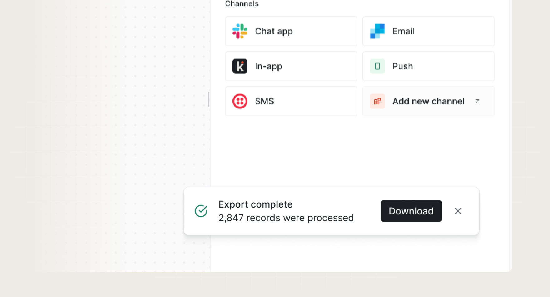
Beyond client-side libraries: complete notification infrastructure
While these libraries handle the UI components effectively, production applications often require more than just client-side notification display. You need reliable delivery, cross-channel orchestration, user preferences, and real-time infrastructure—all of which require significant backend development and maintenance.
Many teams start with client-side libraries but quickly encounter challenges:
- Real-time infrastructure complexity: Setting up WebSocket servers, handling connection management, and ensuring reliable delivery across different network conditions.
- Cross-channel coordination: Users expect notifications to be delivered via email, SMS, push notifications, and in-app feeds without duplication or timing conflicts.
- Preference management: Building user preference systems that work across all notification channels.
- Reliability and scale: Ensuring notifications are delivered even when your primary application experiences issues.
Knock provides the infrastructure layer that complements these client-side libraries, enabling you to build sophisticated notification systems without the backend complexity.
Real-time capabilities:
- WebSocket infrastructure with automatic fallback and reconnection.
- Real-time in-app notification feeds with unread state management.
- Live updates that integrate seamlessly with the libraries covered in this guide.
UI flexibility:
- Compatible with Sonner, React Hot Toast, and other toast libraries for immediate feedback.
- Guides product enables modal and tooltip notifications triggered by user behavior.
- Pre-built React components for notification feeds and preference management.
Cross-channel orchestration:
- Unified API for email, SMS, push notifications, and in-app messaging.
- Intelligent delivery rules prevent notification fatigue.
- User preference controls that work across all channels.
Developer experience:
- React SDK with TypeScript support and hooks for common patterns.
- Next.js integration guides and examples.
- Workflow editor for complex notification logic without code changes.
This approach lets you use the best client-side libraries for UI while relying on proven infrastructure for delivery, reliability, and cross-channel coordination.
Whether you choose to build with these open-source libraries or combine them with a notification infrastructure platform like Knock, the key is selecting tools that grow with your application's needs and your team's expertise.
If you want to learn more about Knock, you can sign up for a free account or chat with our team. 👋