If at any point in reading this post you get bored, you can press ⌘ + W to make it stop. That is the power of keyboard shortcuts. (A note for our Windows/Linux readers: we'll be using macOS keyboard references throughout this post. Please forgive us.)
Keyboard shortcuts matter because they save us time. Even with modest assumptions, simple math points to regular use of keyboard shortcuts saving us days of time a year. If you're building a product or a dashboard that users come back to often, keyboard shortcuts are a great way to improve their productivity and to help them become power users.
Now let's say it's time to assign key bindings to the actions in your own product. Where do you start?
We faced the same question when we started to introduce keyboard shortcuts into the Knock dashboard. We knew there were experiences we admired in other products, but we weren't sure which key bindings to use in our own.
In this post we share our learnings on how to design a great keyboard shortcuts experience and a few resources we created along the way to choose key bindings that were memorable and conflict-free.
What makes a great keyboard shortcuts experience
Great keyboard shortcut experiences have three traits in common.
- They are discoverable. Shortcuts are only useful to users if they know they are there.
- They are memorable. The key bindings chosen have built in mnemonics that help users learn them over time.
- They are conflict-free. The user can use the key bindings without having to change settings in the product, the browser, or the OS. Everything just works.
Next we'll dive into each of these traits and discuss a few learnings from each that you can use in your own keyboard shortcuts experience.
Great keyboard shortcuts are discoverable
A user should never have to google for your keyboard shortcuts. If you want users to discover your keyboard shortcuts, return to them often, and become power users, you need to surface them to users where they'll find them.
As far as we can tell, there are three ways great products do this.
Tooltips
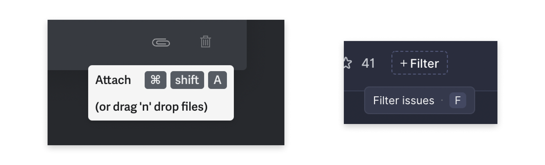
One easy way to get your keyboard shortcuts in front of your users is to use tooltips to visually bind them to their associated actions. This way every time a user hovers over a given affordance in your app, they're reminded of how they could perform that action without their hands leaving the keyboard.
Here are two examples from products that do this well: Superhuman and Linear.
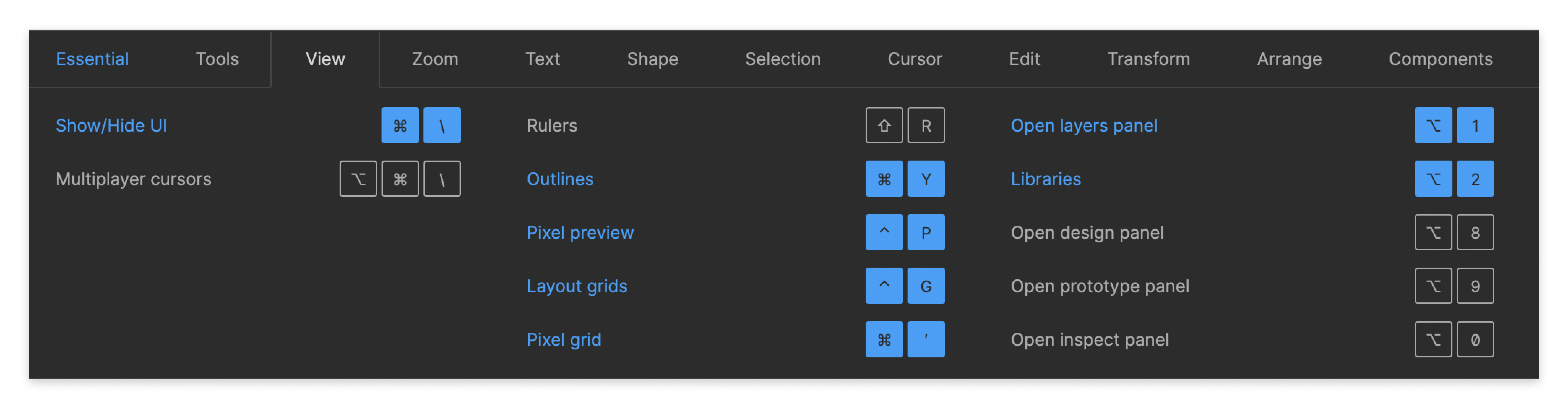
Shortcuts reference guide
While tooltips are a great way to surface shortcuts in context, sometimes your users will want a single view of all of the shortcuts available within your product. A shortcuts reference that your users can access globally (that is, from wherever they are in your app) is a good way to solve for this.
This is especially useful for users when actions are nested deep within context menus or other hard-to-find places. A keyboard shortcuts reference gives them a quick way to remind themselves how to do something within your product without having to remember where they need to go to do it.
Figma is one of the best examples of a keyboard reference in action. The first time you land in Figma, they prompt you to open their keyboard shortcuts guide. They even gamify the experience by color coding the shortcuts you've tried and the shortcuts you haven't.
Command bar
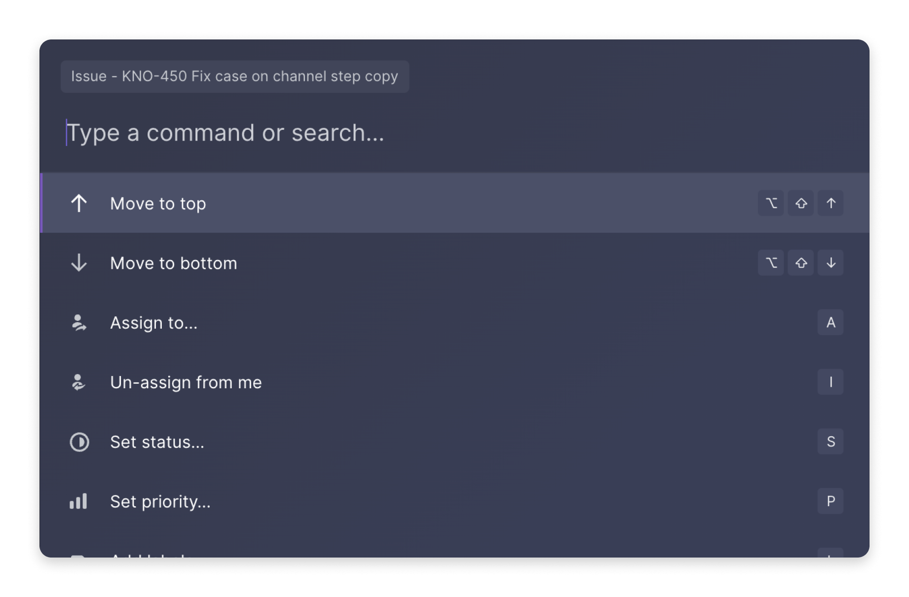
The third way we see great products surface shortcuts to their users is through a command bar.
The power of the command bar is that your user only has to remember one shortcut (⌘ + K) to open a command bar that gives them a way to search for any of the actions in your product. The best command bar experiences give users indicators of the keyboard shortcuts available for those actions (when applicable) so they won't have to come back to the command bar next time they need to run that action.
Great command bars combine the best of both reference guides and tooltips to help users discover and remember the shortcuts in your product, as you can see in the Linear command bar below.
Command bars are their own UX experience unto themselves. If you want to learn more about them, we recommend this excellent guide from the team at Superhuman. There are also tools, such as commandbar and kbar, that help you add command modules into your product.
One last thing to keep in mind on discoverability: you're keyboard shortcuts need to be OS-aware. Wherever you show shortcuts to your users—tooltips, reference guides, command bars—you need to make sure you're showing them shortcuts specific to their operating system. The moment you show a Windows/Linux user a macOS keyboard shortcut, you've lost your credibility.
Great keyboard shortcuts are memorable
Your users finding your keyboard shortcuts is step one, but if they constantly need to hover over an affordance or open your command bar to remember the key binding for a given shortcut, they aren't getting into the flow state that keyboard shortcuts unlock.
This is why choosing the right key bindings is so important. A key binding with a clear mapping to its bounded action is one that is easier for users to remember. Here are a few ways we've found to keep keyboard shortcuts memorable.
Do what's familiar
This is an easy one. There are a handful of common keyboard shortcuts with which your users are already familiar. ⌘ + C to copy. ⌘ + X to cut. ⌘ + V to paste. The basics. If you're a product that includes this same basic functionality, do what your user already knows.
Key-to-verb mapping
Where it makes sense and you don't have to worry about browser focus conflicts, you can map your key binding to one of the memorable letters in the verb action you're binding to. F for Filter , C for Create , E for Edit, and so on.
This is especially helpful for combination key bindings, where the user needs to use two keys to perform the action with a keyboard shortcut. For a lot of users combination keyboard shortcuts can feel intimidating, but the right mapping can make combo shortcuts easy to remember. A favorite example: Linear and Superhuman both use the simple keyboard shortcut G to help you "Go" places. G + I to "Go to your Inbox", G + D to "Go to your Dashboard", and so on.
Visual mapping
While key-to-verb mapping is an effective way to make your key bindings memorable, sometimes you'll find they don't quite work. Sometimes it's because the key binding you'd use is already taken by another action in your product (more on this below), sometimes it's because the key binding would lead to poor ergonomics or confusing UX for your user.
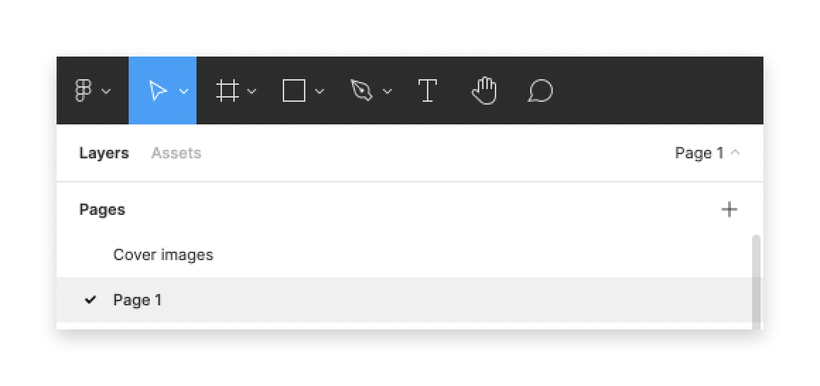
In these cases, you can map key bindings to the visual space in your product to create memorable shortcuts with better usability. This can be hard to grok in words, so let's look at an example of this in action in Figma.
Let's say we're on the product team at Figma. A common use case in Figma is for our users to go back and forth between the Layers and Assets tabs in the lefthand navigator panel. Without keyboard shortcuts, they'd need to move their cursor away from the canvas any time they wanted to get access to an asset, so navigation between these tabs is a great opportunity for us to introduce a keyboard shortcut to speed up their workflow.
If we were using key-to-verb mapping, we might think about binding the "Layer" tab to the L key, and the "Assets" tab to the A key. These key bindings are certainly memorable, but they create a few problems for us.
First, the L key is already bound to a different action: inserting a new line into the canvas. This is a shortcut reserved for new line behavior in other vector-design tools, so we probably wouldn't want to use it for tab navigation.
But even if we could use the L key for the Layer tab, there's a different problem that arises. If we use L for "Layers" and A for "Assets", we get a counterintuitive visual mapping between the keys a user uses to navigate between the tabs and the order of the tabs themselves on the screen.
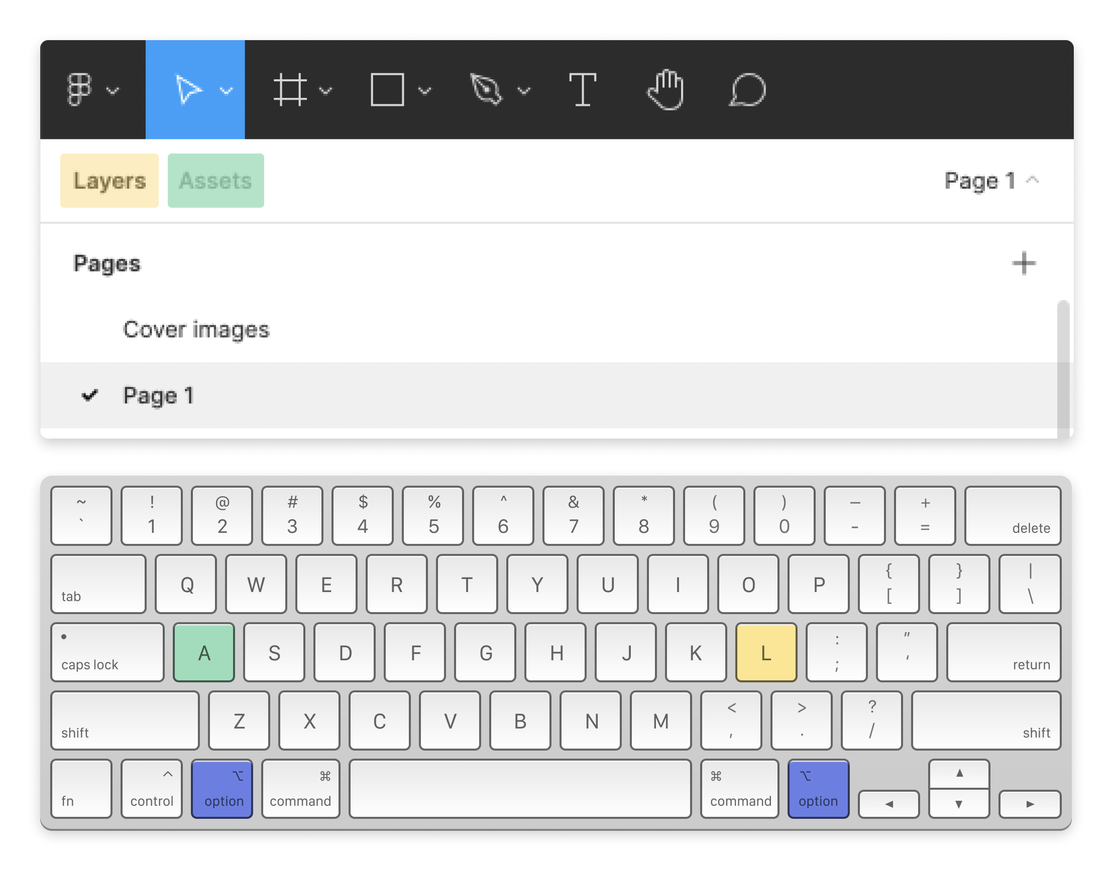
In the example above, our user would be using the A key on the left side of their keyboard to go to the tab on the right, and the L key on the right side of their keyboard to go the tab on the left. Even though these key bindings are memorable because of their verb mappings, they feel weird to us when we actually use them.
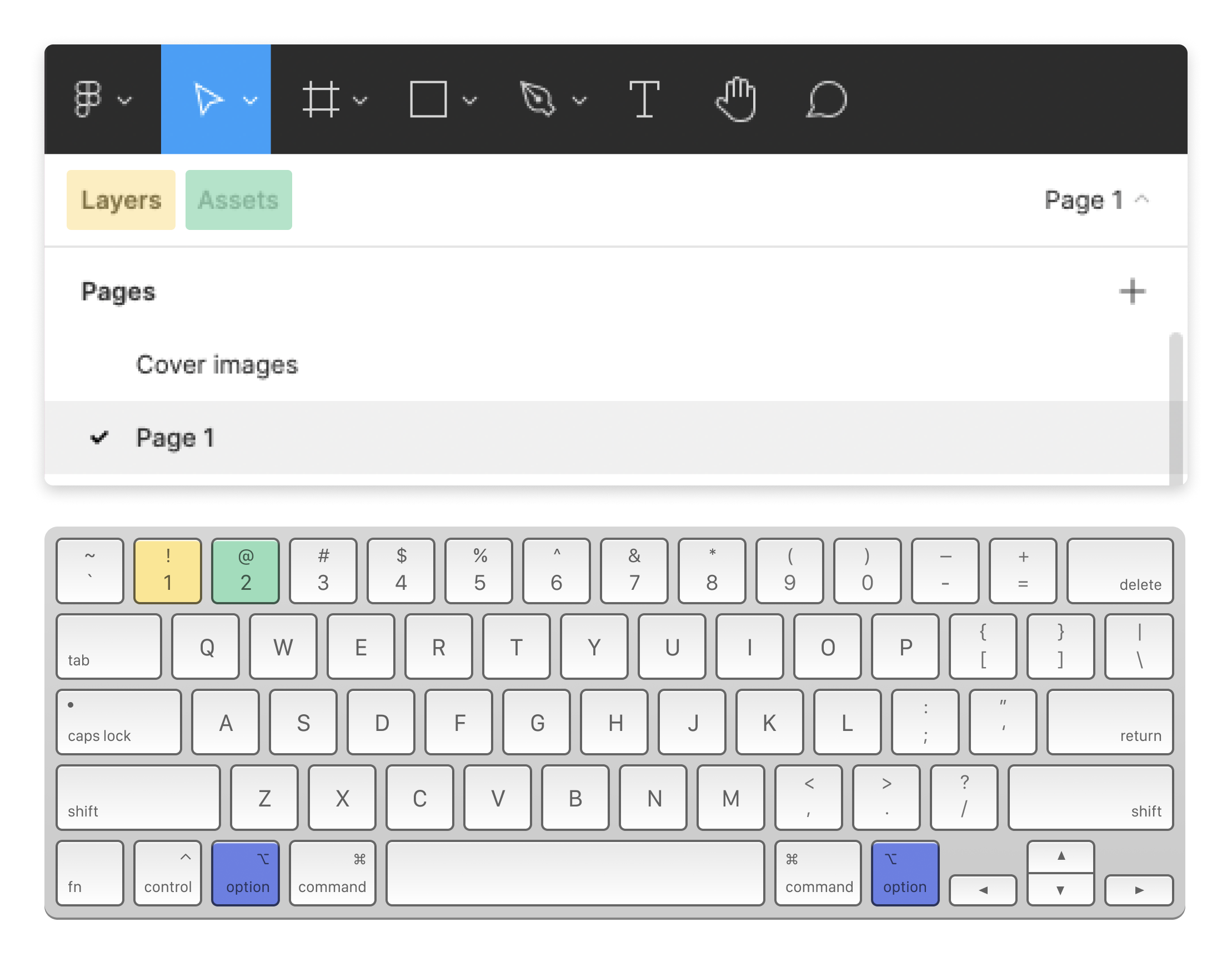
Here are the key bindings the Figma team actually used for this tab navigation. You use ⌘ + 1 to navigate to the Layers tab and ⌘ + 2 to navigate to the Assets tab. While this may not seem memorable at first, you immediately get it once you start using it.
As you can see in the visual above, the bindings map visually to the affordances in the UI—the key on the left maps to the left tab, and the key on the right maps to the right tab.
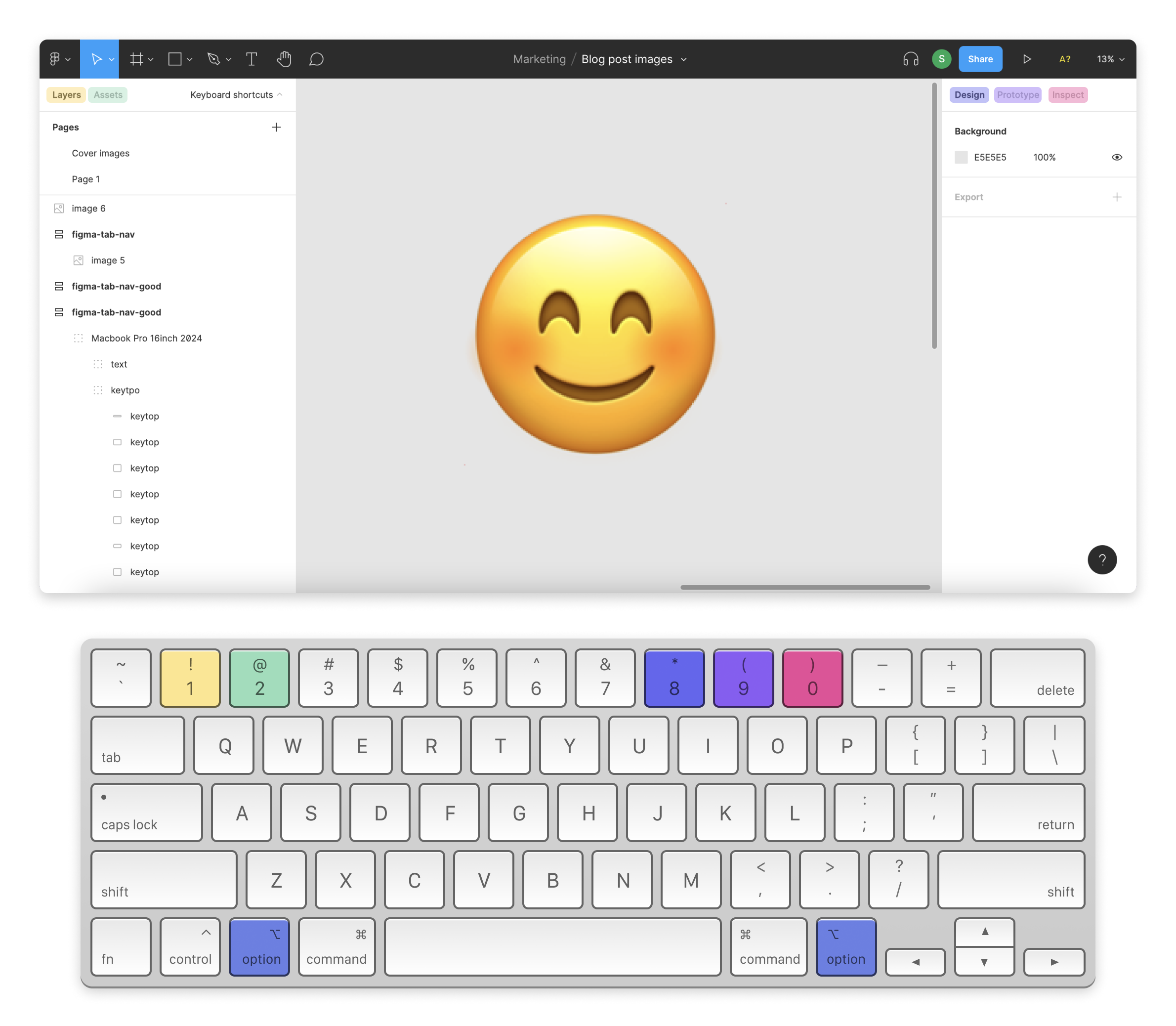
But it gets better. If we zoom out and look at the entirety of Figma's canvas tab navigation, we can see that the tabs in the top-left of the window map to shortcuts at the top-left of our keyboard, and the tabs in the top-right of the window map to shortcuts at the top-right of our keyboard. The symmetry. :chefskiss:
Great keyboard shortcuts are conflict-free
Even after you've decided on key bindings that are memorable and you've put the tools in place to make sure they're discoverable to your end users, you still have one more thing to worry about: key binding conflicts.
If you're someone that aspires to keyboard use daily, you've probably encountered a binding conflict. You jump into a text editor and press ⌘ + F to find something, only to discover that the sacred ⌘ + F binding has been usurped by the product you're using. Not good.
In a great keyboard shortcuts experience, this doesn't happen. The designers that chose the key bindings were aware of the operating system and browser key bindings that would already exist around the context of the product, and avoided using them for their own bindings.
While you usually don't want to take over browser key bindings, there are a few exceptions:
- The browser shortcut maps to similar functionality in your own product. If we take the
⌘ + Fexample from above, most apps with a serious text editor will bind⌘ + Fto the native find functionality of their text editor BUT ONLY if the user's browser focus is currently set on the text editor. (GitHub's text editor is a good example of this behavior.) - The browser shortcut use case isn't relevant to your product. Since most users don't have a reason to save the page of a single-page web app, you're probably safe to use
⌘ + Sfor your own purposes. (You'll probably just use it for saving things in your product, but you never know.)
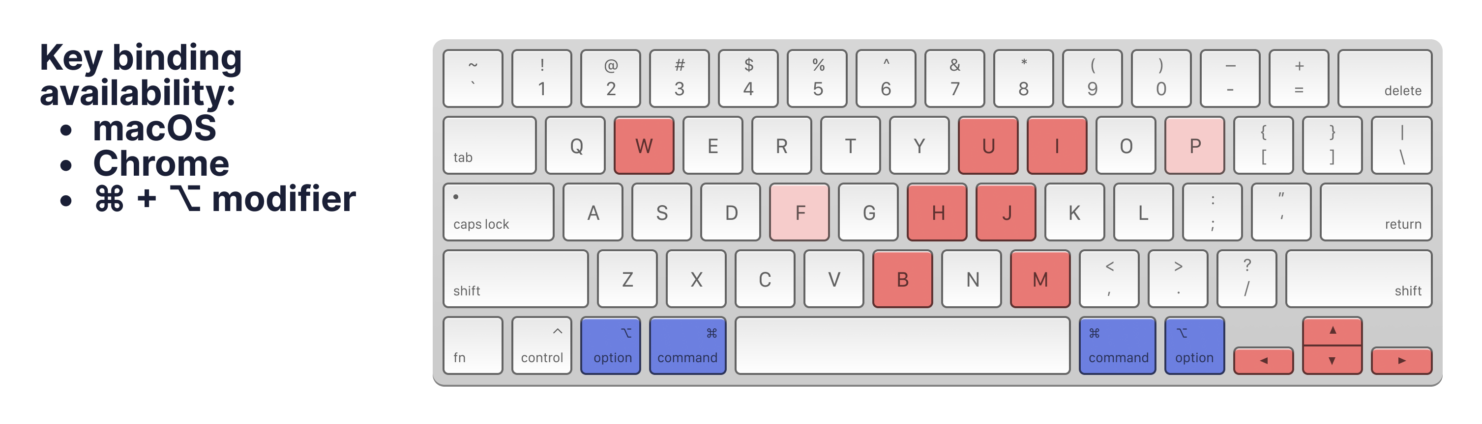
We can see this visualized in the keyboard diagram shown below. This shows us the key bindings that are already occupied when you're using the cmd key modifier within the Chrome browser on a MacOS device. The dark red keys represent those key bindings we don't want to touch, as they're related to product-agnostic browser and OS navigation. The middle reds represent keys with strong associations, such as select all and copy. You should exercise caution when using them. The light red keys are those with weaker associations, such as save or print page.
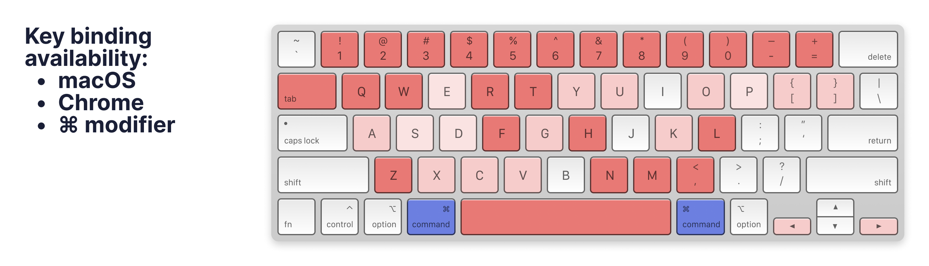
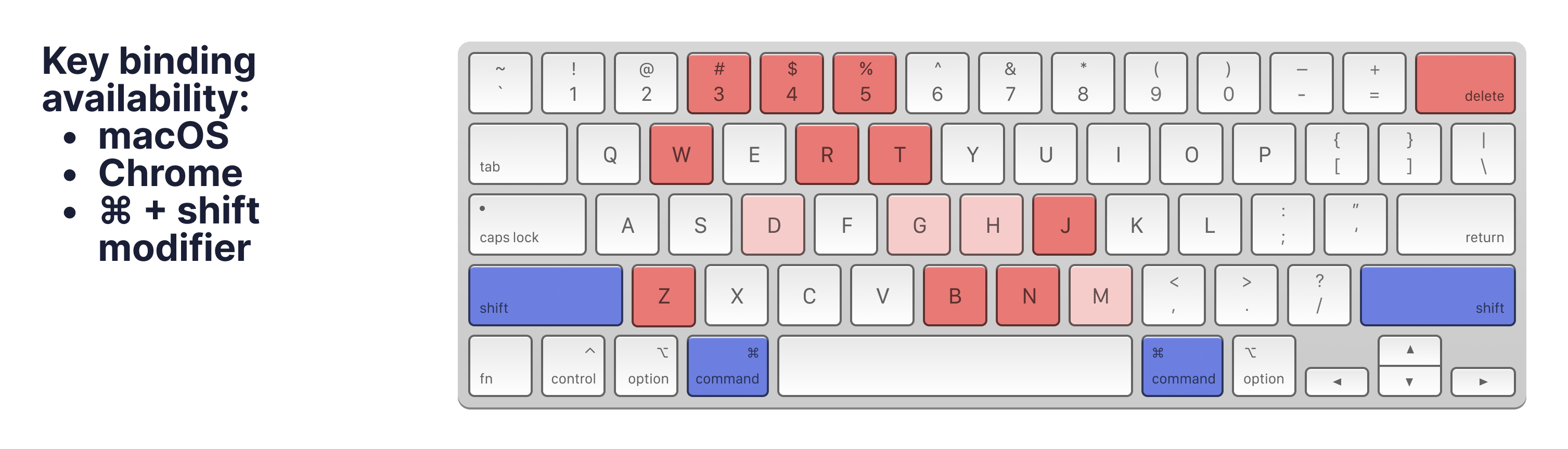
Visualizing key bindings in this way is also helpful as a reminder of the different planes of the keyboard we have available to us when we're electing key bindings. While the ⌘ modifier key bindings are well accounted for, if we look to other modifier keyboards, such as the ⌘ + ⌥ or ⌘ + shift keyboards, we start to see where we can find more room to work with.
And, of course, there are plenty of shortcuts available for us to use on a keyboard where we're not using any modifier keys at all, though they won't be available to our user as soon as their browser focus moves to any sort of input, such as a text editor.
That's the last thing for us to keep in mind on key binding conflicts: they change depending on a user's context within the product. The shortcuts available to a user when they're focused in a text editor will differ from those they can use when they're in navigation dashboards and so on. Context is key.
How to get started
If you want to get started adding keyboard shortcuts to your own product, the best place to start is by listing out all the actions in your app that you'd want to map to a shortcut. Then start assigning them to keys. Remember to keep them discoverable, memorable, and conflict-free.
If you've made it this far, ⌘ + W on out of here and we'll see you next time.