You’re probably already using email to power your notifications, but in-app messaging is a powerful tool for engaging users, driving actions, and delivering information directly within the context of your application. Communicating your messages in this context comes with additional challenges because there are a variety of in-app message types, each with their own considerations based on the content of the notification and purpose (transactional vs. promotional).
In this post, we’ll cover some of the most common types of components used in in-app messaging and discuss how they can be incorporated into a holistic messaging strategy.
Developing an in-app messaging strategy
Part of developing a comprehensive in-app messaging strategy involves understanding the different types of messages and when they should be used. When approaching each decision about what type of message to use for a particular notification, you should start by determining if the message is transactional or promotional.
Once you’ve determined whether the notification is transactional or promotional, you should next categorize the notification based on whether it requires low, medium, or high-attention from the user.
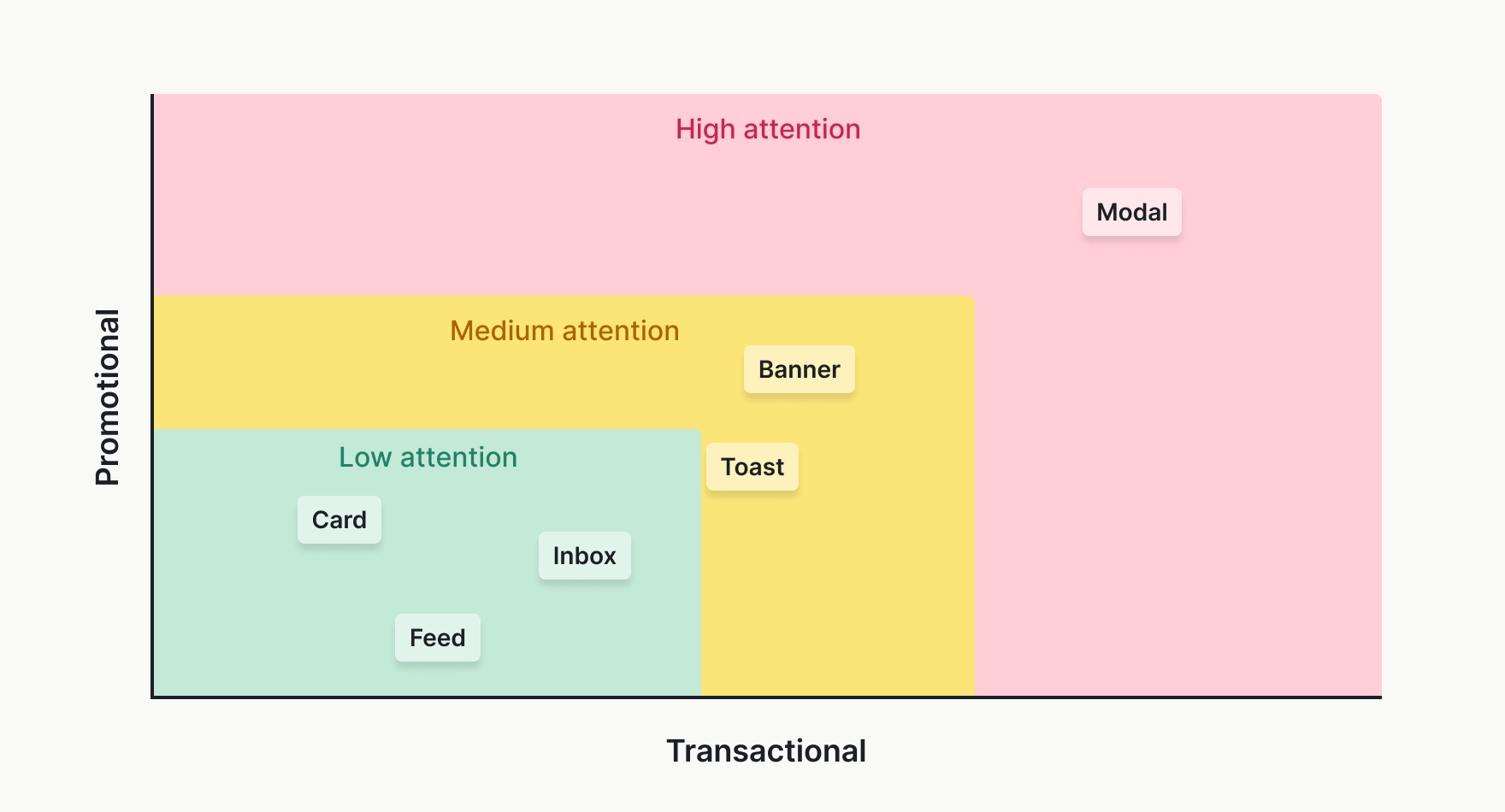
For example, errors, alerts, or other time-sensitive messages are considered high-attention, while an action confirmation or month-long sale might be low-attention. Sending users the right amount of notifications from each category requires balance, and treating low-attention messages as high-attention can lead to a bad user experience. Ideally, you’d pair the kind of notifications you’re sending with a suitable type of in-app message from the list below.
Types of in-app messages
Notification feed
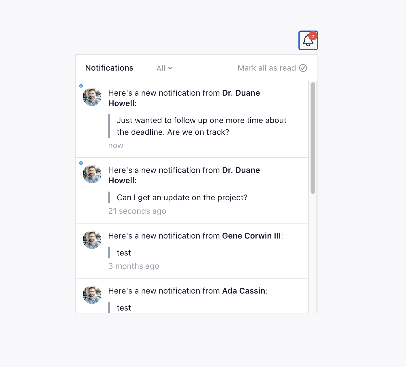
The notification feed serves as a central hub for all user notifications within the app. It’s ideal for transactional messages like order confirmations, payment receipts, and security alerts. This persistent feed ensures that users can review all their notifications at any time, making it perfect for messages that require reference or may be acted upon at a later date.
✅ Notification feeds are useful for transactional messages that need to be easily accessible.
❌ Notification feeds should generally not be used for promotional content that needs to capture immediate attention, as users may not check the feed frequently.
Notification inbox
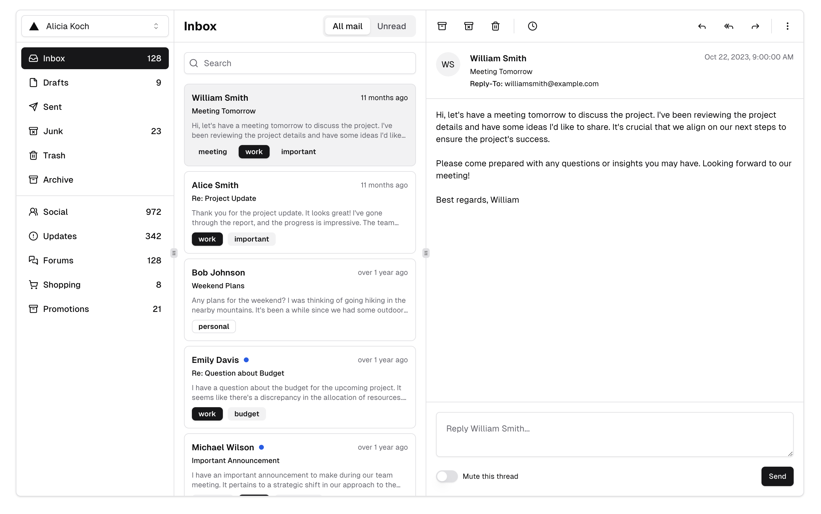
A notification inbox is similar to an email inbox but resides within your app. It’s designed for messages that users might need to access later, such as updates on subscriptions, feature announcements, or personalized offers. The inbox allows for more detailed messaging, as users can open and read these messages at their convenience.
✅ Notification inboxes are useful for messages that require more detailed content or user interaction, such as policy updates or newsletters.
❌ Notification inboxes are generally not great for urgent alerts, as inbox messages might not be seen immediately.
Cards
Cards are small, non-intrusive notifications that appear within the main content of your app. They’re perfect for subtle reminders or suggestions that don’t interrupt the user experience. Cards are versatile and can be used for both transactional and promotional purposes. They’re great for low-priority updates that are relevant to the current screen or activity.
✅ Cards are great to highlight new features, suggest actions, or deliver personalized recommendations.
❌ Cards aren’t great for critical alerts or messages requiring immediate attention, as cards may blend into the surrounding content.
Modals
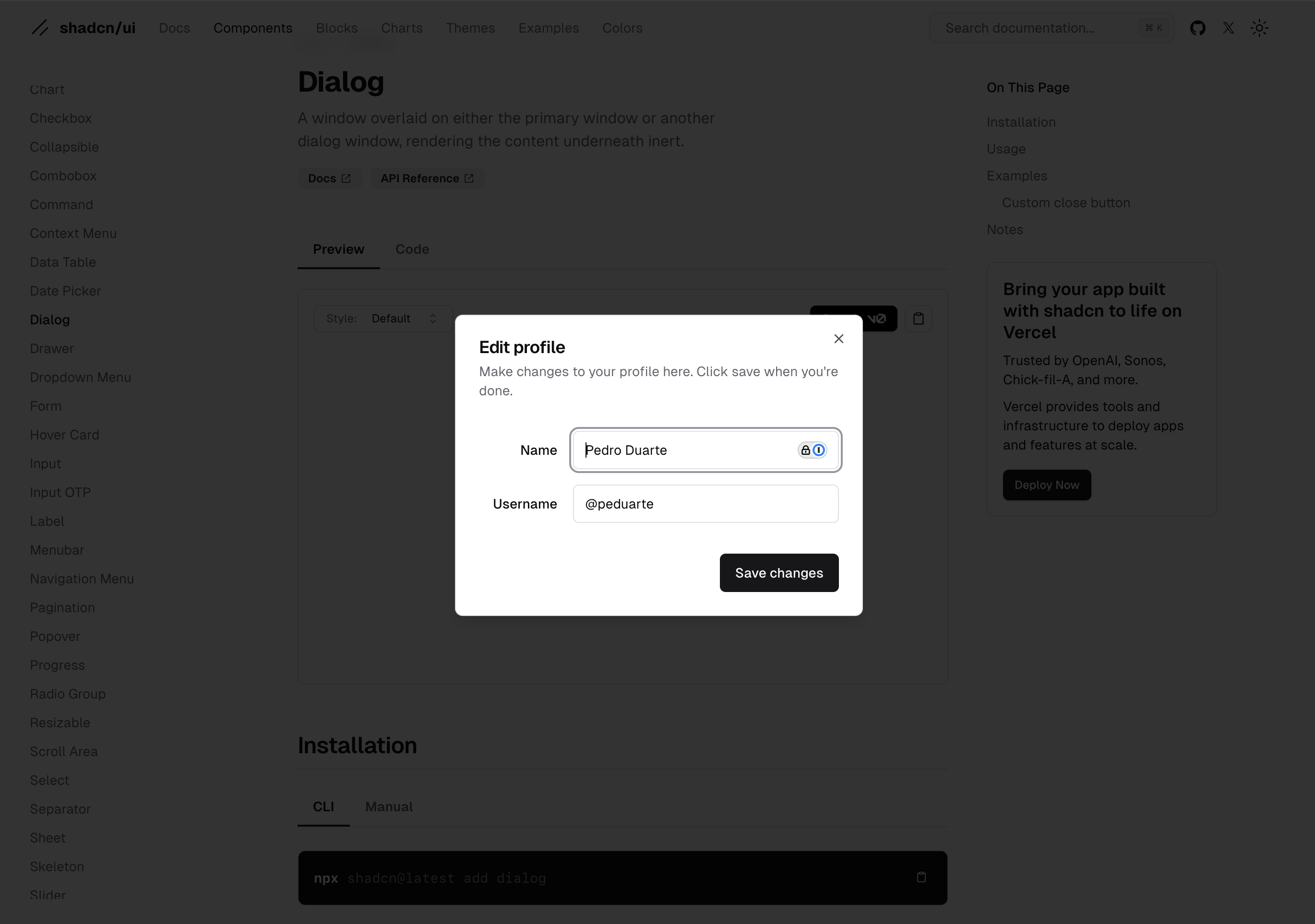
Modals are pop-up windows that appear on top of your app’s content, requiring user interaction to dismiss. They’re highly effective for capturing user attention and driving immediate action. However, due to their disruptive nature, they should be used sparingly and thoughtfully. In a promotional use case, modals should be related to some immediate event and only be shown once.
✅ Modals are good to prompt users for immediate action, such as completing a profile or accepting new terms of service.
❌ Modals should not be used for non-urgent or recurring messages. The frequent use of modals can frustrate users and lead to dismissals without engagement.
Banners
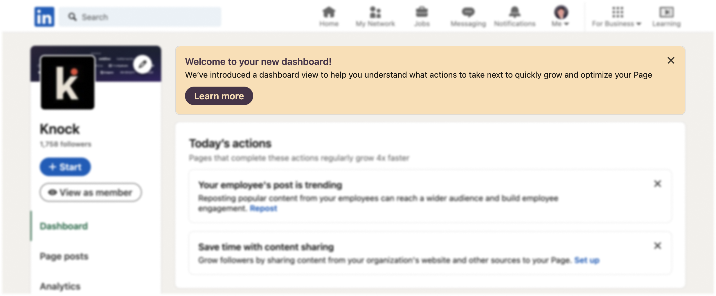
Banners are horizontal strips that appear at the top or bottom of the screen. They are less intrusive than modals but more prominent than cards, making them ideal for conveying important but not critical information. Banners can be used for both transactional and promotional purposes. They’re useful to inform users about ongoing events, such as sales or limited-time offers, or for system notifications, like maintenance alerts or connection issues. Sometimes they can be dismissable.
✅ Banners are useful for displaying information about ongoing events.
❌ Banners should not be used for urgent messages that require immediate action, where a modal would be more appropriate.
Toasts
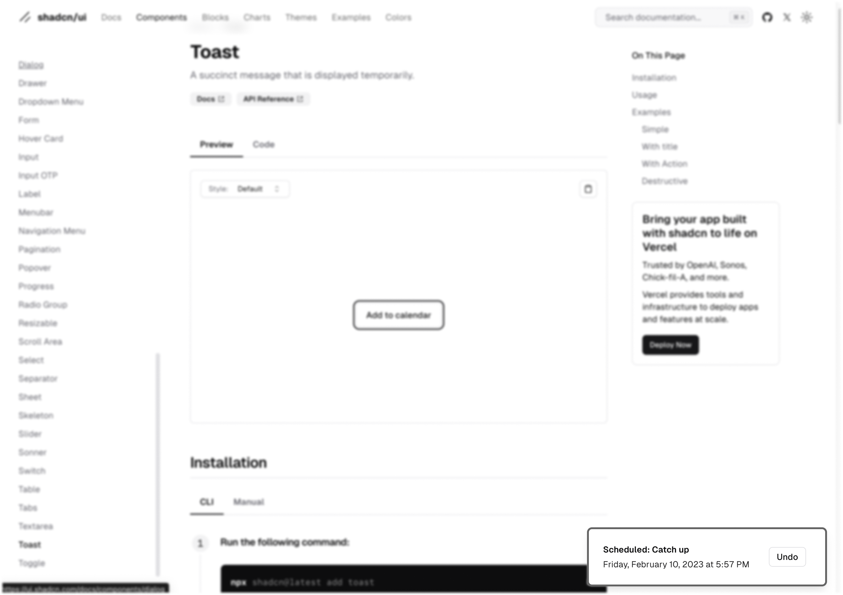
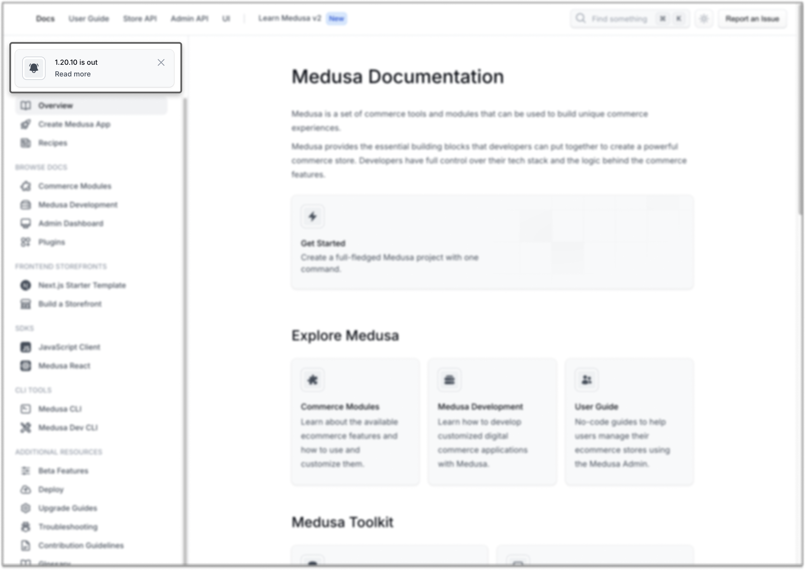
Toasts are small, temporary notifications that appear and disappear automatically after a short period, usually in a corner of the screen. They’re ideal for quick updates that don’t require user interaction or permanent display. Toasts are typically tied to a specific user action or event, such as confirming that an action was successful or alerting the user to a minor issue. Unlike modals, toasts do not interrupt the user’s workflow. They allow users to continue with their current task while being informed of the notification.
✅ Toasts are excellent for providing immediate feedback after a user completes an action. If appropriate, pair the toast with a contextual action. For example, a toast that informs the user of a new message could include a “View” button that directs them to their inbox.
❌ Toasts should not be used for critical or time-sensitive alerts. Since they disappear automatically and may be missed by the user, important information should be conveyed through more prominent message types, such as modals or banners.
Best practices for using in-app messages
Context is key
Always consider the user’s current activity when deciding which message type to use. For instance, a modal might be appropriate if the user is filling out a form and you need to alert them about missing information, but a card or banner might be better suited if you’re simply suggesting they try a new feature.
Prioritize user experience
While in-app messages are effective, they should never overwhelm or frustrate the user. Avoid overusing disruptive message types like modals. Instead, opt for less intrusive options like cards or the notification feed for non-urgent communications.
Segmentation and personalization
Not all users need to see every message. Use segmentation to target specific user groups, and personalize messages to make them more relevant. A well-placed, personalized card can significantly increase engagement compared to a generic, one-size-fits-all modal.
Measure and optimize
Track the performance of your in-app messages to see which types drive the most engagement and conversion. Use A/B testing to refine your approach and ensure that your messaging strategy is as effective as possible.
Think in cross-channel experiences
While in-app messaging can be an effective strategy on its own, it can be even more useful when you think of in-app messages as only one step in an overall cross-channel experience. For example, let’s say you create a campaign to market a sale for an existing product that consists of an in-app banner followed by an email towards the end of the sale period. Should the email be the same for people who’ve dismissed the banner and those who haven’t seen or interacted with it? Using things like branches, delays, and message status checks, you could send these two groups very different messages that feel more personalized.
Wrapping up
By understanding the use cases for each message type, you can create a more engaging and user-friendly experience that delivers the right message at the right time. Incorporating these new message types into your app allows you to reach your audience more effectively, whether you’re delivering a critical alert or promoting the latest feature. As always, the key is to use these tools thoughtfully, with the user’s experience as your top priority.
Knock provides in-app messaging and cross-channel delivery
At Knock, we've created the infrastructure you need to power different types of in-app messages and combine them with other out-of-app channels to deliver a personalized experience to your users.
If you want to try out Knock's in-app messaging features or workflow builder,you can sign up here for free. We have a generous free tier you can use to get started.