Startups move fast, and investing in a design system is often seen as a luxury—something that slows down development rather than speeding it up. But in reality, a well-architected component library does the opposite: it removes friction from the design and development process, making it easier to build and maintain a cohesive UI.
At Knock, we’ve built a component library that supports our own dashboard and provides a foundation for customer-facing SDKs. It’s lightweight, composable, and flexible enough to evolve as we scale. In this article, we’ll walk through how we approached building a component library, the importance of primitives, and the technical decisions that made it all work.
The power of component libraries
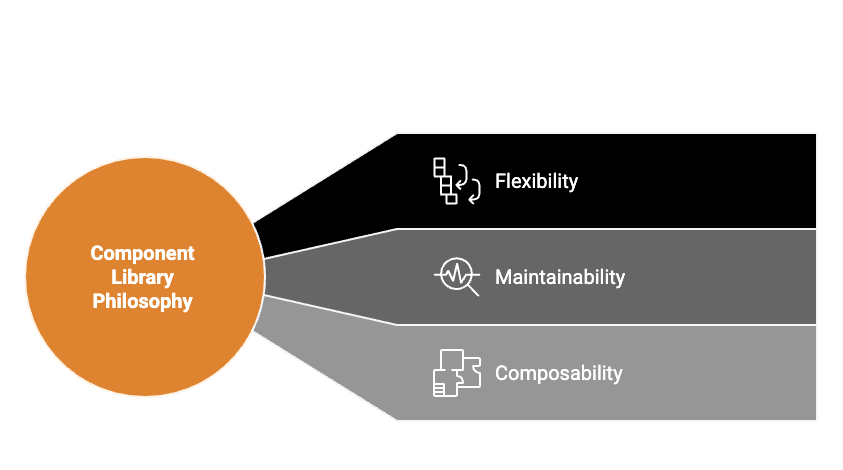
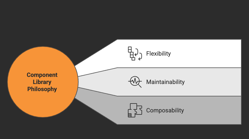
A component library is not the same thing as a full design system. A design system includes brand guidelines, accessibility standards, and high-level UI patterns, while a component library provides the actual code implementation of those ideas. At Knock, we focused on the component library first, ensuring that it was flexible enough to support our evolving design needs.
Starting small: the Knock approach
Many startups make the mistake of trying to build a massive design system from day one. Instead, we started small, focusing on the core building blocks and iterating as we went.
Defining tokens first
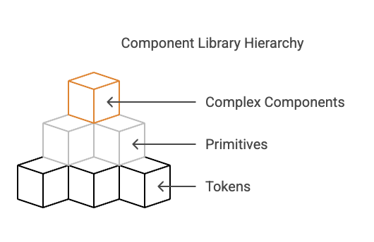
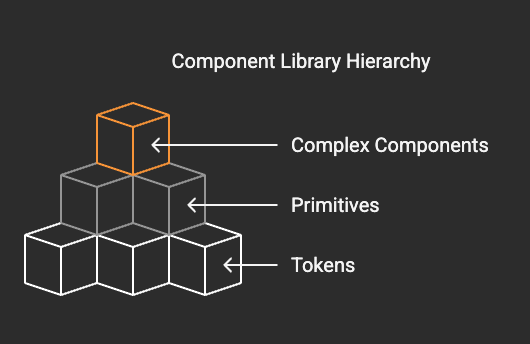
Before writing a single component, we established a set of design tokens for colors, spacing, typography, and more. Our tokens are inspired by Tailwind CSS and Radix, following a consistent numerical scale:
const spacing = {
  px: "1px",
  0: "0px",
  1: "0.25rem",
  2: "0.5rem",
  3: "0.75rem",
  4: "1rem",
  ...
}
This consistency allows for easy theming and predictable UI behavior. If we ever need to adjust spacing across the entire application, we can do it in one place.
Building from primitives
One of the core philosophies of our component library is that small, well-designed primitives allow for greater flexibility and maintainability. Instead of designing monolithic components with rigid APIs, we focused on creating a set of simple building blocks that could be combined in different ways.
For example, let's look at our Box component. The Box component serves as the foundation for nearly everything else in the library. It acts like a <div>, but with built-in support for spacing, background colors, and other styling props:
<Box padding="4" background="gray-3" rounded="2">
  Hello, world!
</Box>
This component is incredibly simple, but it eliminates the need to write repetitive CSS while keeping styles consistent across the application.
Building up from there
Once we had a solid foundation, we layered additional abstractions on top. The Stack component, for example, is just a Box with added flex-box logic:
<Stack gap="4" direction="row">
  <Box background="blue-11" padding="4">
    Item 1
  </Box>
  <Box background="blue-11" padding="4">
    Item 2
  </Box>
  <Box background="blue-11" padding="4">
    Item 3
  </Box>
</Stack>
This makes it easy to manage layout without introducing unnecessary complexity. The same principles apply to components like Text (which handles typography), Icon, and even more complex UI elements like Button and Popover.
Leveraging props for composability
One of the advantages of building components on top of primitives is that we can pass props through multiple layers without needing to modify each component individually. For example, our Popover component is built using Box, which means that it automatically supports background colors, spacing, and other styles:
<Popover.Content background="gray-1" padding="4">
  <Text>Popover Content</Text>
</Popover.Content>
By structuring components this way, we reduce the need for duplicate logic and make customization more intuitive.
Open source and community contributions
We made a deliberate decision to open-source our component library with Telegraph. This wasn’t just about sharing our work—it was about creating a more sustainable, maintainable system.
Why open source?
- Better feedback – By exposing our components to external developers, we get insights into how they’re used in different contexts, helping us refine our approach.
- Broader adoption – Making the library public means that other teams can adopt it, which leads to more contributions and improvements over time.
- Long-term sustainability – A closed-source design system risks becoming stagnant. By keeping Telegraph open, we ensure that it continues to evolve.
How we keep it clean
Maintaining an open-source component library requires discipline. We follow a few key principles:
- Strict API design – Every component is built with clear, well-documented props.
- Minimal dependencies – We avoid bloating the package with unnecessary dependencies.
- Composable first – Components are designed to be used together rather than in isolation.
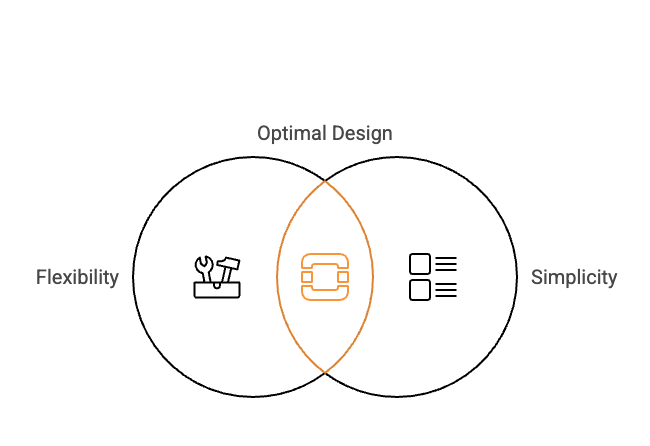
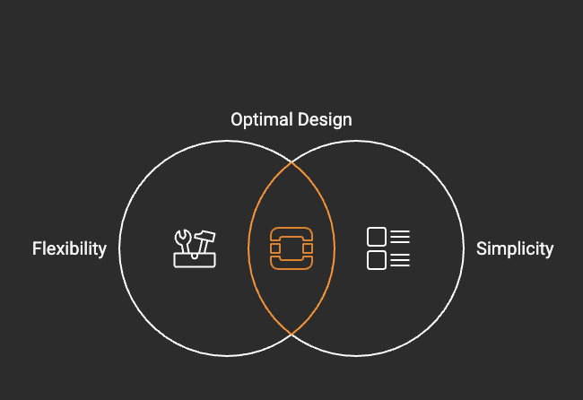
Balancing complexity and flexibility
A common pitfall in component libraries is over-specialization—creating too many variations of the same component to accommodate different use cases. Instead, we aim for a balance between flexibility and simplicity.
The button problem
Many design systems end up with too many button variants: primary button, secondary button, icon button, menu button, form submission button. Instead of creating separate components for each, we designed a single Button component with composable parts:
<Button variant="soft" size="1" icon={Lucide.Check}>
  Confirm
</Button>
For cases where the default button layout doesn’t work, developers can drop down to Button.Root, Button.Text, and Button.Icon to assemble their own layout:
<Button.Root>
  <Button.Icon icon={Lucide.Check} />
  <Button.Text>Confirm</Button.Text>
</Button.Root>
This approach prevents unnecessary variations while still allowing for flexibility.
Challenges and lessons learned
Naming is half the battle
One of the biggest challenges we faced was naming things. A good component API should be intuitive—developers shouldn’t have to guess what prop to use. We followed naming patterns inspired by WorkOS, Radix, and Chakra to keep things consistent.
For example:
- Sizes are always numerical: 1, 2, 3 etc.
- Colors are defined numerically: red-11, gray-2.
- Components follow clear structures: Popover.Trigger, Popover.Content.
Styling without overhead
Early on, we used Tailwind CSS, but we found that it increased our bundle size significantly. We then experimented with vanilla-extract, but it didn’t meet our needs. Ultimately, we built our own styling solution that:
- Maps props to CSS variables.
- Uses inline styles for dynamic values.
- Avoids unnecessary bundle size with a lightweight runtime layer.
This hybrid approach keeps styles lightweight while allowing for runtime theming.
The role of documentation
A component library is only useful if people know how to use it. We use Storybook as our primary documentation tool, providing interactive examples for every component.
Where we can improve
Right now, our documentation lives in:
- Storybook (interactive examples)
- GitHub READMEs (basic usage instructions)
Ideally, we want to integrate these more seamlessly, linking directly to Figma designs and real-world examples in our dashboard.
Reduce friction, increase speed
Building a component library for a startup isn’t just about making things look nice—it’s about reducing friction and increasing development speed. By focusing on small, composable primitives and keeping the API simple, we’ve created a system that scales with our needs.
If you’re interested in checking out our component library, you can explore Telegraph on GitHub. We’d love to hear your feedback and see how others approach building UI at scale.