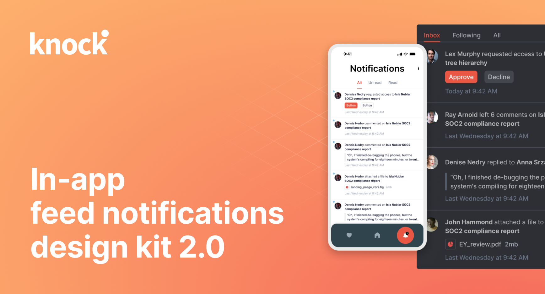
Last year, we released our in-app notification design kit to the Figma community. Since then, it’s been used by more than 7.5k designers.
Today, we’re releasing Knock notification design kit 2.0. It includes:
- Mobile in-app feed designs
- Better component property controls
- And everything from 1.0: dark mode support, in-app cell component variants, and more
In this post we’ll walk you through what an in-app feed is, why your product might need one, and what updates we’ve made to our in-app feed design kit.
What's an in-app notification feed and why would you want one?
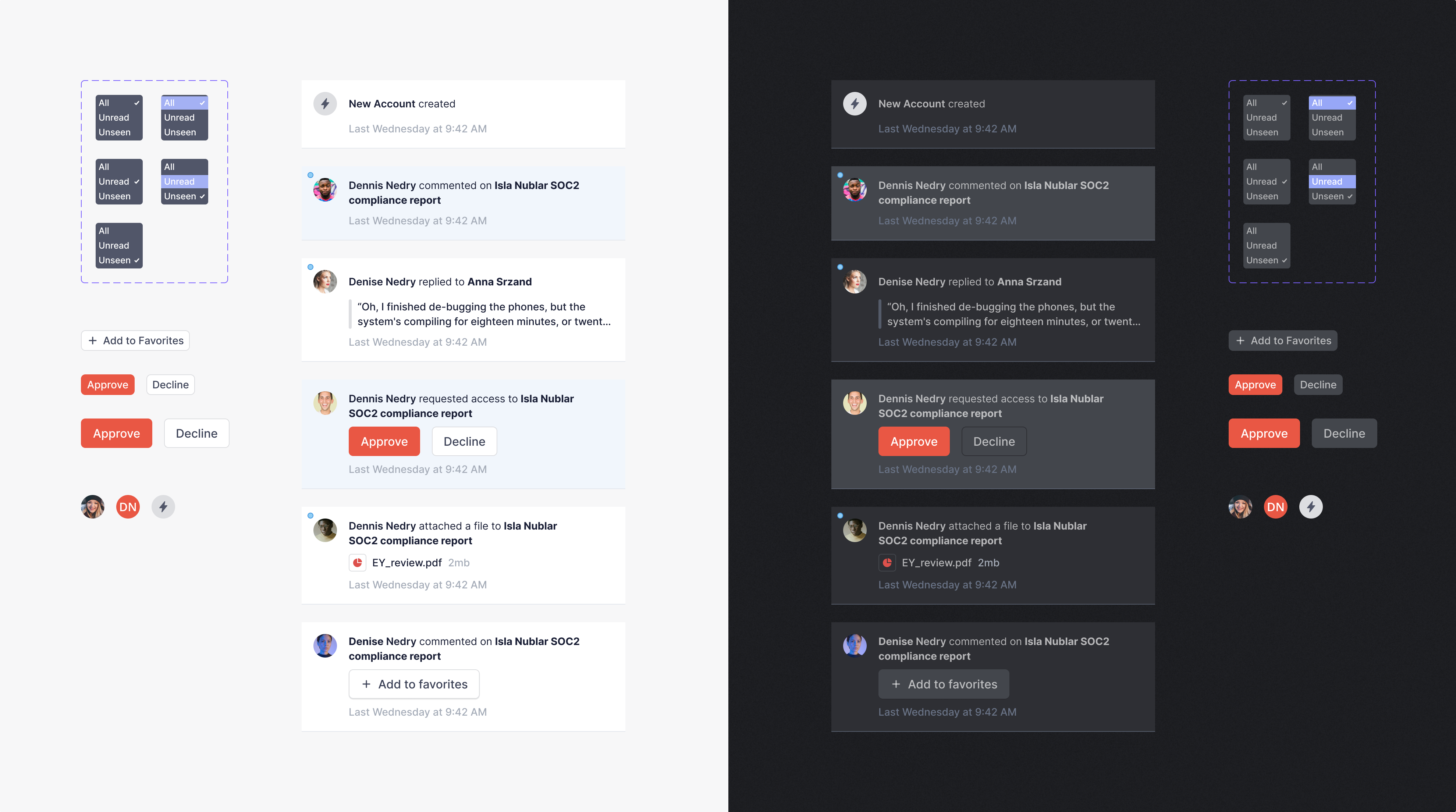
An in-app notification feed lets your users see activity that's relevant to them, surfaced within the product itself. You've probably seen or used a notifications feed in a product in the past, and typically it looks like a badge letting you know how many unread items you have, and a feed in reverse chronological order (with newest items first) describing an action that occurred and who performed the action.
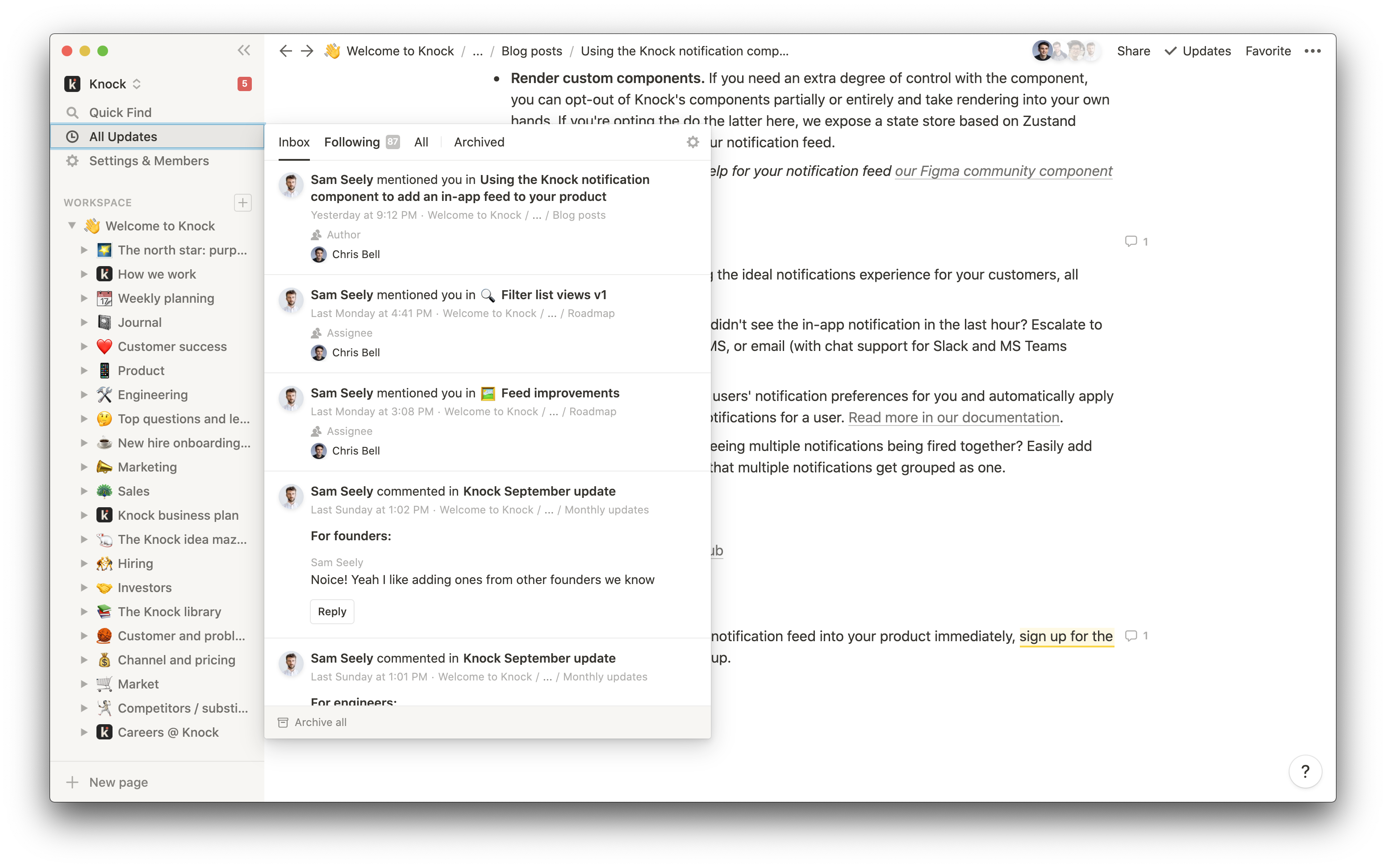
Here’s a great example from Notion:
What’s new in the design kit
With this update, we’ve added support for mobile in-app feeds, better property controls on components, plus reworked everything we had in 1.0: dark mode support, in-app cell component variants and patterns, and more.
Mobile in-app feed designs
With this update, we’re adding a complete set of mobile designs. In the design kit, you now have access to examples and prototype for swipe actions (read, archive, etc) and two new layouts, including sheet and full screen versions for mobile apps.
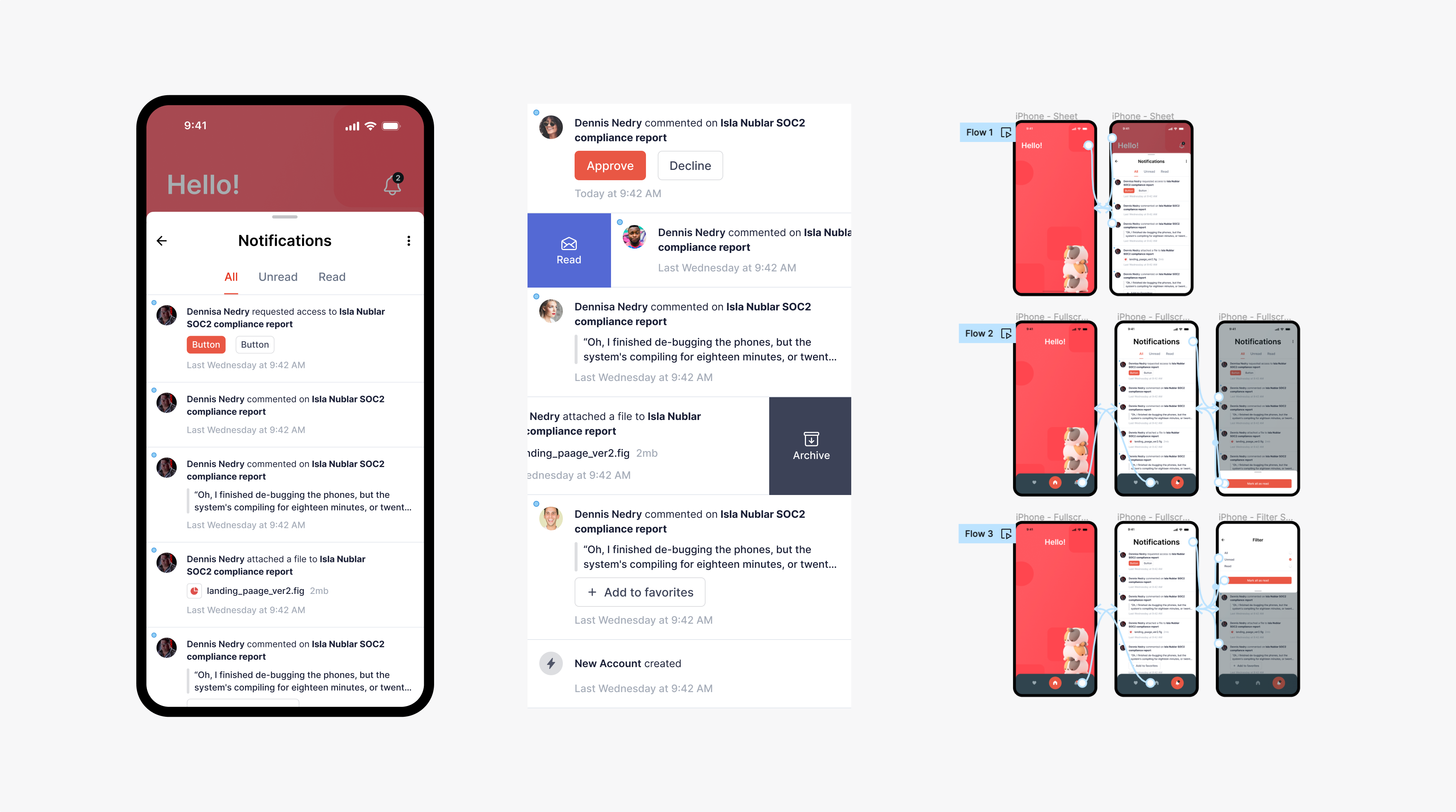
Over the past few months, we’ve been working hard to bring Knock’s React in-app component library to mobile. We shipped our Swift SDK in June, and you’ll see Kotlin and Flutter SDKs from us soon. These in-app feed designs have helped inform those SDKs.
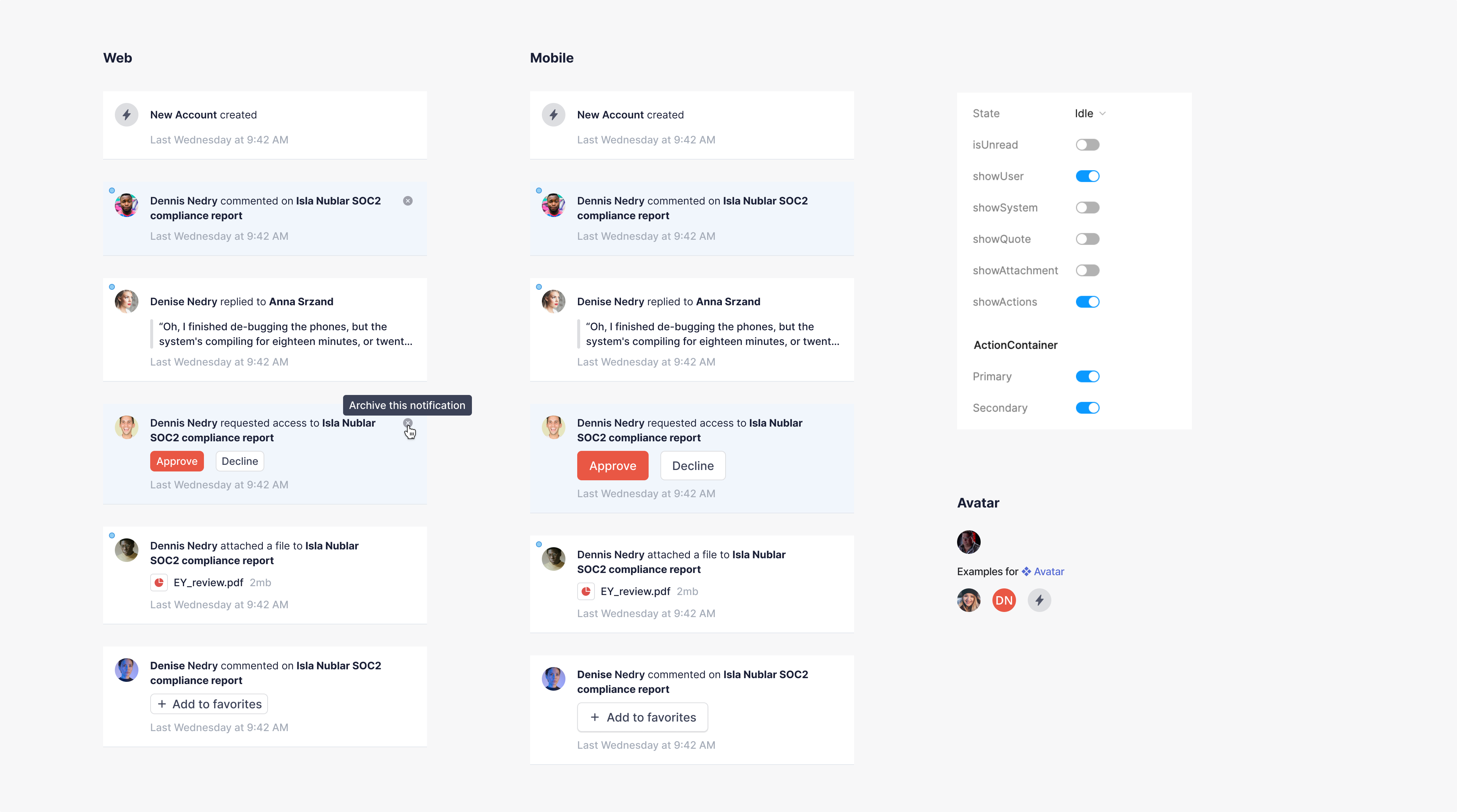
Better component property controls
We’ve also updated the design system to use the latest Figma properties to include different variations from system notifications, comments, replies, attached files, and more.
And everything from 1.0: dark mode support, in-app cell component variants, and more
When we first released the first version of our design kit, we focused on giving designers, product managers and engineers everything they needed to get started with in-app notifications. We’ve now updated all of our original designs with a new coat of paint to match the designs in our new mobile notification system.
Using Knock to power your in-app feed
We started Knock to help teams ship great notifications fast, so they can get back to the differentiating features that set their product apart. If you're looking to ship an in-app feed quickly you should try Knock. We have a ready-to-go in-app channel, and a fully featured set of components so you can have have a real-time inbox, a notification feed, or toasts working in under an hour. There's no infrastructure to setup, and no APIs or UI to build.