Welcome emails are a great way to connect new users with the resources they need to get the most out of your product.
But a lot of companies get them wrong. They focus on features instead of outcomes, send generic templates that ignore user context, or maybe even skip them entirely. The difference between a well-crafted welcome email and a mediocre one can be the difference between product adoption or moving on to your competitor.
In this post, we’ll analyze 16 real welcome email examples from leading SaaS companies in 2026, revealing the specific elements that drive engagement.
Why send a welcome email?
According to one survey, 74% of consumers now expect welcome emails immediately after signup. Given this intent, welcome emails typically have above-average open rates and have the potential to generate more revenue than standard promotional emails. This makes optimizing this important touchpoint critical.
The companies who do this best typically focus on user outcomes rather than features. Combining the right messaging and resources with strategic timing and personalization can create welcome experiences that reach up to 10% conversion rates.
Elements of an effective welcome email
Subject line
Welcome email subject lines should be brief and focus on giving the user enough context that the email is related to their recent signup action.
While other email types might require more subject line strategy to get users to open the email, we find that a simple "Welcome to company" works great.
Preview text
You can leverage preview text to expand on your subject line, adding additional context that increases the likelihood a user opens your email.
Your preview text should briefly explain the contents of the email and tell the user what's in it for them. Effective welcome emails use this space to explain that there are instructions or certain resources inside to help them get started with your product.
Note: All email clients display preview text differently. Some have different character limits, and some hide it completely. Before sending, always make sure you understand what your email’s preview text will look like across major email clients.
Email body
Once opened, the actual email content needs to also answer what's in it for the user. Focus on value, not your brand.
The most effective welcome emails quickly communicate your product's value, provide helpful resources, and provide clear, prominent CTAs that drive specific user actions, ideally within the product.
Here are some best practices your email body should follow:
- Lead with one clear benefit.
- Use short paragraphs (2-3 sentences max).
- Use active CTAs that describe the outcome ("Create your first workflow" is better than "Get started").
- Buttons usually outperform text links.
- Maintain an 80:20 text-to-image ratio for accessibility.
There are also mobile considerations, such as:
- Use single-column layouts for mobile optimization.
- Mobile button sizes should be no less than 44x44 pixels.
- Font sizes need 14px minimum for mobile readability while images should stay under 1MB for proper rendering.
If you follow the above guidelines, you’ll have the content for an engaging, user-friendly welcome email in no time.
16 examples of SaaS welcome emails
For some inspiration on what your welcome email could end up looking like, let’s see some examples from top SaaS companies.
Linear
One of our favorite welcome email examples is from the team at Linear.
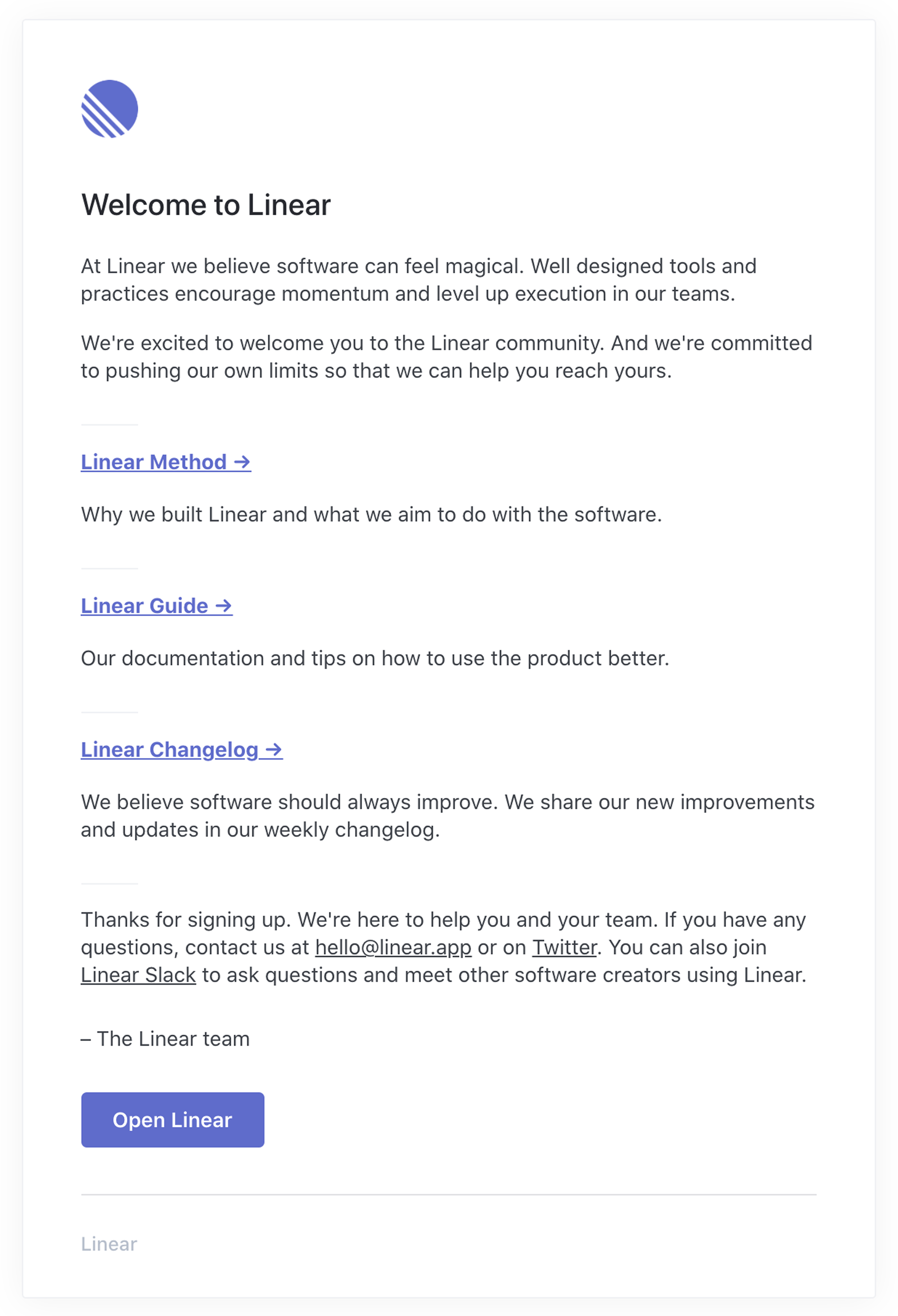
Linear treats this welcome email as part of their product experience, not just a marketing touchpoint. The opening immediately connects to Linear's core value prop "software that feels magical" and then provides three essential resources to become a successful Linear user: why the product exists, how to use it, and what's new.
Beyond that, the design is clean and matches their product aesthetic, the CTAs are clear and unique ("Linear Method" not "Learn More"), and they provide multiple paths for help (documentation, human support, and their Slack community).
This is exactly what we mean when we talk about notifications being core product functionality rather than an afterthought.
Zapier
Zapier nails product activation here. They immediately connect automation to tangible value, with specific examples and a video option to see how it works. After covering the basics, which applies to a greater amount of users, they introduce more advanced features to help more technical users get started quickly. Throughout the email, multiple "Create your first Zap" CTAs drive users back to the product, focused on completing one primary action.

Reddit's welcome email starts off by immediately explaining their unique "karma" system, turning potential confusion into intrigue, followed by a video walkthrough for visual learners. Then, community suggestions give newcomers safe starting points to start using the product.
This progressive education approach transforms what could be a confusing or intimidating platform into an inviting journey of discovery. This is a great example of how to welcome users to a community-driven product.

Miro
The welcome email from Miro is a perfect example of using email design to familiarize users with your product. The design matches their product's look and feel, helping users understand Miro's ease of use. Other imagery helps show users what they can do with Miro rather than just tell.
The email contains several different CTAs across three digestible steps, all meant to drive users back to the product to explore. Smart progression from solo creation to team collaboration mirrors how most teams adopt Miro organically. The Fortune 100 social proof at the bottom adds credibility without being pushy.

Dub.co
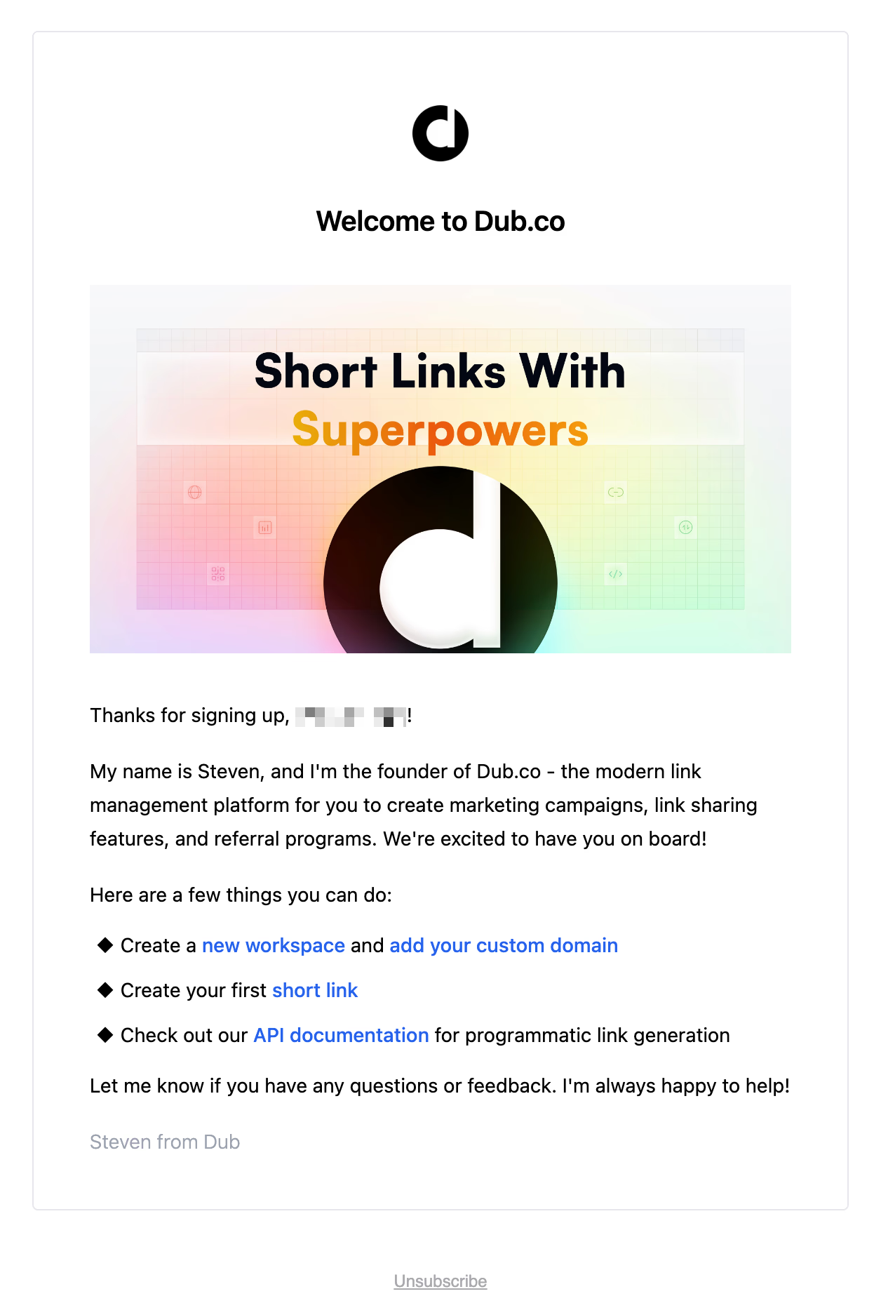
Dub.co nails the founder-led welcome email, with Steven's personal introduction creating immediate connection and building trust.
The "Short Links With Superpowers" header instantly elevates beyond basic URL shortening, and the visual header adds personality without distracting the user.
Then, the three-step action plan (workspace → first link → API) provides immediate paths to success for different user types (in this case, marketers and developers), and linking directly to actions ("new workspace" not "get started") removes perceived friction.
GitHub
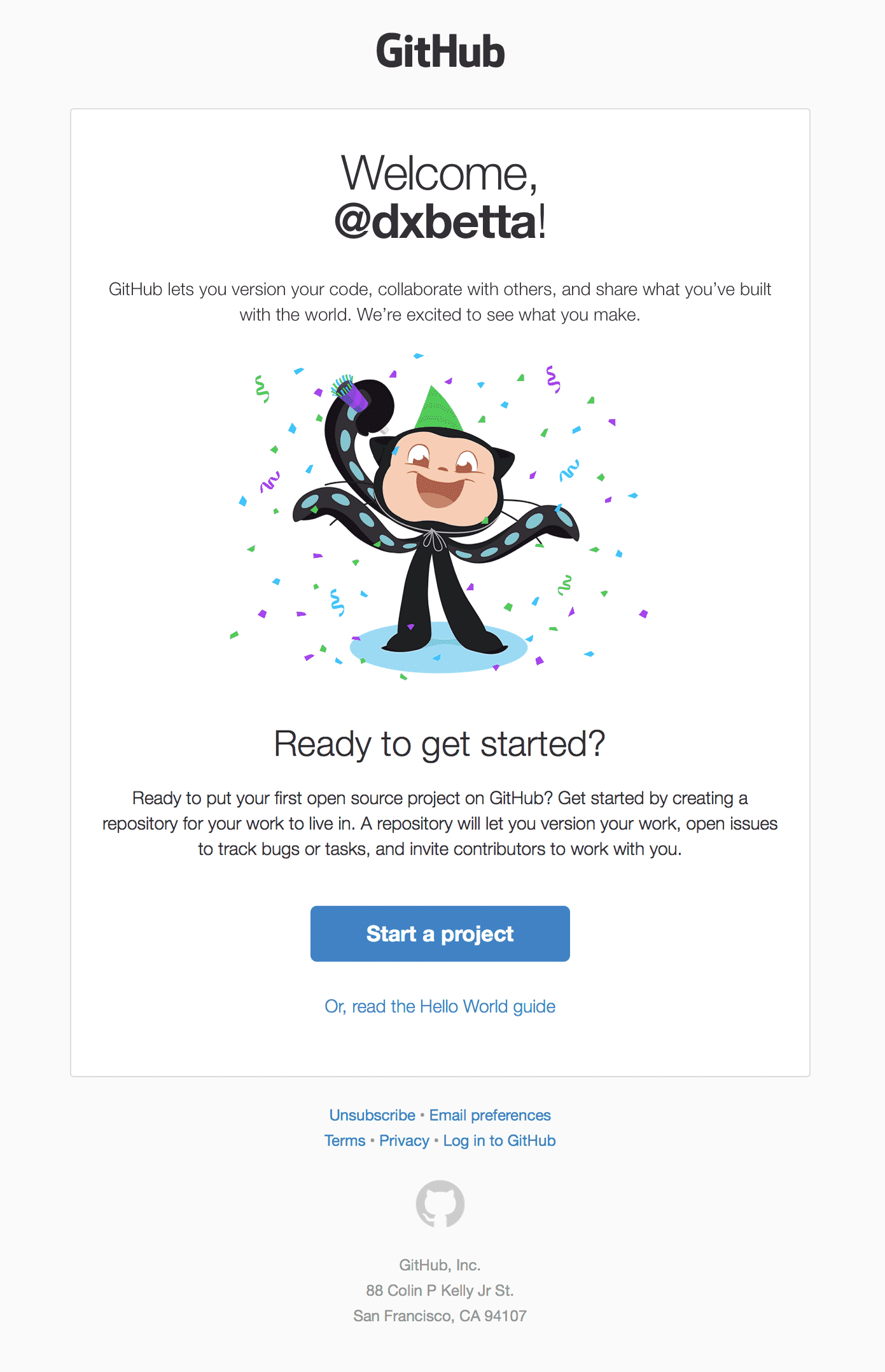
GitHub's welcome email captures the excitement of joining the developer community with the celebrating Octocat, immediately setting a welcoming tone. After establishing a quick value prop, a concise explanation of repositories teaches a core product concept without overwhelming the user. Finally, one clear "Start a project" CTA drives users to take immediate action, with the Hello World guide as a gentler alternative for newcomers.
Google demonstrates how even a tech giant can keep onboarding personal and actionable.

The personalized greeting sets a welcoming tone, while three distinct paths (personalization, app download, security settings) give users control over their experience without overwhelming them.
Smart use of product icons reminds users of Google's ecosystem value without being pushy. The privacy-first approach with prominent security settings builds trust immediately.
They've managed to make account setup feel exciting and value-packed. This balance of simplicity and comprehensiveness is exactly what enterprise-scale onboarding should achieve.
Headspace
The serene visuals and calm messaging immediately communicate the calm users seek, while matching the look and feel of the product. "Happier, healthier life" promises tangible benefits beyond just relaxation, and they address a common objection (time concerns) upfront with copy like "just a few minutes a day."
Smart progression from "Basics" to "Beyond the Basics" gives users a clear, simple learning path. One big CTA drives focused action while the educational content below provides context of what users will likely see next. This is a great example of how wellness apps should onboard—calm, clear, and confidence-building.

Medium
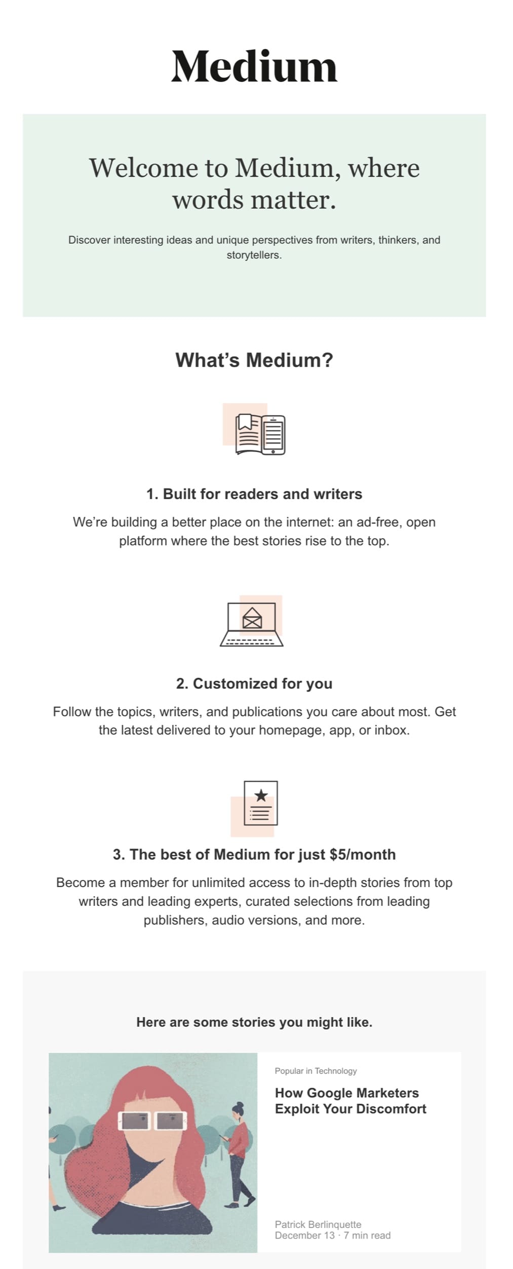
Medium's welcome email leads with a strong brand tagline and a three-point value prop, where the gentle progression from free discovery to paid membership feels natural rather than pushy, and feels like an enhancement rather than a barrier. From there, they include an actual story preview to demonstrate content quality, showing instead of telling. The minimalist design mirrors Medium's clean reading experience, creating cohesion from email to platform.
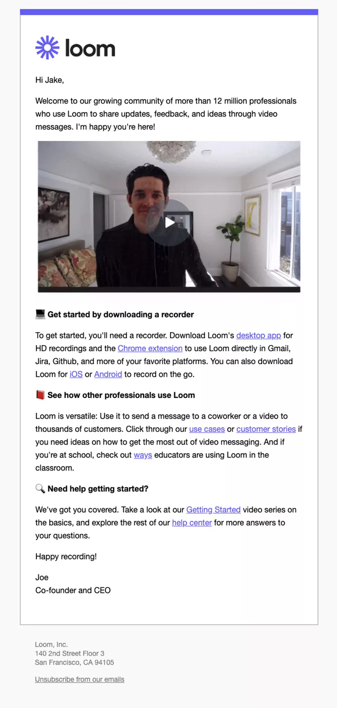
Loom
Loom demonstrates the power of dogfooding your own product to onboard users. A video message from the CEO immediately demonstrates the core value prop (asynchronous video communication) while building a personal connection. The 12 million user proof point establishes credibility, and the multi-platform download options (desktop, Chrome, mobile) ensure users can start recording however they prefer.
This is exactly how product-led companies should onboard: demonstrate the product's value by using it yourself, then make it dead simple to complete that first task.
Supabase
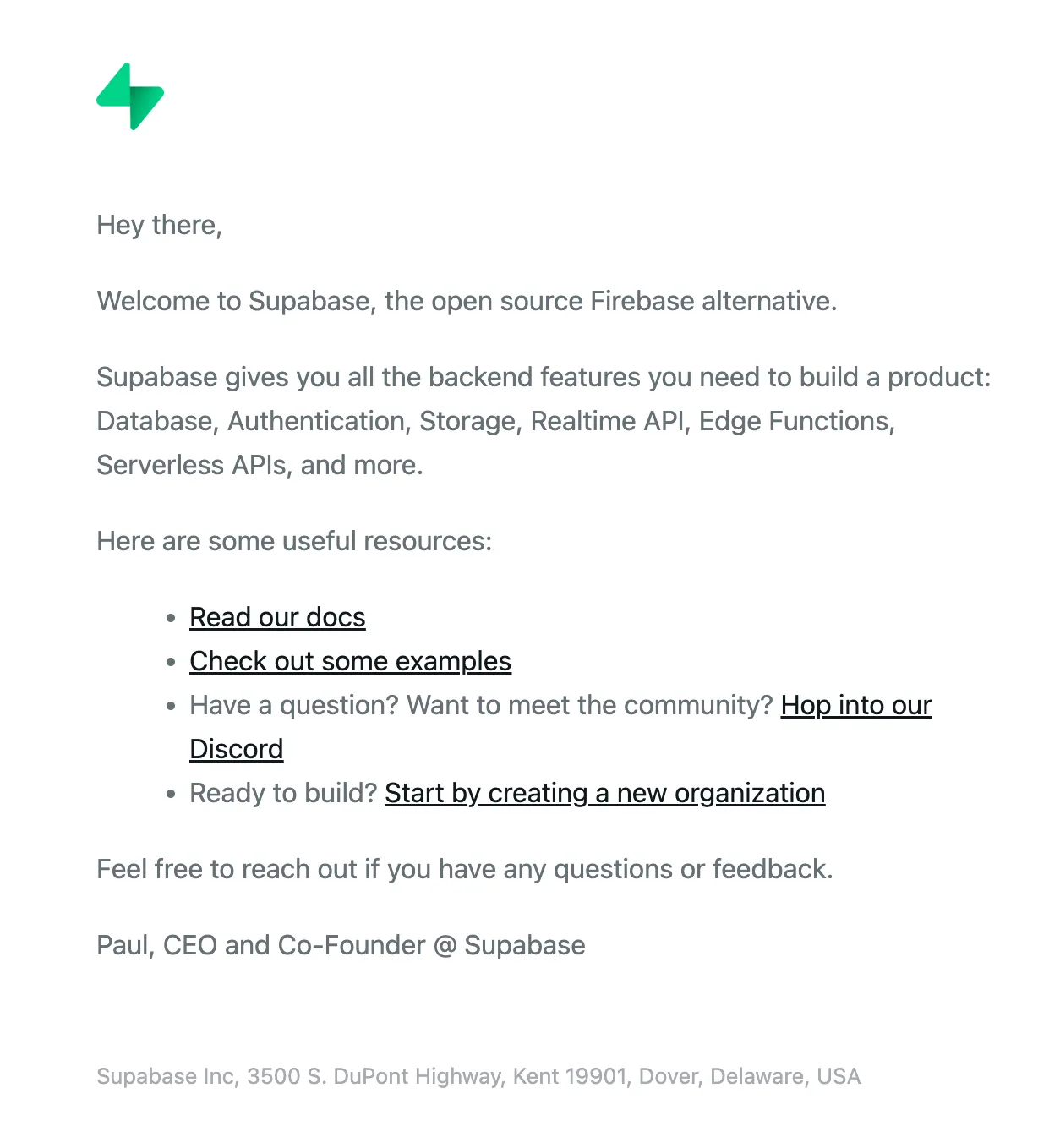
Supabase takes a refreshingly simple approach to their welcome email, opting for a brief, feature-focused value proposition followed by some helpful resources. This minimalistic approach can work great for their developer audience, who may prefer to get started at their own pace.
While the primary action is called out in bulletpoint #4, Supabase could benefit from breaking this out with a button CTA to get more users back into the product rather than presenting lists of features and resources.
Remote
Remote's welcome email is a great example of packing serious value into the welcome experience, so each recipient can choose their own path. This approach works great when users have diverse needs and there can be many paths to a successful customer.

After quickly addressing the core hiring challenge and linking the tools they have to solve it, they provide the option to take an interactive tour, while giving users a concrete preview of the interface to reduce uncertainty. Then, dual CTAs show more high-value options, to add a team member or see a demo. Finally, if the user still hasn't clicked, they provide 2 valuable free tools that address common user concerns.
While dense, Remote understands their audience needs comprehensive information upfront when dealing with complex global hiring. This depth builds confidence in a high-stakes decision.
Arcade
Arcade cuts straight to practical onboarding with five actionable tips that respect users' time and suggest a simple, orderly onboarding journey. This approach works well for PLG tools that help with common, well-understood tasks – skip the philosophy, focus on helping users get started.
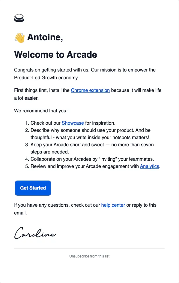
Within the short numbered list, this email removes friction (Chrome extension), provides inspiration (Showcase), demonstrates a use case (product demo), highlights best practices ("no more than seven steps"), and points out a valuable feature (Analytics).
From there, the email provides a quick button CTA to jump into the product, and explains the resources available to them if they get stuck. The email finishes off with the Founder and CEO's signature to create connection without any fluff.
Basecamp
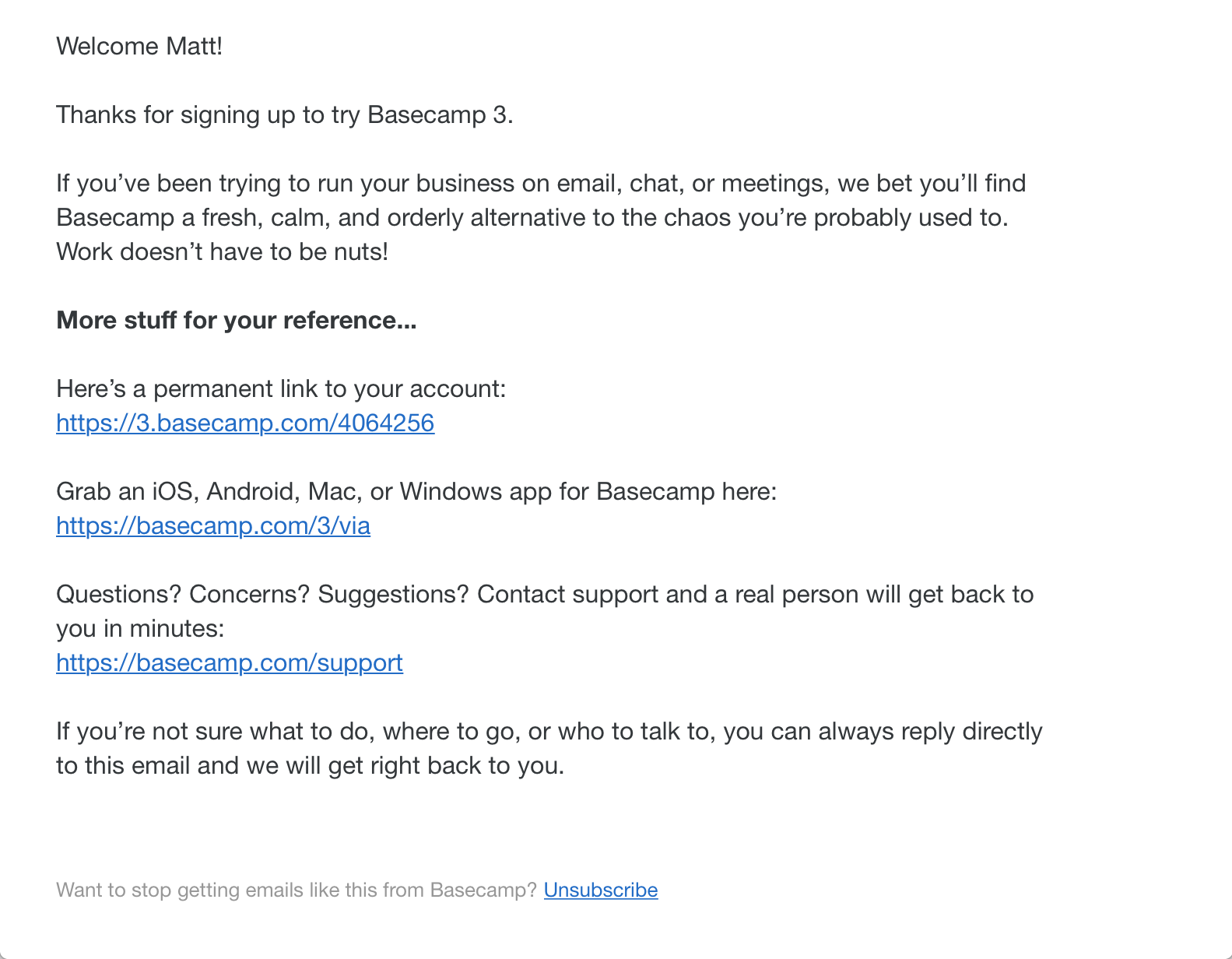
Basecamp proves that sometimes less is more in welcome emails. Their positioning against "email, chat, or meetings" chaos immediately resonates with overwhelmed teams, while "fresh, calm, and orderly" paints the perfect contrast, and matches the vibe of the email itself.
The links to the user's account, mobile app downloads, and Basecamp support are pure utility, not pushing users down a specific path or up-selling any features, just giving users what they need. This builds trust that the Basecamp team is purely focused on helping users succeed.
Todoist
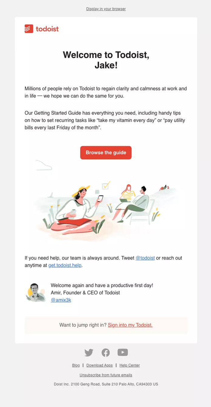
Todoist's welcome email is a great example of how productivity tools should position themselves: not as a new tool to learn, but as a path to a more peaceful day.
Rather than listing features, they provide common, practical examples to demonstrate the power of the tool. The choice to show a relaxed illustration instead of a product screenshot reinforces their calm productivity message visually. Finally, closing the email with the founder's picture and a sign-off message while providing multiple support channels shows that Todoist has your back.
WorkOS
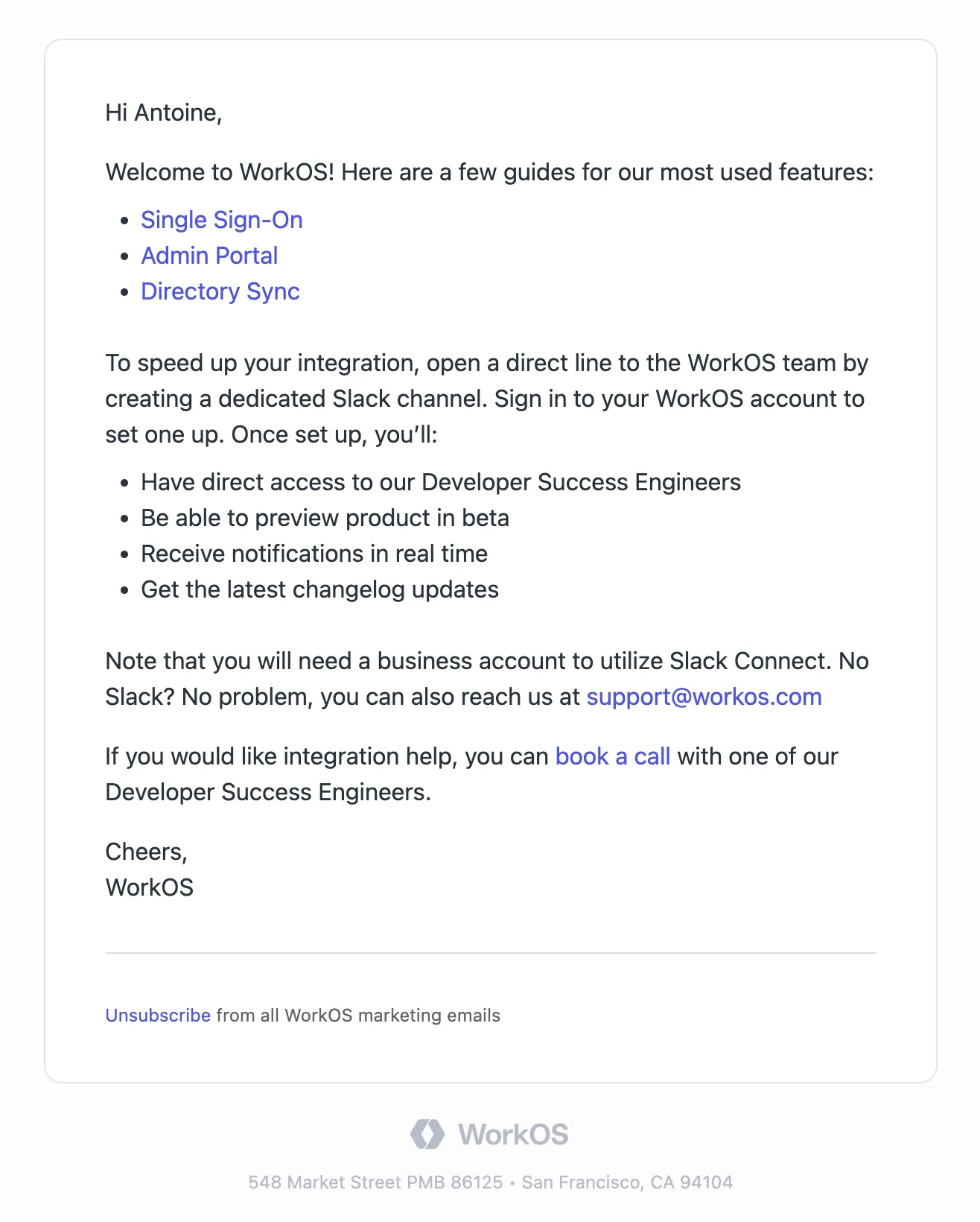
WorkOS takes a no-nonsense approach that respects technical buyers' time by providing what they need with zero fluff. They immediately lead with documentation for their three core features (SSO, Admin Portal, Directory Sync), which is what the majority of new users need to get started.
Then, the offer to create a dedicated Slack channel with the WorkOS team provides a modern alternative to traditional support, providing direct access to WorkOS DSEs. This works great for a product with users that have a variety of complex integration challenges.
When to trigger and send a welcome email
Welcome emails should send shortly after signup, as most consumers expect some form of confirmation. If you have a product onboarding flow in place, best practice is to wait for the user to interact with the onboarding flow (and the product) before sending an email.
Welcome emails are straightforward notifications to send and can be handled by most marketing automation tools, but it can be helpful to keep them in the same system as your product notifications for a couple of reasons:
- Product data. Having access to product data helps improve user experience because you can trigger welcome emails conditionally based on product events. For example, if the user has already interacted with part of your product that you call out in your welcome email, you might just cancel the notification altogether to spare their inbox.
- Consistent branding. Sending welcome emails out of the same system as your product notifications also helps keep consistent branding between all notifications a user might receive from our product.
Send engaging welcome emails with Knock
The most effective welcome emails in 2026 balance sophisticated automation with genuine user value, creating first impressions that convert subscribers into engaged customers through experiences that feel both personalized and purposeful.
Developers, PMs, and marketers use Knock to create sophisticated user messaging workflows that drive engagement, growth, and retention. Messages can be sent across any channel (email, push, SMS, in-app, chat) using the same design system as your product, to create a cohesive user onboarding experience.
Whether you need to send a welcome email or trigger product notifications across many channels, Knock can help. If you'd like to try it out, you can sign up for a free account or chat with our team. 👋