In-app messaging is a great way to engage users as they use your product.
But a lot of companies get it wrong, if they use it at all.
Well-crafted in-app messaging can help your users and improve engagement, while mediocre or generic messages can hurt user experiences.
In this post, we’ll analyze 18 real examples of effective in-app messages from leading SaaS companies, revealing the specific elements that drive engagement.
What is in-app messaging?
In-app messaging refers to any message that appears directly inside your product interface rather than through external channels like email or SMS. It’s a common way SaaS companies guide, educate, or prompt users in the exact moment of interaction, where behavior change is most likely to happen.
Think of it as the connective tissue between product and marketing—a way to move users toward activation, retention, and expansion without leaving the app.
Benefits of in-app messaging
When done right, in-app messaging improves both engagement and efficiency, helping users succeed faster and teams communicate smarter.
- Accelerates activation. Personalized in-app prompts can help new users discover value faster, turning passive signups into active users.
- Drives feature adoption. Announcing new functionality inside the workflow dramatically increases the likelihood it’s seen and used.
- Reduces churn. Proactive tips, alerts, and reminders prevent user confusion before it turns into frustration or cancellations.
Beyond engagement metrics, great in-app messaging compounds over time because it can be used to educate users, train behavior, and strengthen product stickiness.
Types of in-app messages
In-app messages come in several formats depending on visibility, urgency, and the desired action. The three most common message types are:
- Banners. Colored bars at the top or bottom of the screen, usually using text to announce new features or scheduled maintenance. Visible but not obnoxious.
- Cards. Similar to banners, cards are often positioned in a static area of your product screen that is noticeable but not distracting. This format is often used to highlight new features as it allows for images more easily.
- Modals. The "stop everything" pop-ups that dim the background. Reserve these for critical stuff like session timeouts or confirming destructive actions.
Other variants include tooltips, checklists, and inline hints, which are more contextual and action-oriented. Choosing the right format for your message depends on how interruptive you want it to be and what kind of response you expect from users.
18 real SaaS examples of effective in-app messages
Now that we’ve covered what in-app messaging is and how to use it effectively, let’s look at what great execution actually looks like.
The following 18 examples from leading SaaS companies show how in-app messages can educate, prompt action, and drive retention without feeling intrusive.
We’ll break them down by message type (like banners, cards, modals), message category (like new feature, changelog, upsell), and why they work, so you can adapt similar practices with your own in-app messaging.
Linear
Linear introduces its Product Intelligence feature with a clean, image-driven card that blends naturally into the product interface. The tight copy explains the benefit in one line without fluff. It works because it’s fast to read and visually clear, ideal for surfacing new functionality in a workflow-heavy tool.
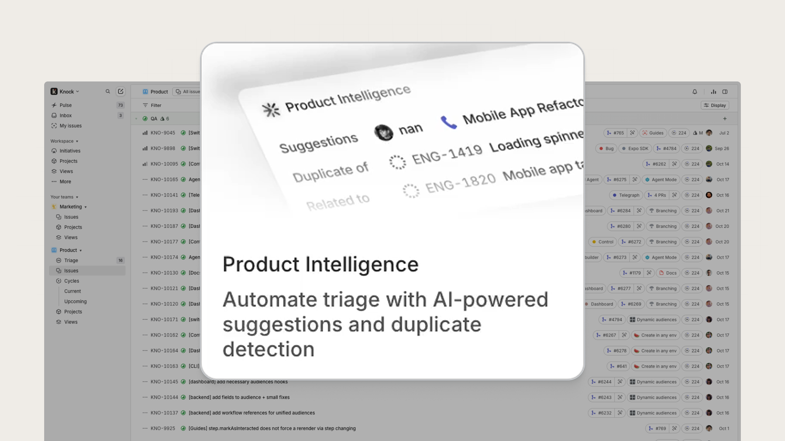
An example of a new feature card from Linear
Cursor
In this first example from Cursor, the team used a small in-app card to announce the new Cursor Web capability, blending naturally into the product’s dark UI without overwhelming it. The design is visible yet subtle, and uses concise copy and a clear “Try it out” button to encourage feature adoption. It works well because it meets users inside the dashboard, making it feel like a discovery rather than a disruption.
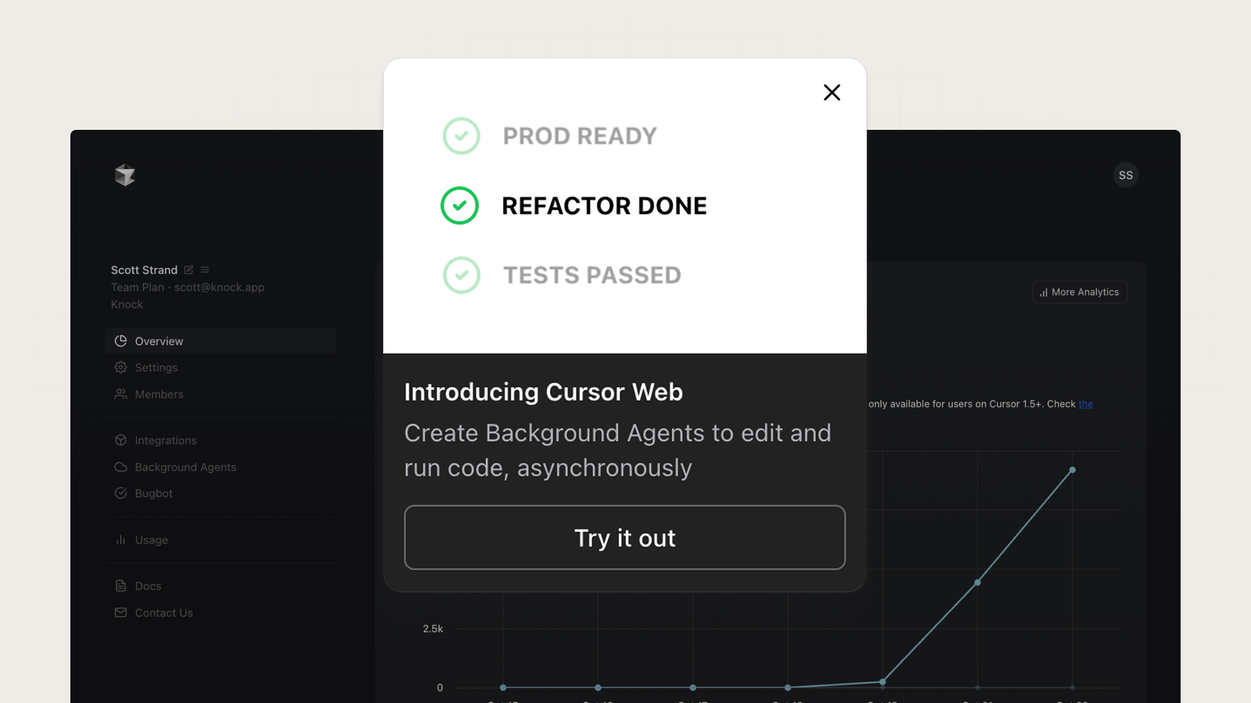
An example of a new feature card from Cursor
Next, this changelog modal highlights what’s new in the latest version of Cursor, combining multiple updates in one focused layout. By grouping features under clear subheadings with small icons and “Beta” labels, the message feels efficient and professional. The “Continue” CTA gives users a clear path to continue to the product after reading. It works because it respects the user’s time, communicating multiple improvements in a scannable, one-stop format rather than separate pop-ups.
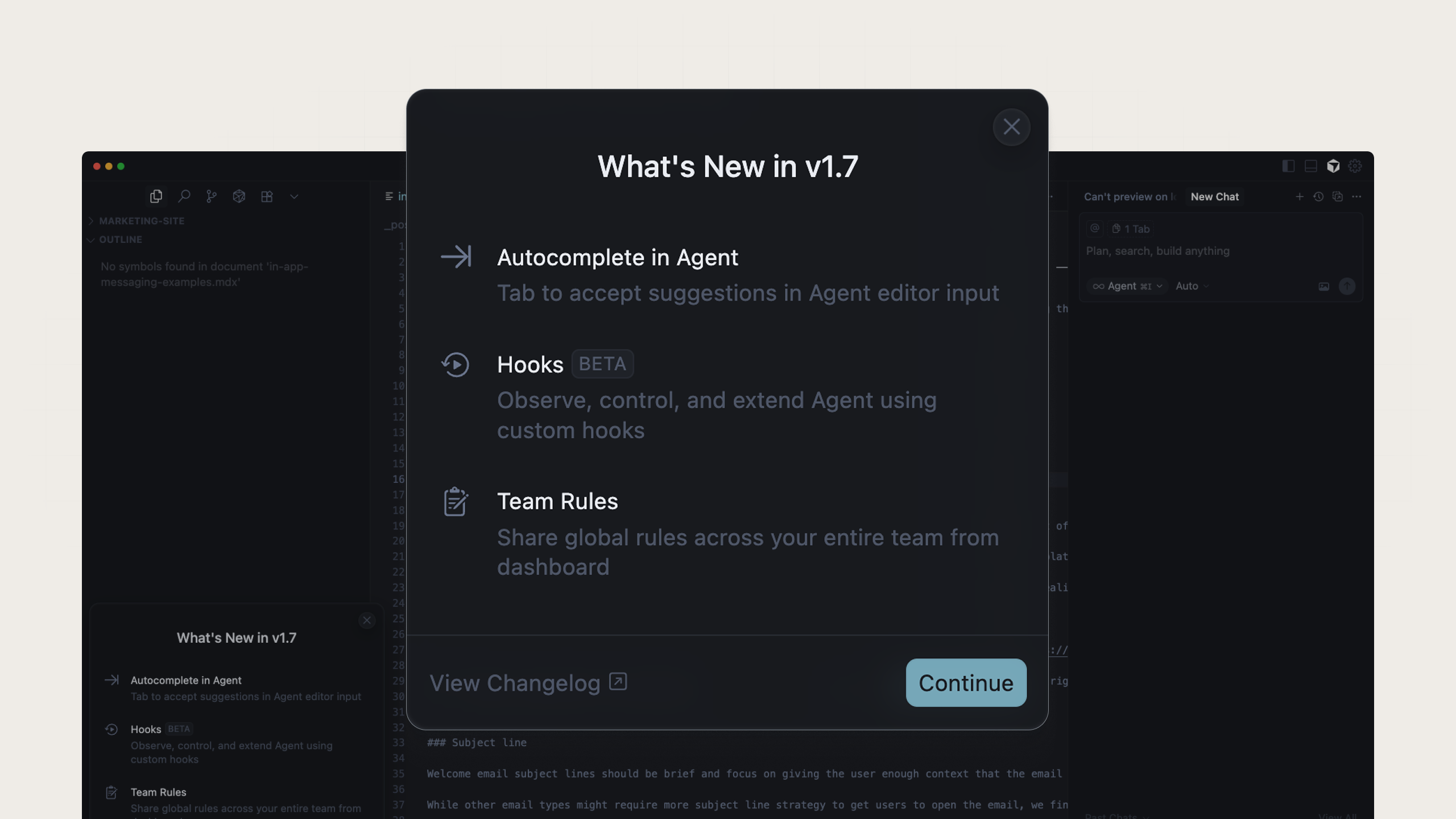
An example of a changelog modal from Cursor
Loom
This modal highlights Loom’s AI features with an interactive, value-driven layout and two CTAs for different intent levels. The visual flow guides the eye across use cases, and clear imagery shows how AI enhances productivity rather than telling. Users can get a lot of details without having to navigate somewhere else, increasing their chances of upgrading.
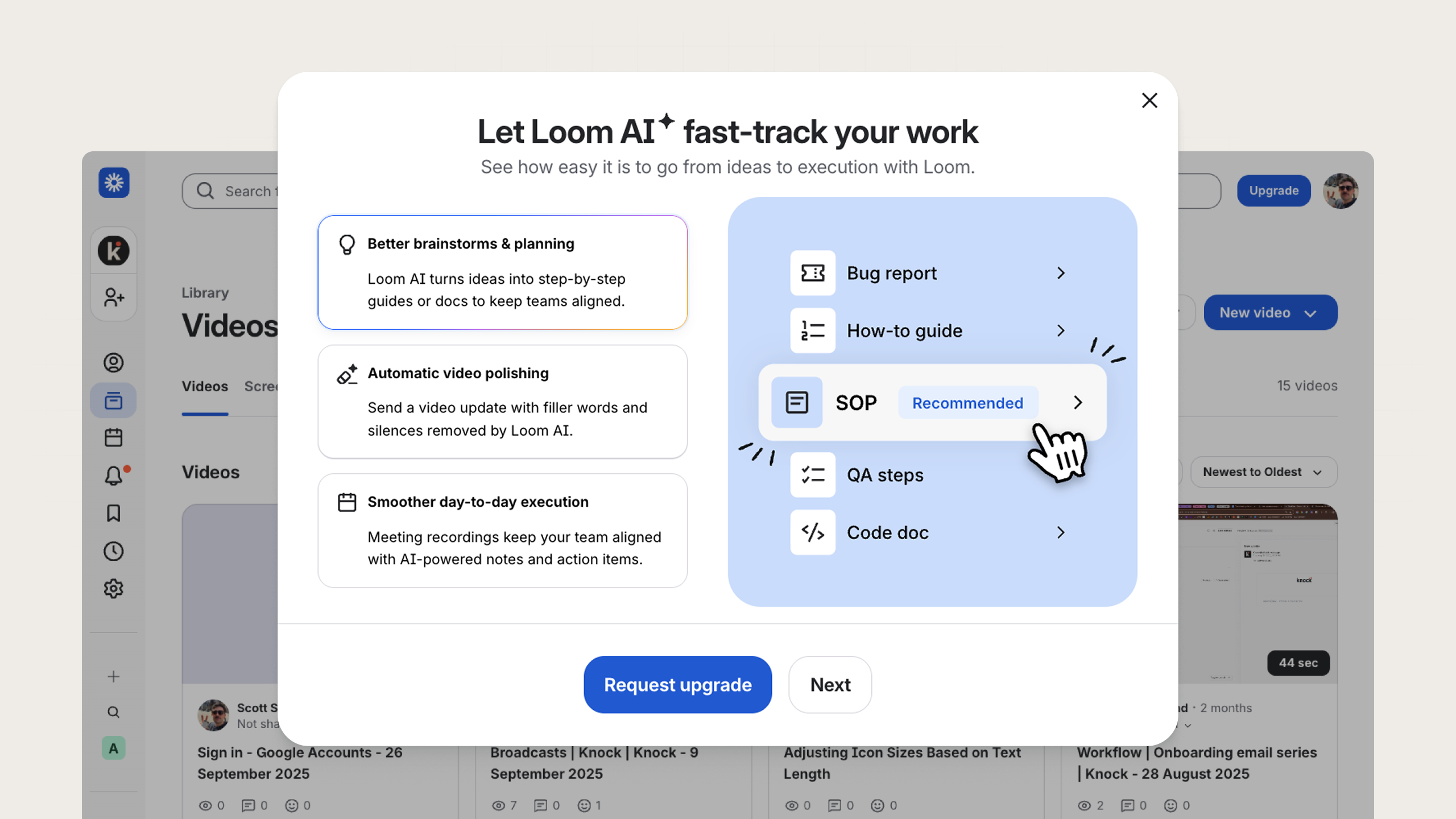
An example of an upsell modal from Loom
Loom also uses a checklist-style onboarding modal that tracks progress through key setup actions for their product, like recording and sharing. The simple checklist layout and progress bar create a small dopamine loop that encourages completion, an obvious win for product onboarding.
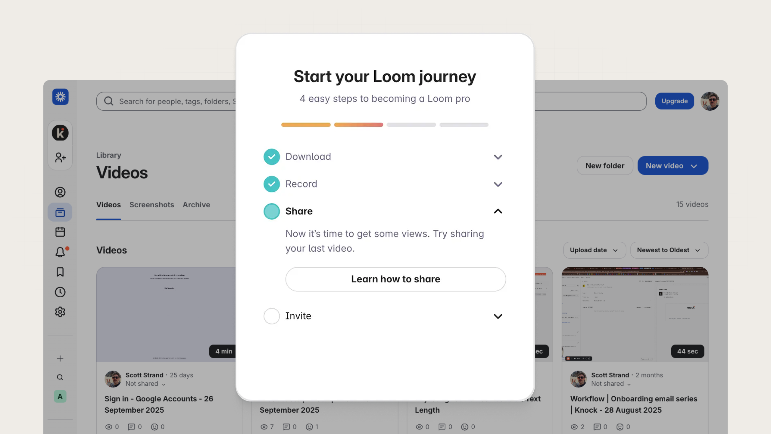
An example of a checklist card from Loom
Figma
In this first example from Figma, a modal introduces a major product update, inviting users to “Take the tour” of the new Figma experience. The headline is bold and confident, the description explains what’s changed, and the call-to-action leads directly into an interactive walkthrough. It works because it’s both informative and actionable.
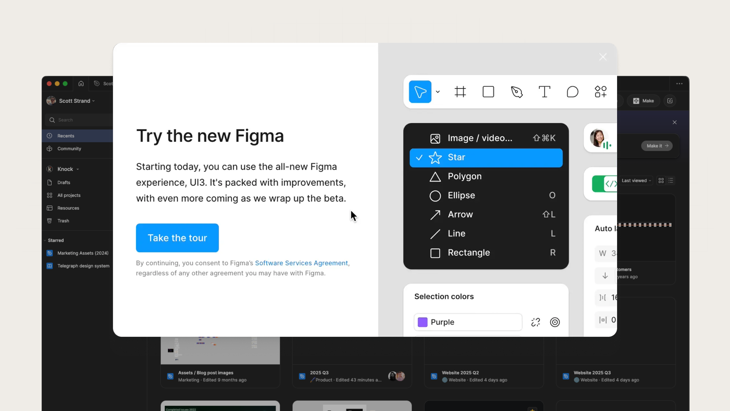
An example of a new feature modal from Figma
Next, this small, dark-themed modal uses a clean visual hierarchy to promote upgrading to an Organization plan. The concise copy explains exactly what value users gain, and the bright “View plans” button stands out against the neutral background. It works because it’s highly contextual (it only appears when users encounter features limited to higher tiers), making the upsell feel helpful, not pushy.
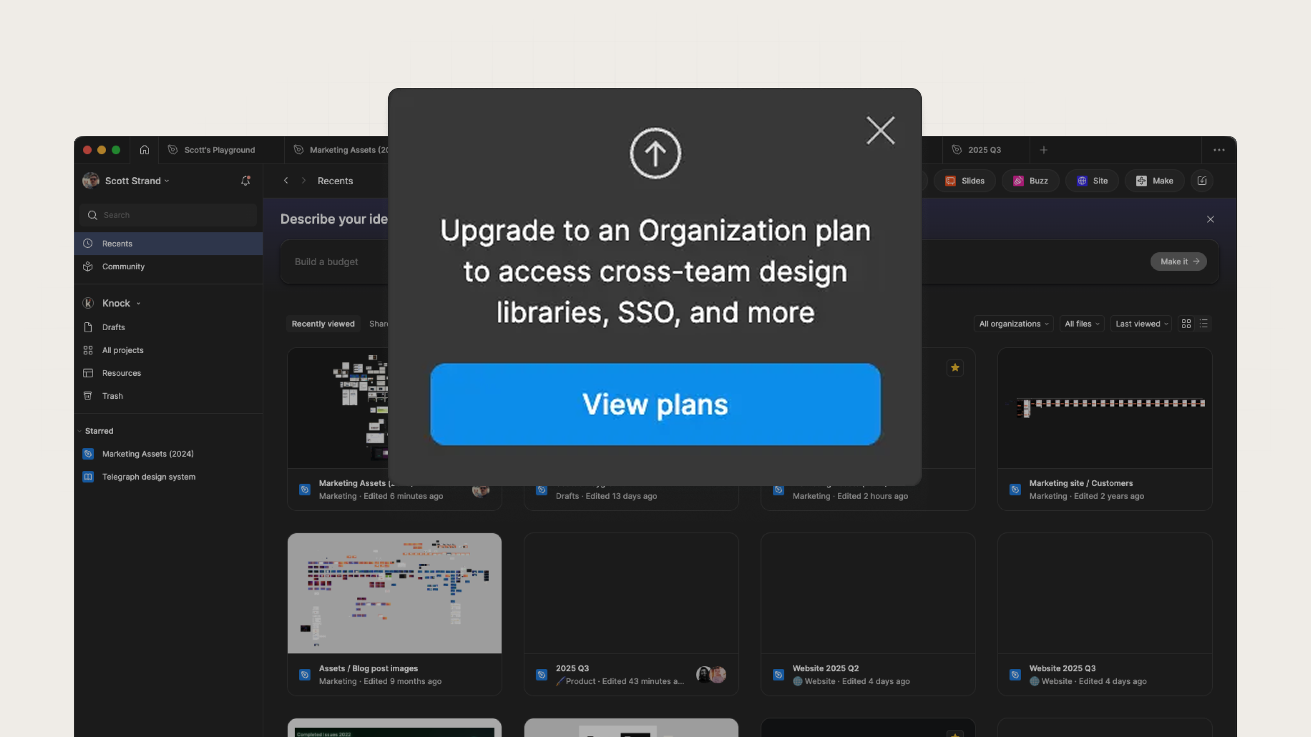
An example of an upsell card from Figma
Github
This first example from GitHub introduces its redesigned Projects feature using a large banner at the top of the page. The mix of short, benefit-focused copy and an inviting image makes it immediately clear what’s new. The “Learn more” CTA provides an easy next step without demanding attention. It works because it’s positioned front and center as soon as users login, meaning high visibility and low friction.
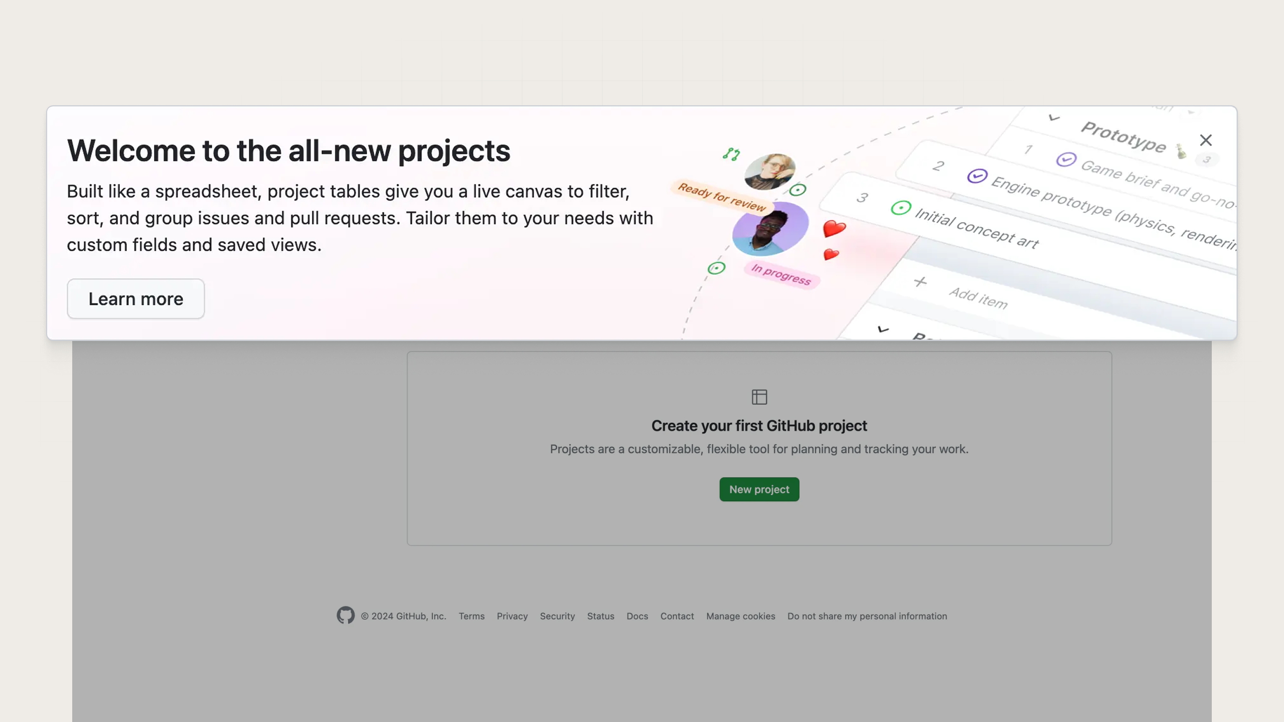
An example of a new feature banner from Github
Next, they use a banner to highlight a feature reserved for enterprise accounts, custom roles and permissions. The visual treatment feels elevated with dark mode styling, clear typography, and two distinct CTAs depending on how ready a user is to act. This gives users a path toward conversion or education with clear intent toward conversion.
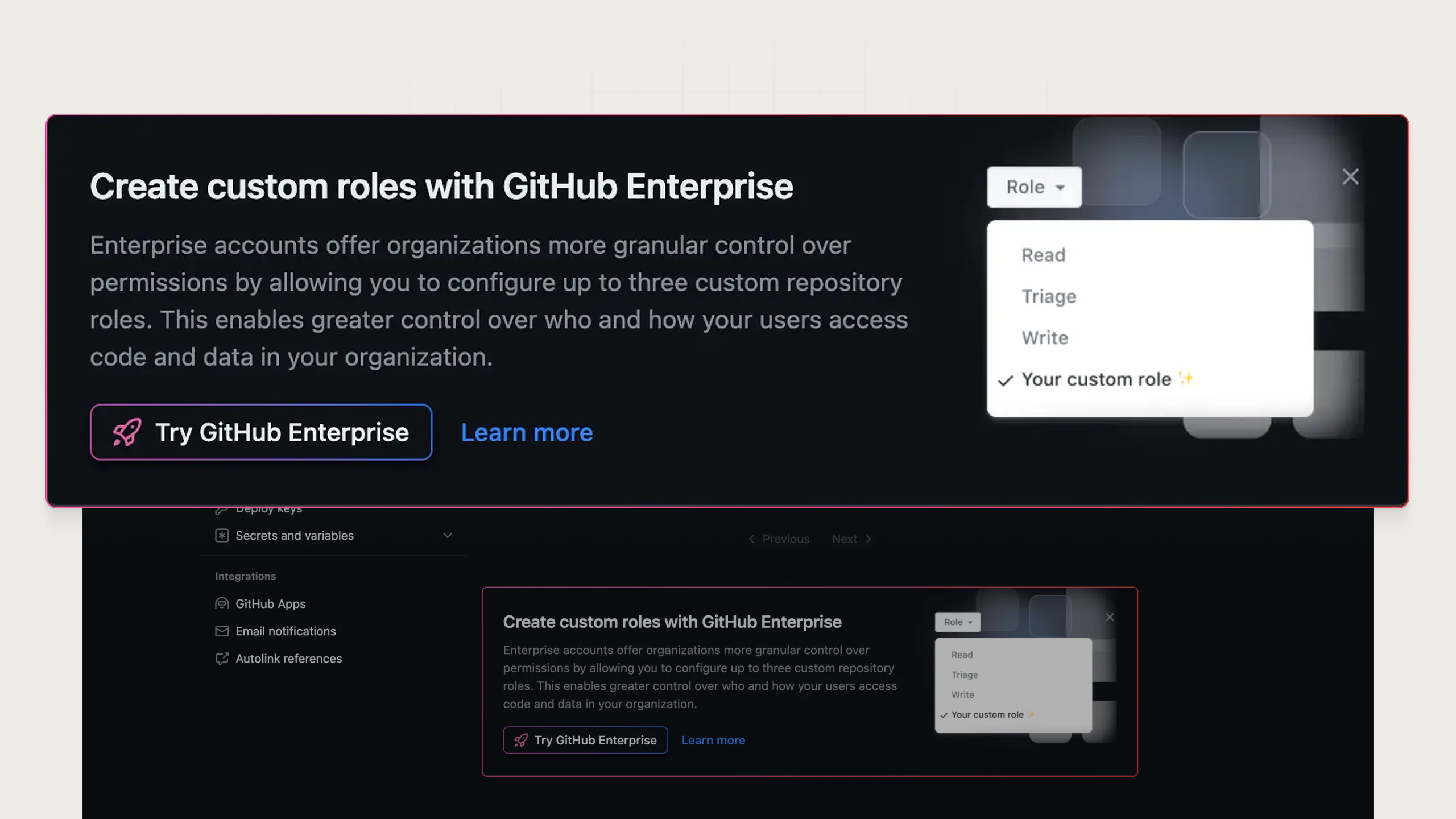
An example of an upsell banner from Github
Rippling
Here, Rippling introduces its global payroll expansion with a balanced split-screen modal—visual on the left, clear copy on the right. The copy leads with scope and follows with impact, while offering two clear CTAs to different conversion paths. It offers education but focuses on conversion so users act fast.
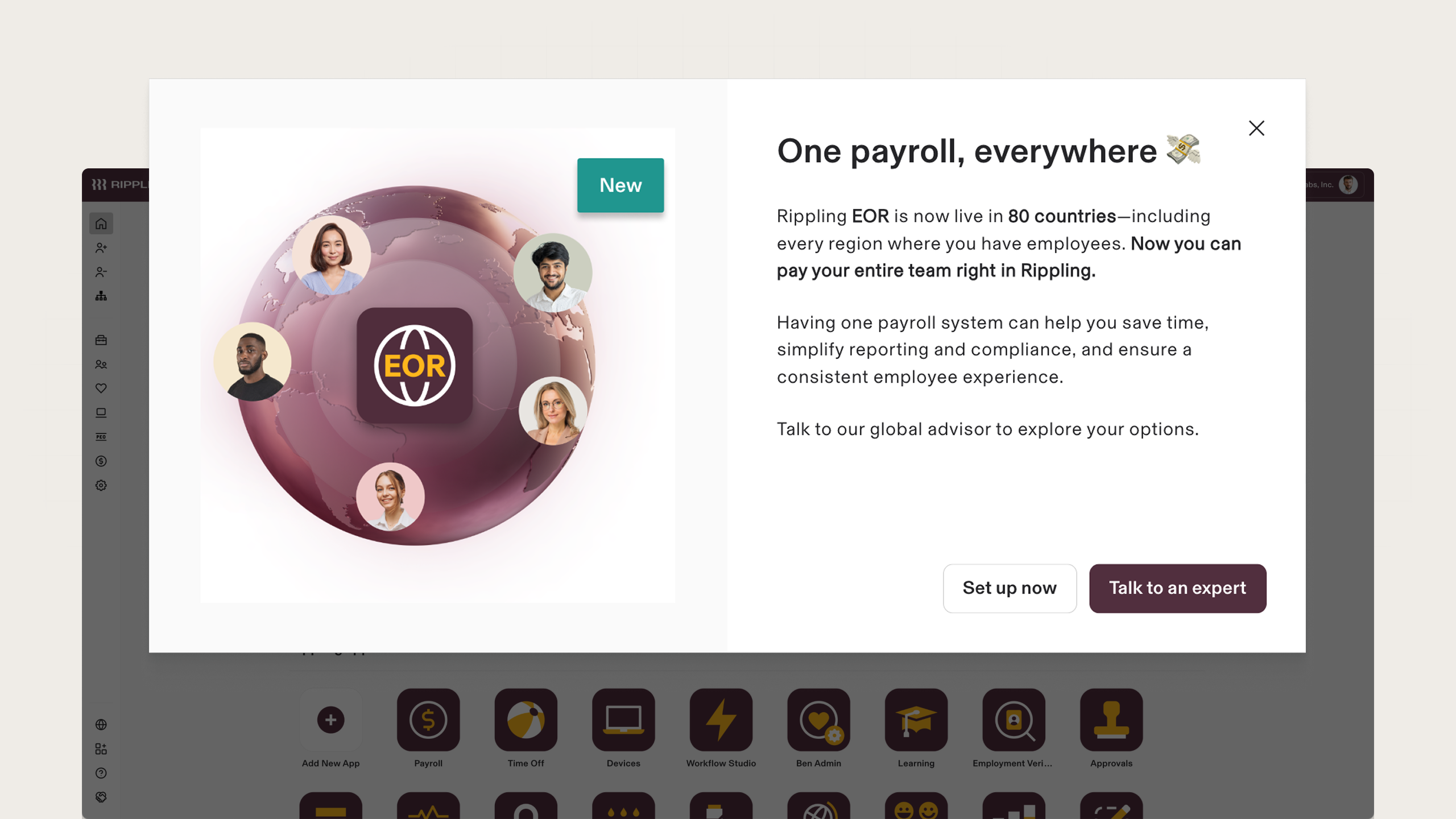
An example of a new feature modal from Rippling
Notion
First up, this compact changelog card highlights what’s new in the latest Notion release with a friendly icon and a concise link to “See what’s new.” It’s informative without cluttering the workspace or interrupting the user. Just a quick update giving context at a glance, that also allows for curious users to dive deeper if they want.
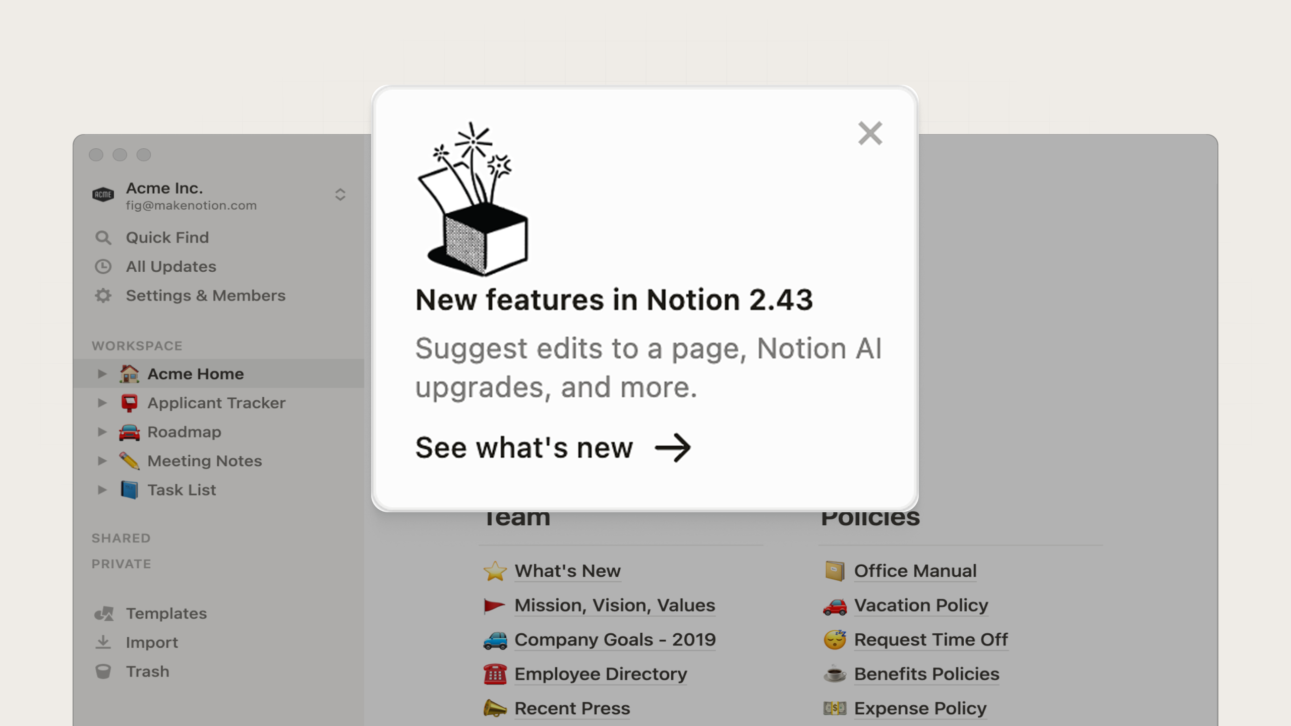
An example of a changelog card from Notion
Next, this modal from Notion introduces its new Charts feature, with bold visuals and short, scannable text. The “Show me” CTA indicates an interactive tour, while the optional “Skip” button lets a user get back to using the product. This is another good example of in-app messaging that respects user flow.
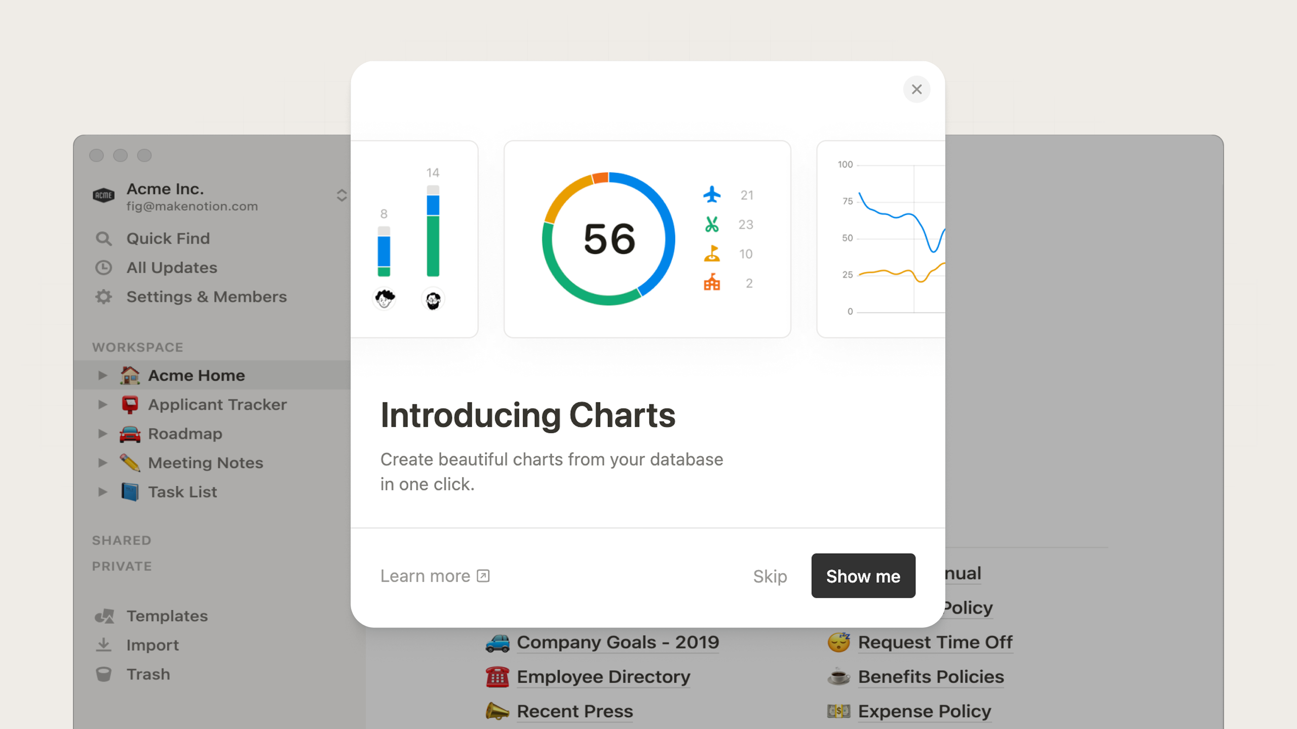
An example of a new feature modal from Notion
Notion also uses in-app messaging to promote its campaigns and events. This small card invites users to register for Notion’s annual ‘Make with Notion’ conference. By adding the event date and a discount code, it feels personal, exclusive, and time-bound—perfect for driving event registrations.
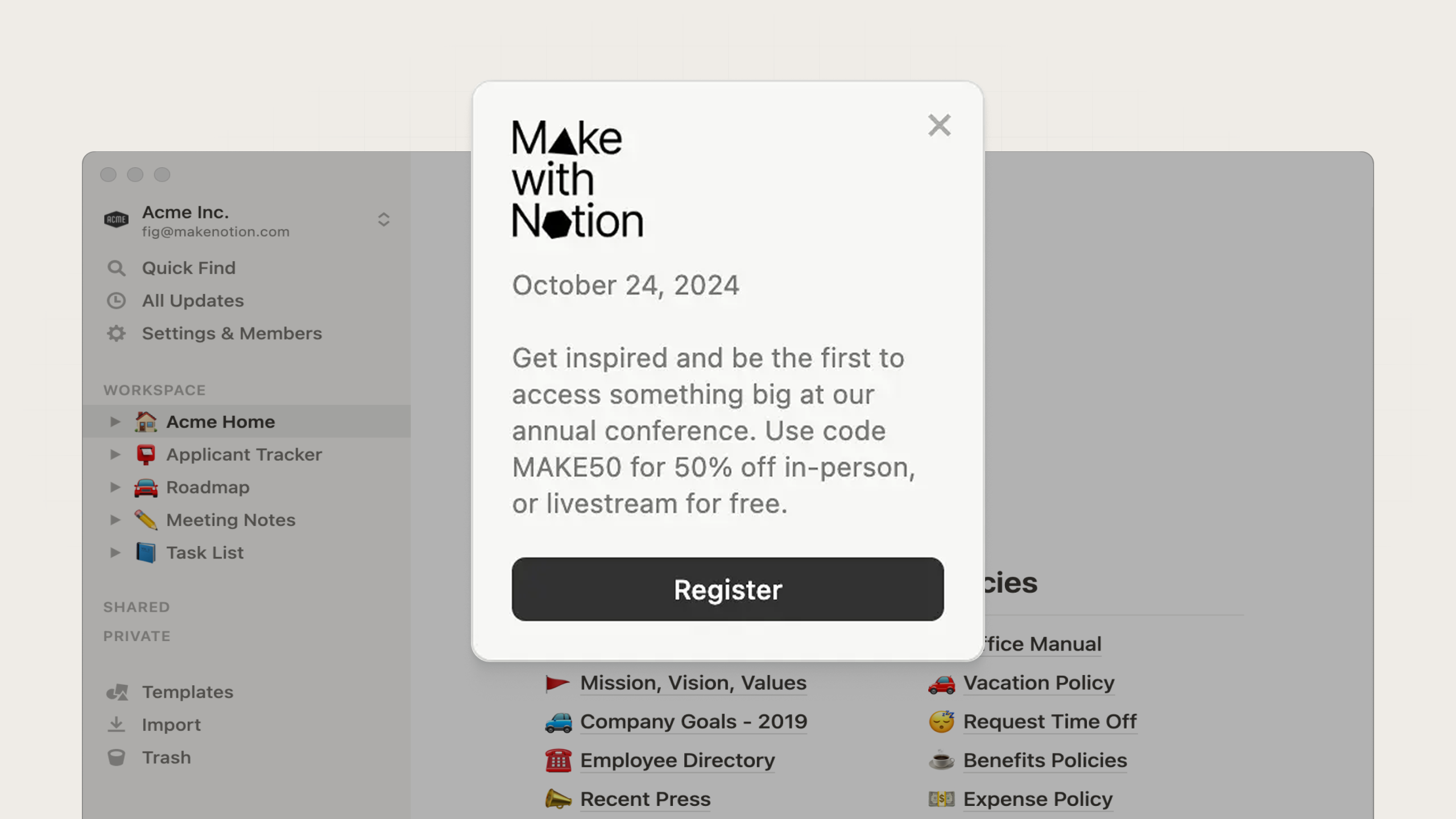
An example of a promotion card from Notion
Ramp
In this modal, Ramp pairs minimal text with a simple line illustration to hint at some new app integrations. The bright CTA against the dark-mode background immediately draws attention, while the concise copy clearly explains the value. It works because it’s direct, visually striking, and clearly tied to utility.
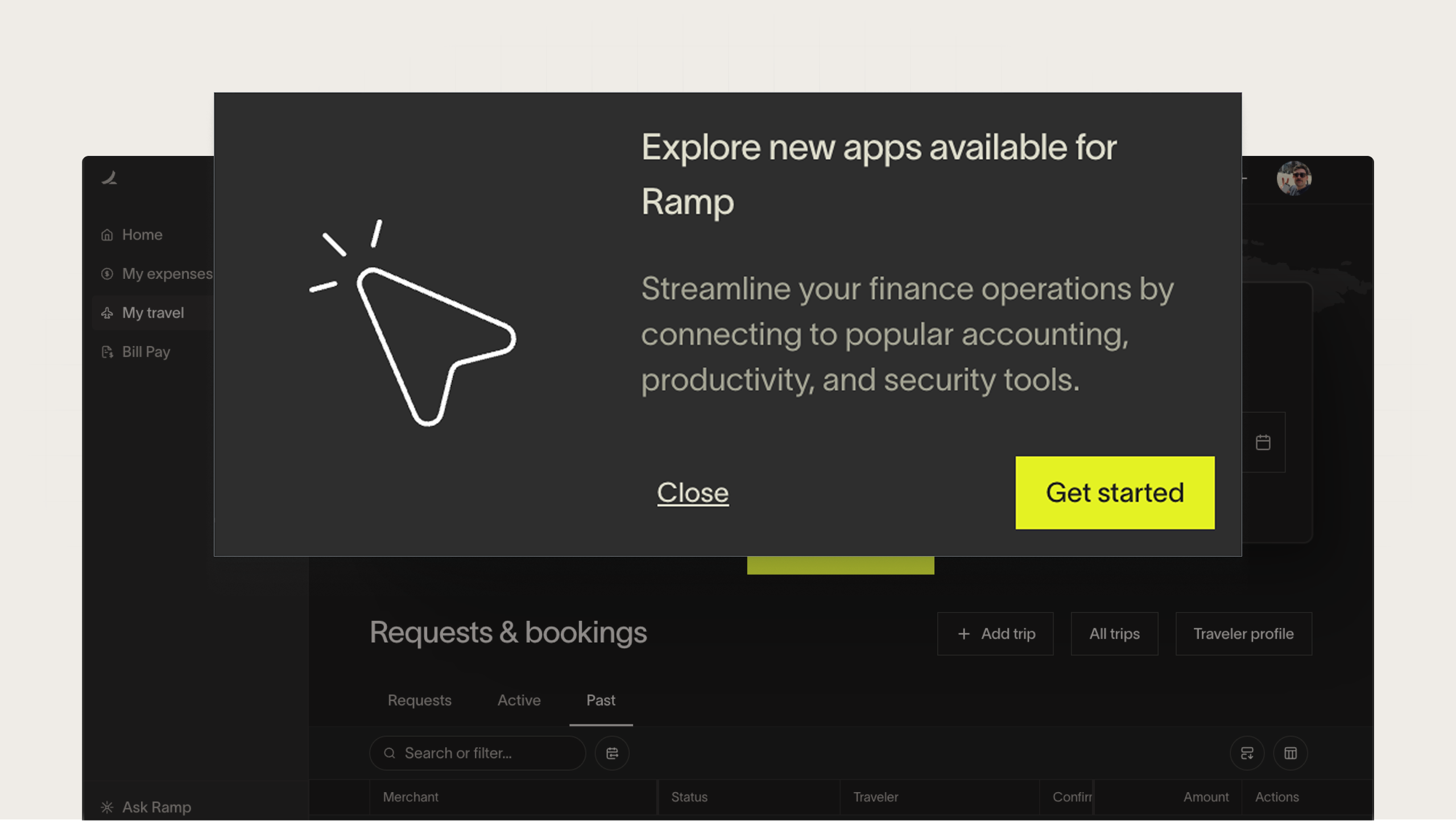
An example of a new feature modal from Ramp
Next, this small card in the sidebar serves as a minimalist reminder that a user’s Ramp Plus trial is ending soon. It creates a sense of urgency while blending seamlessly into the product, and the subtle text CTA drives curiosity and makes the product experience feel personal.
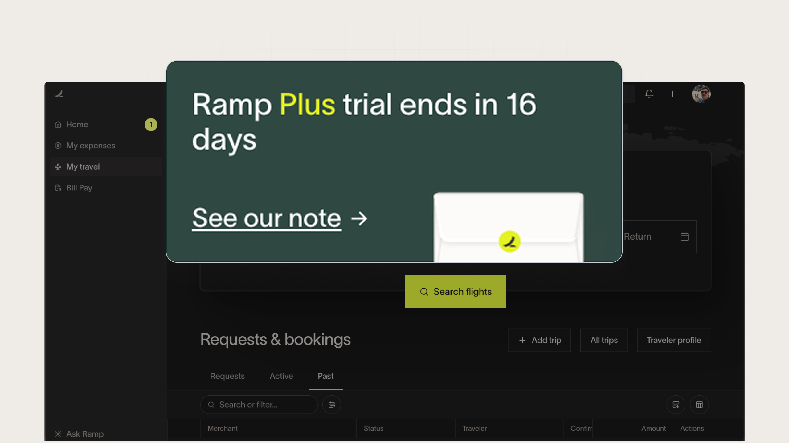
An example of an upsell card from Ramp
Airbnb
When Airbnb launched Guest Favorites, the team used a centered in-app modal to introduce the new feature, instantly capturing attention the moment users log in. The large, minimalist layout, paired with a clear headline, short explainer, and single CTA, drives quick understanding and presents the option for additional discovery.
Besides being an elegant interruption that’s easy to dismiss or act on, it works because the message feels useful and relevant to Airbnb’s browsing experience.
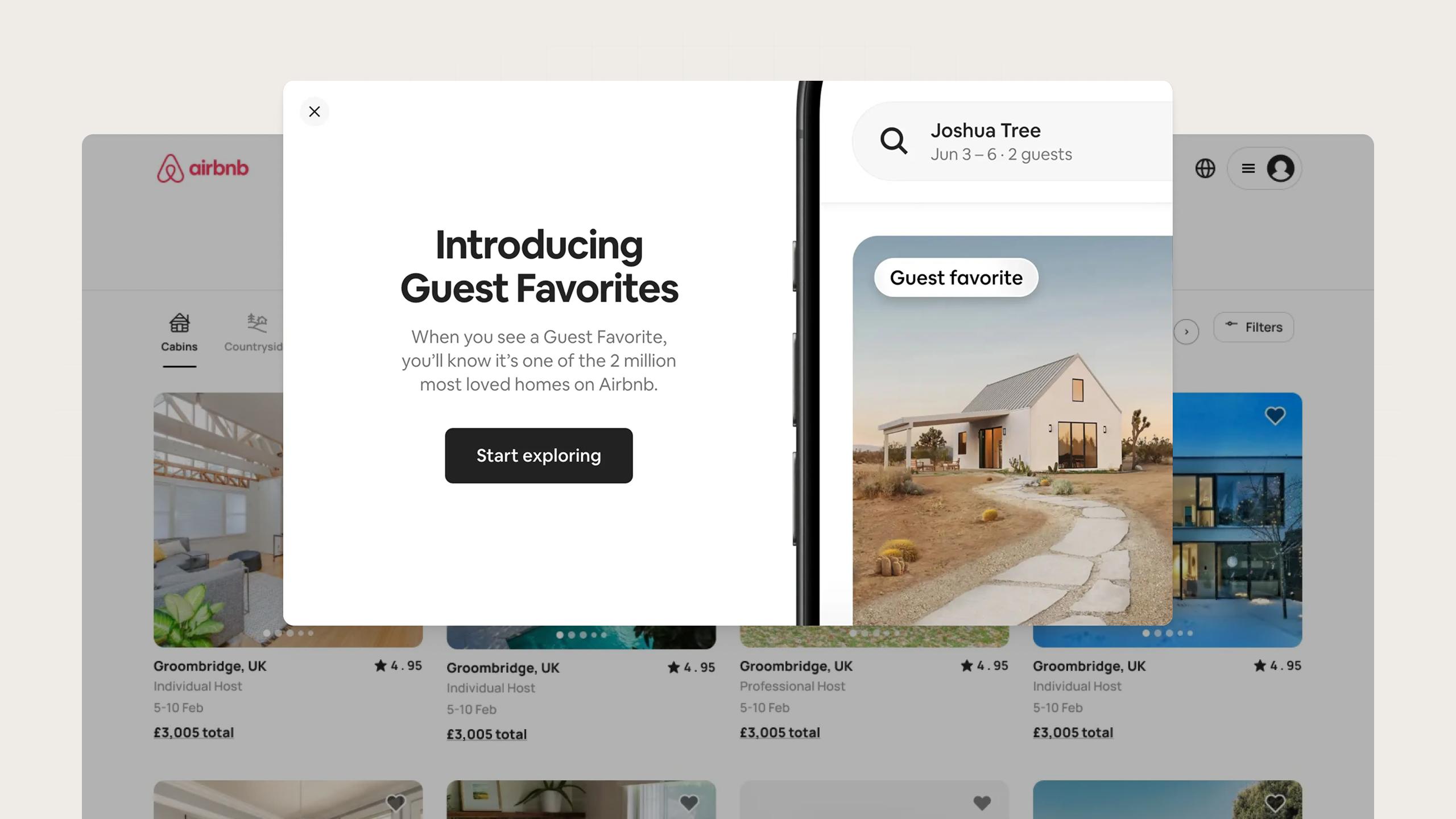
An example of a new feature modal from Airbnb
Dub
Dub’s in-app card announces a new feature using a minimal layout. Positioned subtly in the app’s sidebar, it doesn’t demand the user’s attention, but the image still draws the eye while the truncated text hint there is more to explore. It works because it feels like a lightweight discovery moment, inviting curiosity without demanding action.
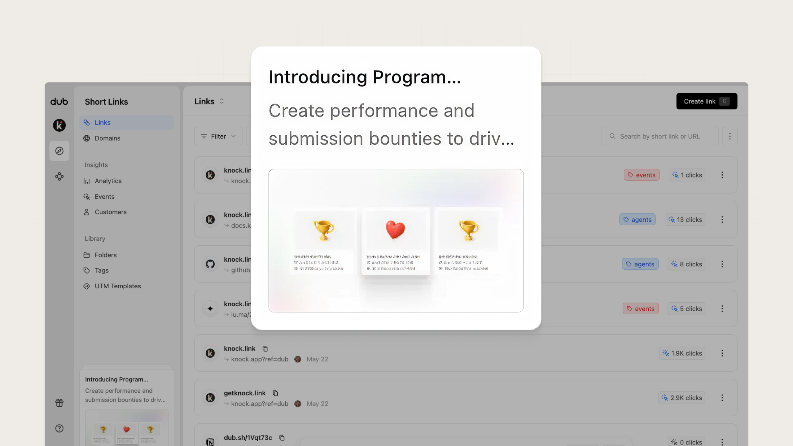
An example of a new feature card from Dub
Google Drive’s modal announcing dark mode mirrors the interface users will experience once they apply the change, which builds confidence in the action. The microcopy adds a touch of delight and works well with a feature that lets users personalize their environment.
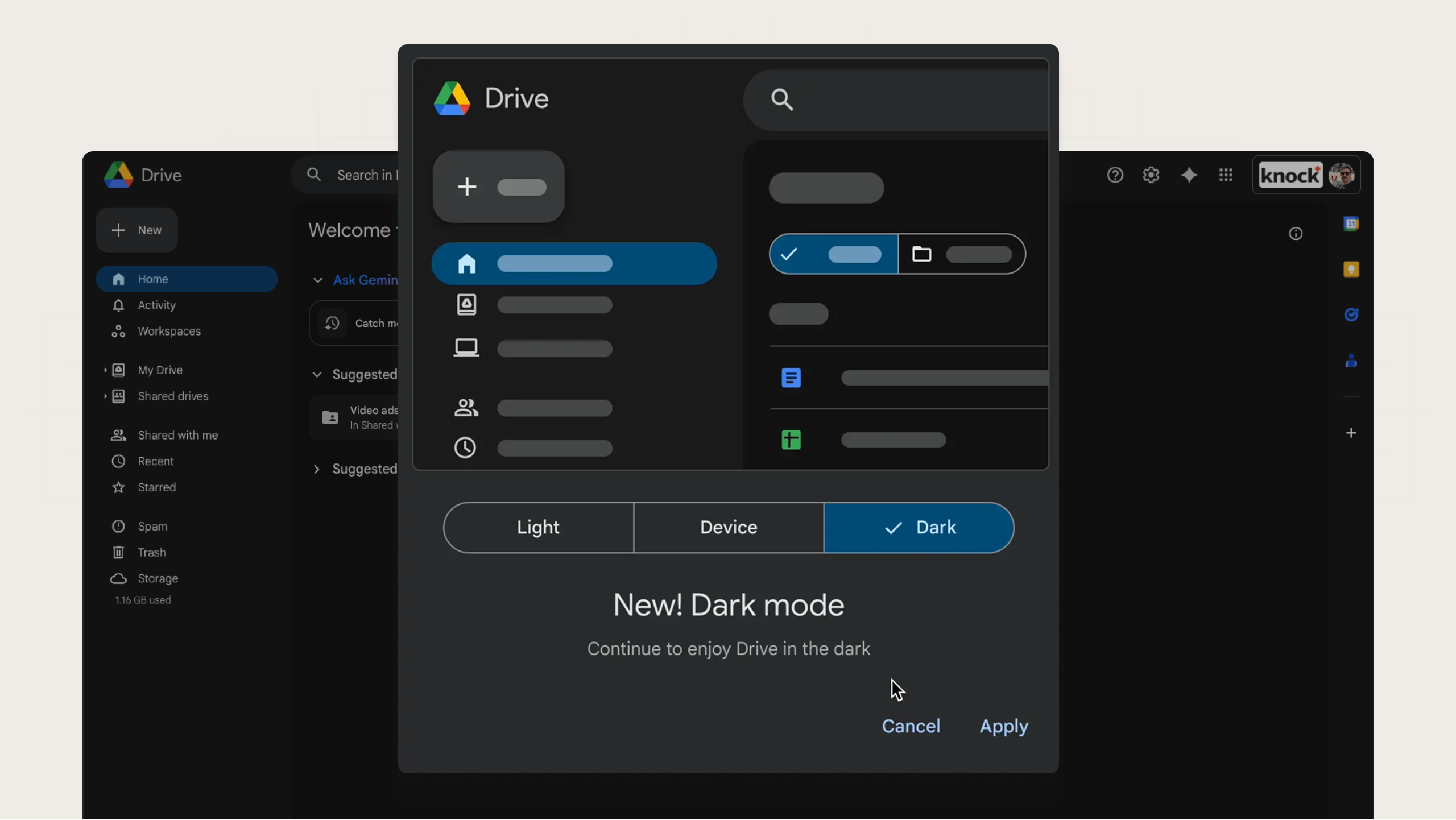
An example of a new feature modal from Google
Common mistakes to avoid
Misuse of in-app messaging can lead to poor user experiences that ultimately hurt adoption, reduce engagement, and even lead to inactivity or churn. To ensure you’re getting the most out of in-app messaging, make sure to avoid these common mistakes.
Notification overload
Bombarding users with in-app messages can cause banner blindness or irritation that trains them to ignore everything.
Instead of showing multiple messages at a time, you’ll need to prioritize which messages matter most. Each message should have a clear purpose and measurable outcome. If you can’t define exactly why a user needs to see it right now, it probably shouldn’t be shown.
If a user dismisses a message, don’t show another one immediately. Throttle the number of messages a user can see within a given timeframe (1 per session or 1 per day).
Generic, one-size-fits-all messaging
Messages that could apply to anyone feel like noise and erode trust. Personalized in-app messaging feels more like guidance and less like marketing, which makes users more likely to engage.
You should aim to use user-specific product data to tailor your messages, such as referencing a feature the user just tried, their account’s plan level, or an action they haven’t completed yet.
Irrelevant targeting
Not every message is relevant for all users. You wouldn't want to show a tooltip about your reporting feature to power users who run reports daily.
Segmenting your users and showing only relevant in-app messages to each segment is critical for preventing notification fatigue. You can create user segments based on their role, their plan type, their behavior, or even their engagement.
Misaligned timing or placement
Even a good message fails if it appears when the user isn’t ready for it, like asking for a product review before the user has even finished setting up their profile.
The most logical time to trigger a message is after the user takes a specific, related action, such as a 'success' toast after the user completes a task. Placement matters, too. Set rules so messages only activate on relevant pages or at relevant moments in a user’s workflow.
In short: the best in-app messages are useful, contextual, and minimal. In-app messaging succeeds when it respects attention. The goal isn’t to add another communication channel—it’s to make your product speak intelligently in the moments that matter.
Send effective in-app messaging with Knock
The most effective in-app messages in 2026 blend personalization, timing, and design into seamless product experiences that guide users instead of interrupt them. When built thoughtfully, they help users activate, adopt new features, and stay engaged over time.
Knock Guides makes it possible to ship any in-app messaging experience you want, powered by your components. The intuitive template editor enables non-technical teams to draft content, define targeting, and ship live messaging in your product. These messages use the same logic, data, and design system that powers your product, creating a consistent, performant experience for user engagement at scale.
Whether you’re launching a new feature, guiding users through onboarding, or nudging them toward activation, Knock gives you the tools to send the right message at the right time. You can sign up for a free account or chat with our team to see it in action. 👋