Most product messaging, such as emails, SMS, and Slack, happens outside of your product. Oftentimes, the primary goal of these messages is to encourage users to return to your app and engage, whether that be to use features, complete tasks, or view content.
In-app messaging is different. These messages are meant to reach users while they're already engaging with your product, with the goal of taking specific, often strategic, actions.
Because it's your product, you have much more control over when and where these messages are shown. Done right, messages appear exactly where users need them, with all the context they need to take immediate action.
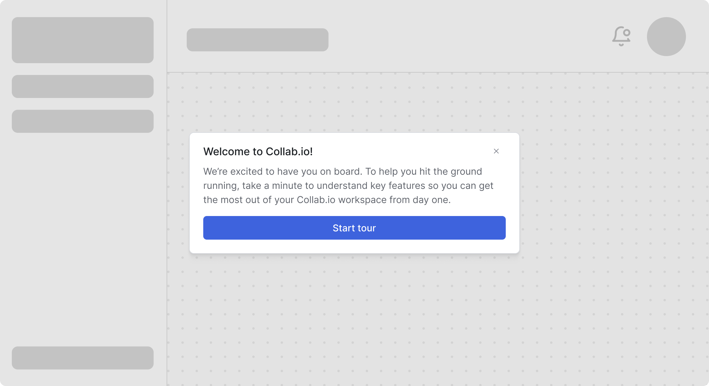
An example welcome screen modal in Collab.io
These contextual differences means in-app messaging requires a different approach. Instead of competing for attention in crowded inboxes or threads, you're better off figuring out how to prioritize and throttle your messages so they don't overwhelm your users. Instead of interrupting your user, your message needs to complement their current workflow without disrupting their experience.
Timing, placement, and frequency become critical factors that can make the difference between helpful guidance and annoying interruptions.
In this guide, we'll explain everything you need to know about in-app messaging, including common use cases, how it works, best practices, and how to implement in-app messaging in your product.
What is in-app messaging?
In-app messaging refers to messages or notifications delivered within your application's UI while someone is actively using it, rather than through external channels like email or SMS. In other words, these messages reach users when they're already engaged with your product.
Control and context makes in-app messaging extremely powerful. You can trigger messages based on what users are actually doing, like showing an onboarding tip when they discover a feature, confirming when they complete an action, or alerting them to security issues immediately.
Transactional vs promotional in-app messaging
Like many other channels, in-app messaging is used to deliver two types of messages, transactional and promotional. Transactional in-app messages keep users informed about their activity or account, while promotional in-app messages can be used to highlight new features or campaigns.
| Transactional | Promotional |
|---|---|
|
|
Products should strive to maintain a healthy balance of both of these notification types. Users expect and appreciate transactional messages when they're relevant, while promotional messages need more care. You don't want to constantly interrupt your users' workflows with suggestions that don't help them.
Key features of in-app messaging solutions
Modern in-app messaging systems need to enable teams to create, target, and optimize messages that feel native to their product while maintaining control over the user experience.
This requires several important features, including:
- Fully-customizable design system. You should be able to match your brand exactly with complete control over styling, animations, and positioning. Using your existing design tokens and component libraries ensures messages feel like a natural extension of your product, not a third-party widget.
- Intuitive content editor. Modern systems should empower non-technical team members to create and update messages without deploying code. Visual editors with live previews enable product and marketing teams to iterate quickly within the guardrails set by engineering.
- Dynamic user targeting. In-app messages need to be delivered to the right users based on real-time attributes, behaviors, and segments. You should be able to target by user properties, custom events, or complex conditional logic to ensure relevance at the moment of delivery.
- Flexible activation rules. This helps you control exactly when and where messages appear using URL patterns, user actions, or custom triggers, which can provide additional context and improve user experience.
- Intelligent message prioritization. You should be able to manage competing messages with priority queues, ensuring that critical system alerts take precedence over promotional content, all while maintaining a coherent user experience.
- Built-in message throttling. Throttling helps prevent notification overload, with configurable rate limits per user, session, or globally. You should also be able to set frequency caps, timing windows, and cool-down periods to maintain engagement without overwhelming users.
- Observability and message debugging. It's important to be able to track every message, from trigger to dismissal, with detailed logs and real-time monitoring. Full visibility into the message pipeline helps troubleshoot issues related to delivery, personalization, and targeting logic.
- Granular engagement analytics. Finally, you should be able to track impressions, clicks, dismissals, and custom conversion events to measure overall impact and continuously optimize your messaging.
Types of in-app message formats
Since in-app messaging is embedded in your product, you have much more control over when and how it appears. Some vendors may lock you into limited templates, but technically there's no limit for how you introduce messages to your users.
Some of the most common formats to display in-app messaging include:
- Notification feeds. That familiar bell icon with a dropdown of recent activity. Perfect for things users might want to check later, like order confirmations or comment notifications.
- Banners. Colored bars at the top or bottom of the screen, usually using text to announce new features or scheduled maintenance. Visible but not obnoxious.
- Cards. Similar to banners, cards are often positioned in a static area of your product screen that is noticeable but not distracting. This format is often used to highlight new features as it allows for images more easily.
- Modals. The "stop everything" pop-ups that dim the background. Reserve these for critical stuff like session timeouts or confirming destructive actions.
- Toasts. Those little notifications that slide in and disappear after a few seconds. Great for quick confirmations, such as "Settings saved" or "Message sent."
- Tooltips. Contextual help that blends into your product UI. Think onboarding tours, feature tips, or those helpful hints that appear when you hover over something new.
The format you choose can matter nearly as much as the message itself. If the format doesn't match the urgency or add the proper context, your message may fall flat.
Top use cases for in-app messaging
In-app messaging works best in scenarios where timing and context make all the difference. Below are the most common use cases and the formats that work best for each.
User onboarding and feature discovery
Getting new users up to speed without overwhelming them is an art, especially with more complex products. It's often best to greet new users with a modal on first login to welcome them and set expectations, then switch to tooltips and cards for further guidance. Progressive disclosure will be your friend here, as it can be more effective to show tips as users explore rather than dumping everything upfront.
An example welcome screen modal in Collab.io
For feature discovery, toasts can work well for "Hey, did you know you can..." moments after users complete related actions. Save the full guided tours (using tooltip sequences) for when users actively click "Show me how" rather than forcing them on everyone.
Transactional updates and activity notifications
Notification feeds are great for non-urgent messages that users may want to review at their own pace. Notifications like comments, mentions, order updates, and payment confirmations are all a great fit to show in a dropdown behind a single red dot on the bell icon. These messages should be rich enough to be useful without requiring users to navigate elsewhere, but still provide a means to review or take action if the user so desires.
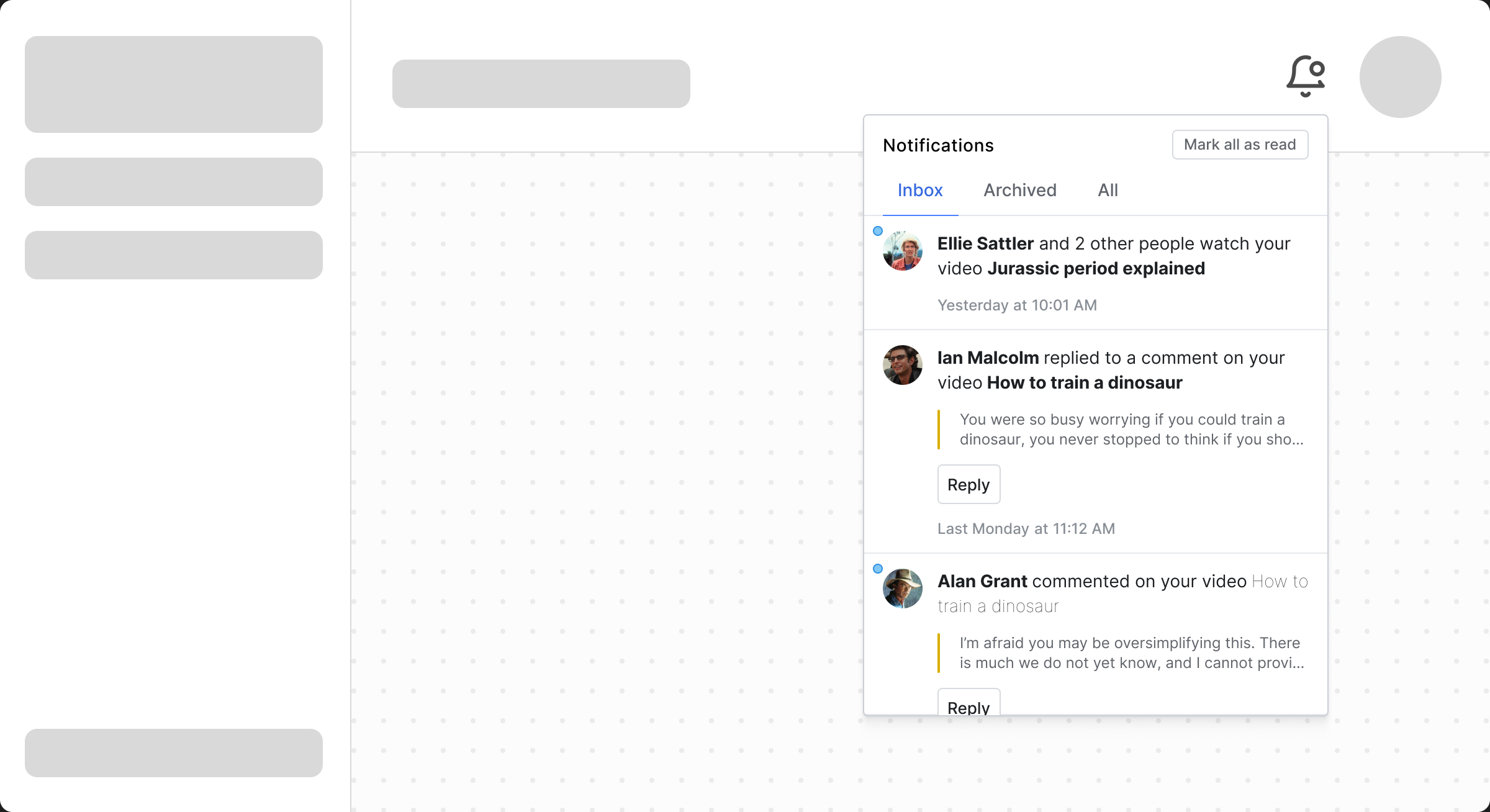
An example interactive feed update in Collab.io
For certain time-sensitive messages, you may want to layer your approach. A payment failure might trigger both a feed notification and a banner, ensuring users notice even if they ignore the bell icon. Security alerts should escalate to modals if they require immediate action.
System status and maintenance
Banners are ideal for important, system-wide announcements, such as scheduled maintenance or service disruptions. They're visible without being panic-inducing, and users can dismiss them once they've noted the information.
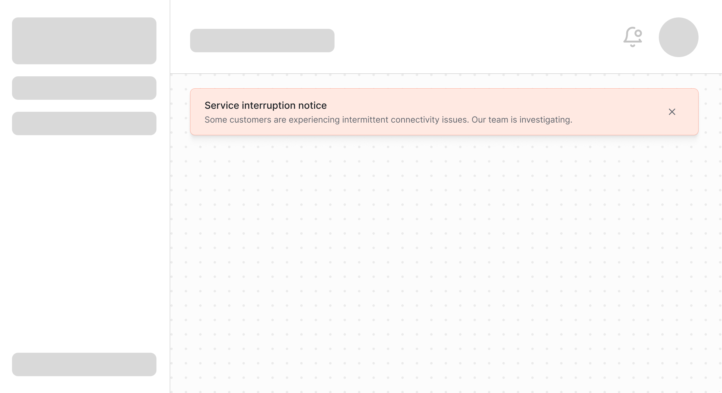
An example system status banner in Collab.io
For real-time status updates during an incident, combine a persistent banner with toast notifications for major status changes. This keeps users informed without requiring them to constantly check a status page.
User engagement and retention
Milestone celebrations and achievement notifications work best as toasts, brief moments of delight that don't interrupt workflows. "You've completed your 100th task!" is appreciated as a toast, but would be annoying as a modal.
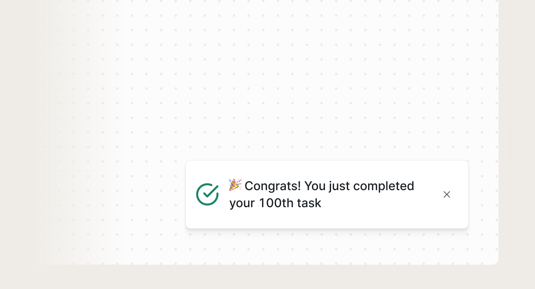
An example usage toast in Collab.io
Re-engagement prompts need subtlety. Use cards embedded in natural places (like an empty part of the dashboard) to suggest abandoned features or incomplete setup steps. These feel helpful rather than pushy because users encounter them during natural pauses.
Growth and monetization
Upgrade prompts and plan limit warnings require careful handling. The way you approach new or long-time users about upgrading from their current plan can help or hurt your brand. You want users to feel like it's a fair, friendly transaction based on their usage, so avoid being too abrupt or aggressive.
You may want to start with feed notifications when users hit 75% of their limit, escalate to banners at 90%, and only use modals when they're actually blocked. This graduated approach feels fair rather than aggressive.
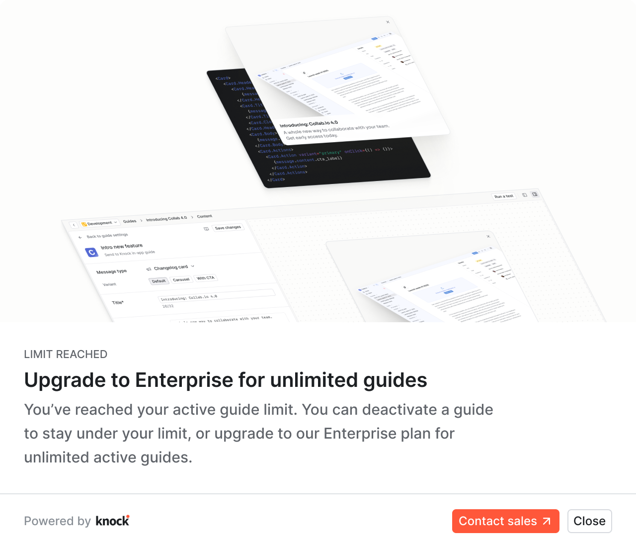
An example upgrade modal in Knock
For promotional campaigns and special offers, cards integrated into your UI feel less intrusive than banners. If the offer is time-sensitive, a dismissible banner is effective, but make sure to provide users with a way to opt out by saying "don't show this again" to maintain trust.
Support and error handling
Error messages need formats that match their severity. Form validation errors are perfect for toasts, while system errors that prevent progress warrant modals. Always provide clear next steps to address the error, not just stating what went wrong.
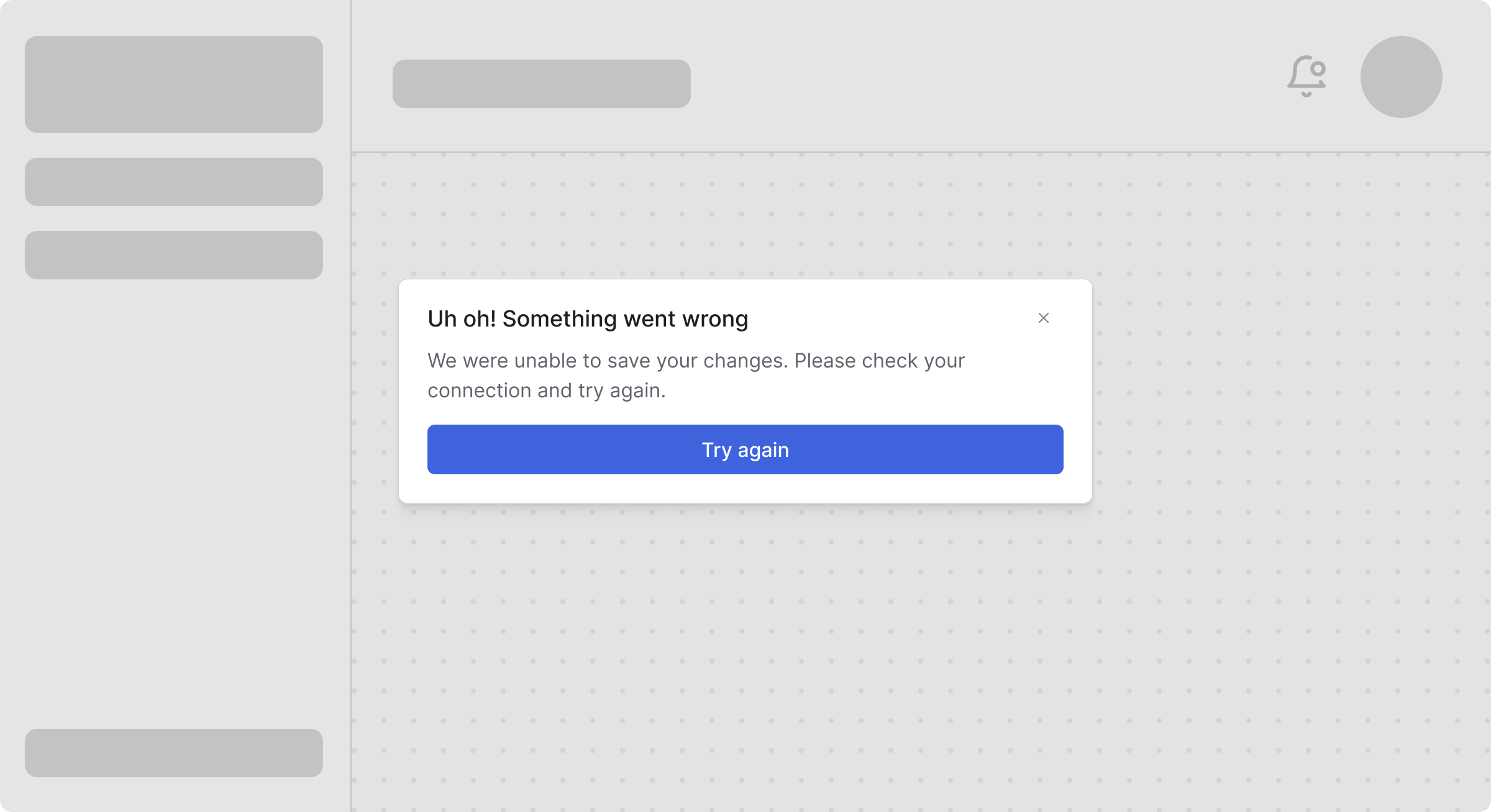
An example error modal in Collab.io
For proactive support, like suggesting help articles based on user behavior, use cards or tooltips that appear after a few failed attempts at something. This feels helpful rather than condescending.
Multi-user collaboration
In collaborative environments, real-time activity needs real-time messaging. Toasts for "John is viewing this document" or "Sarah started editing" keeps users aware without disrupting work. Save the feed for more permanent collaboration events, like comments or approvals.
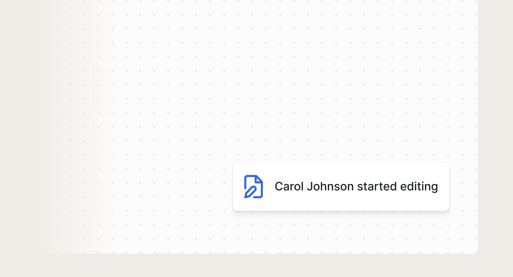
An example collaboration toast in Collab.io
For team announcements or workspace-level messages, banners ensure everyone sees critical information, while less urgent team updates can live in a dedicated section of the notification feed.