Getting in-app messaging right requires more than just technical implementation. Let's explore the practices that make the difference between messages that help users and those that annoy them.
Planning and strategy
Before you start sending messages, you need a solid foundation. This section covers the strategic decisions that determine whether your in-app messaging will help or hurt your users.
Determine the right in-app message format
Matching message urgency with the correct format is key to effective in-app messaging. Using mismatched formats that don't meet user expectations can slowly train users to ignore all of your messages.
For example, urgent transactional messages, like a suspicious login attempt or missed payment, should probably use a high-visibility format, like a banner or even a modal. The more immediate the required action, the more intrusive you can be.
At the same time, less urgent transactional messages can afford to be more subtle. A feed or inbox works perfectly for order confirmations or comment notifications that users might want to reference later. This works great when a message doesn't need to interrupt what they're doing right now.
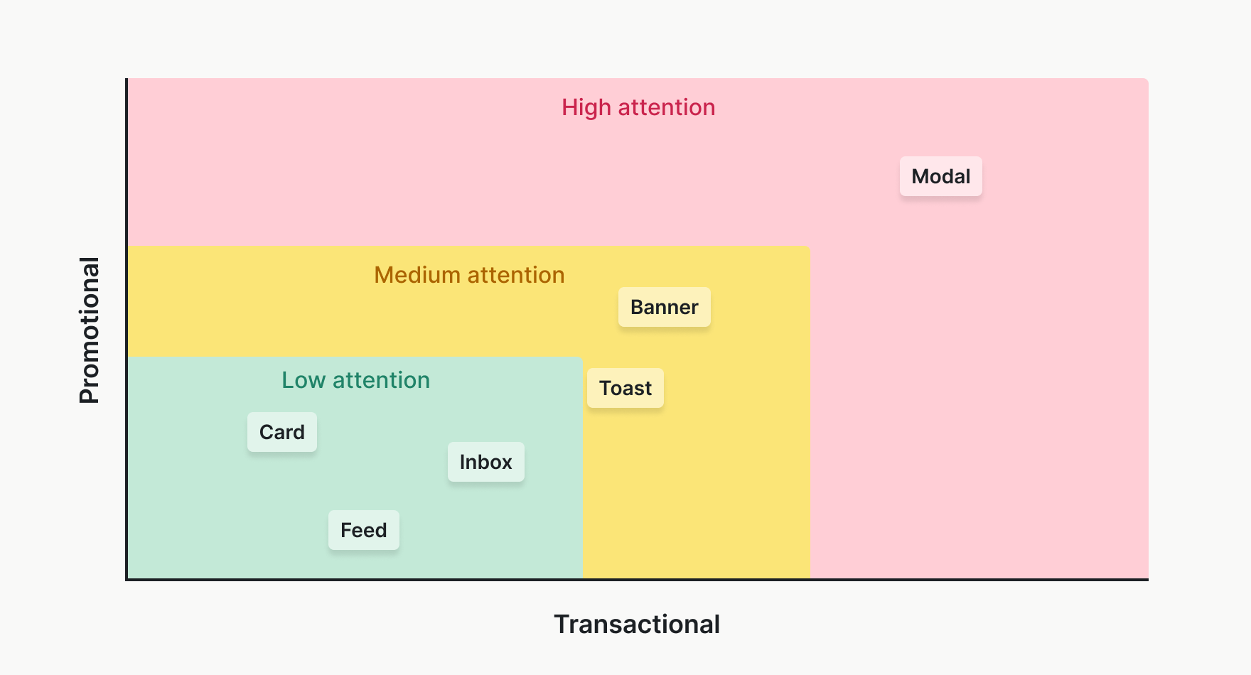
On the flip side, promotional messages should use a low-attention format that minimizes user interruption, like a card or inbox feed item. Suggesting a new feature may be beneficial to the user in the long run, but it runs the risk of blocking their current work. Save the high-attention formats for truly critical promotional moments, like a final warning before a free trial expires.
Time messages for maximum impact
Even great messaging in the right format becomes annoying at the wrong time. Promoting a webinar while someone's frantically trying to meet a deadline or showing an upgrade prompt in the middle of a complex workflow won't lead to a conversion and simultaneously hurts user experience.
Products should strive to make in-app messages feel almost telepathic. There are several ways to trigger messages right when users need them (or when they're most receptive).
The most logical time to trigger a message is after the user takes a specific, related action. For instance, showing a 'success' toast after the user completes a task is the type of subtle touch that improves the user's experience with your product.
Other messages may require more attention from the user. While you shouldn't be afraid to send these types of messages, you don't want to interrupt users mid-task with non-urgent information. In these cases, waiting for natural breaks in workflow can drive impact without hurting user experience.
Some natural breaks include:
- Show feature announcements when users land on the dashboard.
- Display tips after users complete an action successfully.
- Present upgrade prompts when users hit limits, not randomly.
- Deliver summaries at the end of sessions.
Finally, you'll want to make sure you're setting frequency caps to prevent overwhelming active users with the same messages over and over. For messages triggered on user actions, make sure to batch these messages, so instead of ten toasts for ten completed tasks, you show one: "You completed 10 tasks! Great work!"
Target the right users
Not every message is relevant for all users. You wouldn't want to show a tooltip about your reporting feature to power users who run reports daily.
Segmenting your users and showing only relevant in-app messages to each segment is critical for preventing notification fatigue. Consider these categories of message relevance:
- Role-based: Show developer tips only to users who've accessed the API.
- Plan-based: Display upgrade prompts only to free-tier users.
- Behavior-based: Suggest features after users complete related actions.
- Engagement-based: Re-engage dormant users differently than daily actives.
The most effective targeting responds to user behavior in real-time. When users dismiss a message, respect that choice. Don't show the same banner again immediately. Store dismissal preferences and honor them for at least the session, preferably longer.
Content and implementation
Great strategy means nothing without great execution. These practices ensure your messages are well-written, accessible, and maintainable as you scale.
Write messages that get read
Once you have a smart messaging system that shows messaging to the right people at the right time, you need to ensure you're writing notification copy that works at a glance. Users spend maybe two seconds looking at a message before deciding to dismiss it.
Start with specificity. Instead of "Notification" or "Update available," write messages that tell users exactly what happened and what they can do about it.
Instead of:
Write:
Backup complete: Your project files were backed up successfully. [View backups]
The second version names the event, confirms success, and provides a clear action. Front-load the critical information, as the first few words determine whether users keep reading.
For transactional messages, include the details that matter. "Order #1234 has shipped" beats "Your order has shipped" because users often have multiple orders. Context prevents confusion and builds trust.
Keep your voice consistent with the rest of your product. If your app calls them "Tasks," don't suddenly switch to "To-Dos" in notifications. Use active voice ("12 people viewed your report") rather than passive ("Your report was viewed by 12 people") for clarity and directness.
Use templates to scale
Hard-coding message strings becomes unmaintainable fast. A templating system can solve multiple problems at once:
- Templates let non-developers update copy without code changes.
- Templates support localization for different languages and personalization with user data.
- Templates handle edge cases gracefully if values aren't available or need to be formatted.
For example, in the template below, if the actor.name isn't available, the template using a dynamic Liquid variable falls back from "Sarah sent a message" to "Someone sent a message."
Hey {{ recipient.name | split: " " | first | capitalize | default: "there" }} 👋 - {{ actor.name | default: "someone" }} sent a message:
"{{ message }}"Note: Store templates in a database or CMS, not in code. This separation lets you update messaging without deployments and maintain consistency across notification types.
Design for accessibility
Like your product, in-app messages must be accessible to all users. For screen readers, use ARIA live regions to announce dynamic content:
<div role="status" aria-live="polite">Saved successfully</div>

<div role="alert" aria-live="assertive">Session expires in 2 minutes</div>
Ensure keyboard navigation works for all interactive elements. Users should be able to tab through notifications, dismiss them with Escape, and activate links with Enter.
Don't rely on color alone to convey meaning. That red dot indicating "unread" needs accompanying text or labels. Follow WCAG contrast guidelines, especially for banner text on colored backgrounds.
Test responsive behavior across screen sizes. A desktop banner might overwhelm mobile screens. Consider different formats or simplified messages for smaller viewports.
Optimization and coordination
In-app messaging isn't a set-and-forget feature. You need to measure performance, coordinate with other channels, and continuously refine your approach.
Measure what matters
Once you're sending messages, you'll want to track some key metrics to reveal whether your messages are achieving their purpose or need to be revised.
Some key metrics to watch include:
- Impressions: How many users are actually seeing your messages?
- Interaction rate: How many users are clicking your CTAs?
- Dismissal rate: How many users are dismissing your messages?
- Completion rate: Are your messages driving the intended user actions?
Testing different copy, timing, or formats will help drive these metrics forward. Try to connect notification interactions to downstream behaviors, so you can determine if users who see onboarding tips complete setup faster or if upgrade prompts actually increase conversions.
Don't forget to watch out for negative signals, too. Support tickets mentioning annoying pop-ups may be a sign to scale back your messages or set frequency caps, and high dismissal rates suggest irrelevant or poorly timed messages.
Coordinate across channels
In-app messaging works best as part of a unified communication strategy. If you announce a feature via email and in-app tooltip, ensure consistency in messaging and timing.
Use interaction data to optimize other channels. If users click "Learn more" on an in-app banner, they probably don't need the follow-up email. If they never log in to see the in-app message, that's when email becomes valuable.
Build smart fallback chains: try in-app first for logged-in users, email if the message goes unseen for 24 hours, and SMS only for critical time-sensitive alerts. This orchestration prevents redundancy while ensuring important messages get through.
Start conservative, then optimize
When in doubt, err on the side of being less intrusive. It's easier to make messages more prominent if users are missing them than to dial back after you've annoyed everyone with too many modals.
Track how users interact with different message types. If they are dismissing your banners immediately, maybe the timing is off or the message isn't relevant. If critical alerts are going unnoticed in the notification feed, try a more attention-grabbing format.
The goal is not to maximize message visibility, it's to maximize value for users. Sometimes that means staying quiet. The best products know when not to send a message at all.
Common pitfalls to avoid
- Notification overload: More isn't better. Each message should provide clear value.
- Vague messaging: "Check this out!" doesn't tell users why they should care.
- Interrupting workflows: Don't block users from their tasks with non-critical messages.
- Ignoring preferences: Once users opt out, respect that permanently.
- One-size-fits-all: Different user segments need different messaging strategies.
- Set and forget: Messages need regular review and optimization.
The best in-app messaging feels like a helpful assistant, not an annoying salesperson. It appears when needed, provides value, and respects user attention. When you get this balance right, notifications become a feature users appreciate rather than disable.